The Shipping Guru by Werklig
Opinion by Richard Baird Posted 10 June 2011

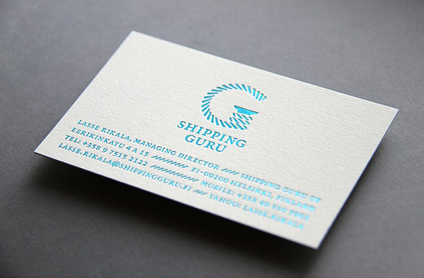
The Shipping Guru is a Finnish consultancy specialising in ship-broking and sea logistics, their new identity developed by Helsinki based brand development agency Werklig, blends a clear maritime sensibility with an iconic ‘G’ logo-mark.
This really grabbed my attention and is a great example of a small branding project well handled distilling a perceptibly large operation into a neat little identity package. The ‘G’ is really well done with the highlights of the rope being perfectly balanced through the difficult curves of the character while the solid serif reinforces both the letter and the mooring reference. The type choice balances the modern simplicity of the mark with a classic and formal tone.
The business card utilises the rope aesthetic to nice effect creating a justified type layout that draws the eye to the curves of the logo-mark. The blue foil cuts through the icy white of the background and is an inspired choice that really captures a glistening azure sea. Very much like the Stripland identity there is very much a strong Nordic feel to this identity both in its simplicity and tone which is effective both visually and conceptually.


