Brandfluent by Six
Opinion by Richard Baird Posted 22 September 2011

Brandfluent is a London-based brand innovation and technology consultancy that specialises in integrated, digital and experiential marketing as well as search engine and social media optimisation. They approached independent creative agency Six to develop a new identity based around a simple and bespoke serif logo-type.
“The solitary request from the client was to use a serif font for their new identity. From there a font was chosen and then tweaked, adjusting the majority of the letter-forms and negative spaces, to create a word that appeared more fluent in its appearance.”
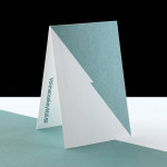
“Printed in one colour, with the logo in a matt platinum foil on a combination of Pistachio and Damascus Green Colour Plan by GF Smith.” – Six
After some previously quite complex architectural identities I wanted to post something that was a little more straightforward but equally well executed that manages to resolve the aspects of professionalism in its serif form but with quirky and custom details that communicates a uniquely creative approach. The individual characters have each been competently rendered and well spaced throughout while the flourishes are cleverly isolated to the ‘fluent’ end of the logo-mark. The ‘n’ ‘t’ and copyright symbol combination has a neat positive and negative balance across the horizontal axis and counters the weight of the capital B at the front as well as the height of the ascenders at the centre of the logo-type. I am generally not keen on overlapping letter-forms but the ‘fl’ combination has a friendly interaction that lends itself well to the social media aspect of the company.

The layout and application of the identity across the printed collaterals are kept simple and identity focused, the circle is a little bit of a superfluous detail but could be seen as an appropriate representation of global communication and inclusivity. The foil treatment and colour palette are a particular highlight that is a really nice blend of classic style and minimal execution that comes across as sophisticated and confidant.