Rivero Gonzalez by Anagrama
Opinion by Richard Baird Posted 12 October 2011
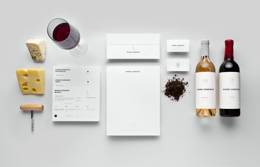
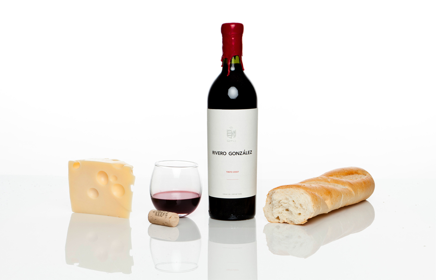
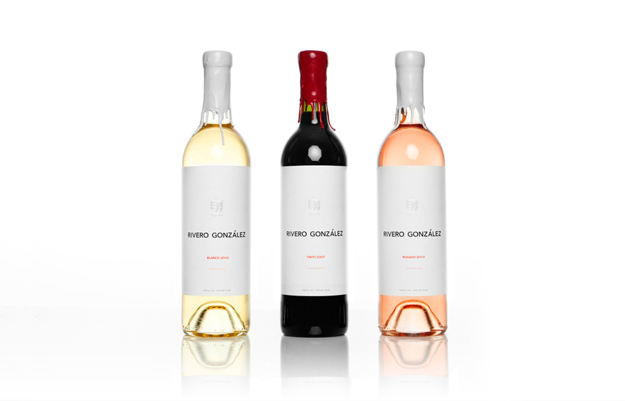
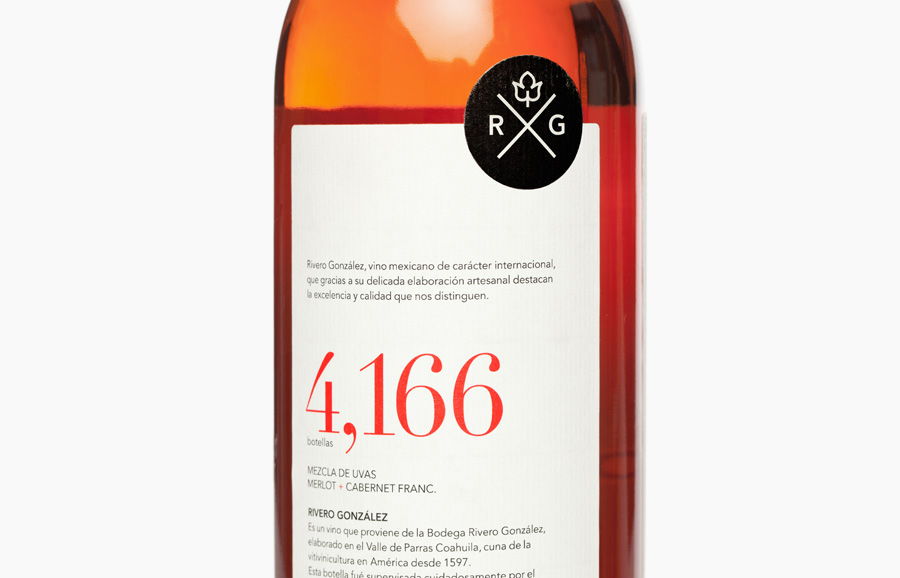
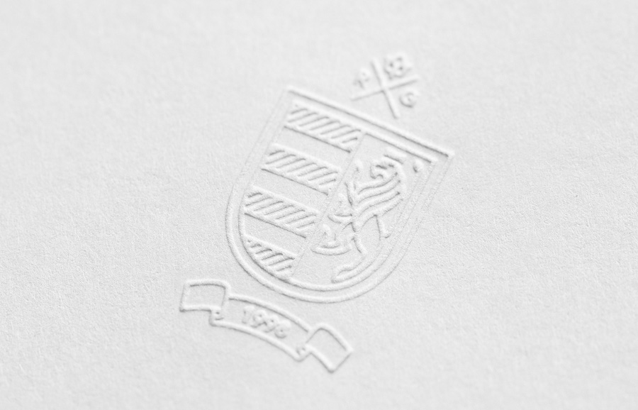
Rivero Gonzalez is a small San Pedro (MX) based family wine producer with a rich history and tradition in the industry. As part of a new identity and packaging proposition, brand development agency Anagrama developed a modern take on the classic heraldic symbol and juxtaposed it with traditional, tactile, material and print techniques.
“Throughout the years, there has been a tendency of taking products originally treated to remain longer such as cheese, cured meats and even salt, and take them to the same level of sophistication of a perfume or a high couture garment. For wine, this tendency is stronger than for any other beverage; We can find three dollar wines in a cardboard box, or a $160,000 bottle of Château Laffite.”
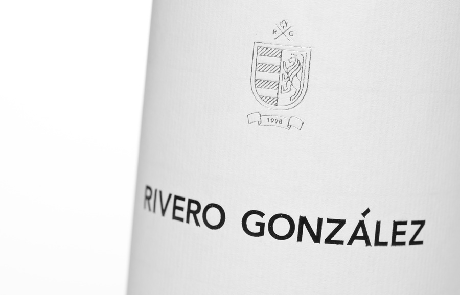
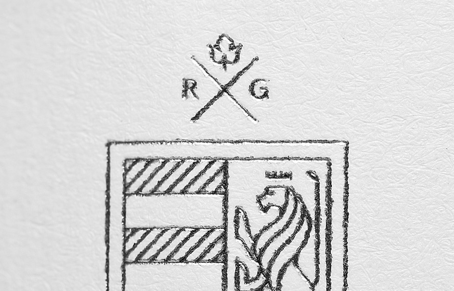
“The market’s top section is very small, and the demand is under supplied. For these wine producers it is fairly simple, but for the vast majority of the younger wine houses the situation is much more complex. Our solution was to use Rivero González’ family coat of arms as the brand’s identity. We developed a modern version that would convey elegance without pretending to seem like an ancient wine house.”
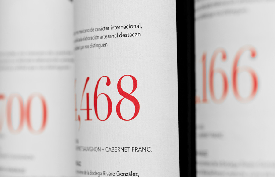
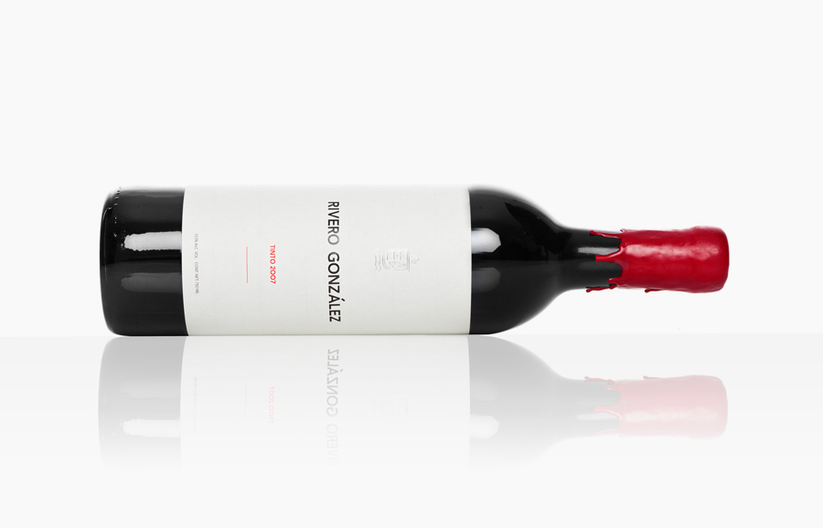
“In contrast with this modern and simple visual language, we played around with textures that denote the wine’s craftsmanship. These details can be appreciated in the packaging: silver foil, textured paper, and melted sealing wax on the cap.”
“Rivero González is a brand that represents this new wine cellar but also heightens the most traditional wine producing processes.” – Anagrama
I generally avoid writing about wine branding and packaging as it’s something I have not much experience with either as a design project or as a purchaser. But for this I make the exception as it is the latest work by Anagrama who have yet again managed to create a very strong brand message and packaging aesthetic with very few graphical components.
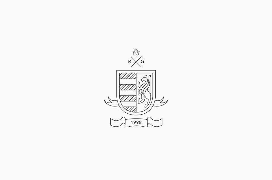
The single line weight design of the logo-mark is a very smart way of evolving a long established coat of arms and giving it a contemporary and less fussy aesthetic. Each component is well executed with a good consideration to both positive and negative space while the crown and the lion’s tail display an aptitude for restraint and reductionism without loss of detail. The word-mark, a bold sans serif with a rough printed quality adds weight to the brand and body to the product resolving the aspects of heritage and craft in a simple and distilled way. The embossed application of the identity across the stationary, foil treatment on the label and a simple stamp on the cork are a testament to how flexible it is, neatly moving between contemporary and a more classical expression. The minimal and spacious layout of the label has a confident and self assured sensibility choosing to utilise tactile post-press devices such as block foil, wax and stickers to communicate the aspect of craftsmanship and quality with a more expressive and diverse sensory experience.
