DB Draught by Designworks
Opinion by Richard Baird Posted 13 April 2012
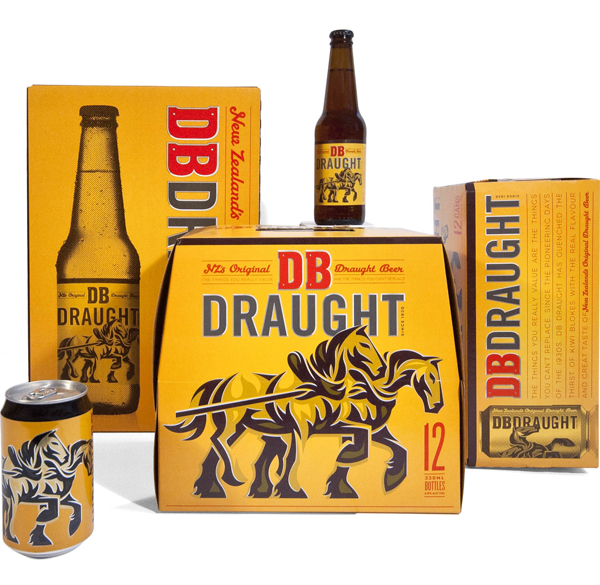
DB Draught is an award winning New Zealand draught ale produced by Singaporean and Dutch owned DB Breweries, an Auckland based company that also brews for popular beer brands such as Heineken, Amstel and Tiger. This year DB Draught underwent a rebranding exercise, conducted by international studio Designworks, to develop the brand’s 80 year heritage and remain relevant to today’s customer.
“The driving idea behind the rebrand was to bring emphasis back to DB Draught as “the beer that built New Zealand”. Whilst the previous design had the iconic Clydesdales as somewhat of an afterthought the new direction required bringing back the iconic Clydesdale horses as a central part of the design. The new look highlights the brand’s uniquely kiwi values of strength, honesty and hard work expressed in a modern way. Drawing its cues from the horses’ character – the resulting aesthetic is very bold, black and steely – an approach that is true to the brand’s icons and history.
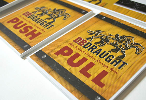
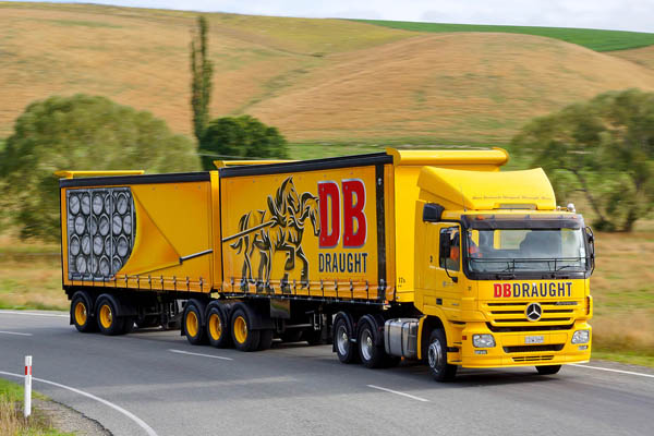
As part of the re-launch, new labels, packaging, signage and glassware were developed. A special livery was also designed for a B-Train (two-trailer truck) to give the brand a moving presence while delivering beer in the South Island. Featured as the centre pull-out in the March issue of NZ Truck and Driver, the new design seems to be hitting the mark.” – Designworks
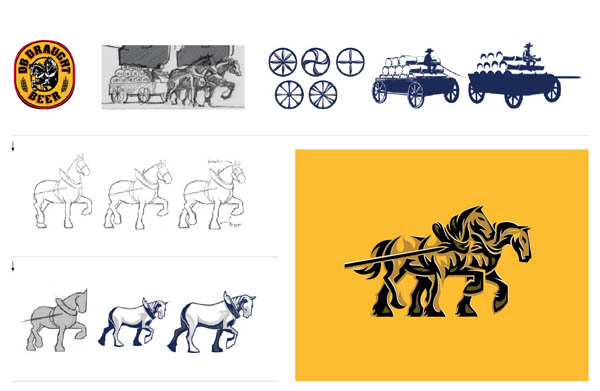
I was really drawn to the bold illustrative approach and the traditional ‘hard-work followed by simple pleasures’ symbolism captured through the Clydesdale horses. These have been really well rendered with a lovely sense of motion, weight, stability, reliability and an underlying and traditional workingman’s pub-sign aesthetic delivered through heavy but fluid strokes, muscle highlights, executed with a sparing and contemporary sophistication across the packaging.
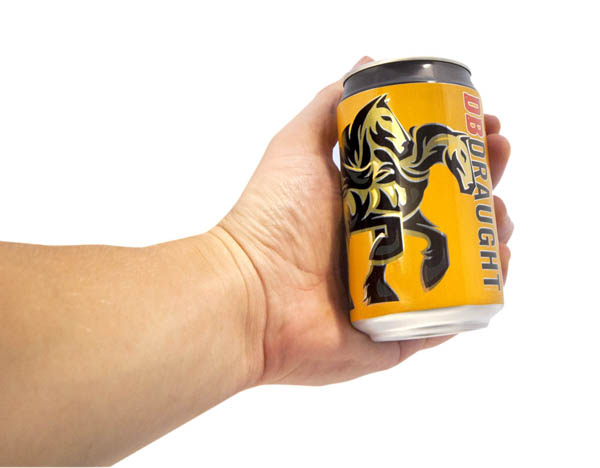
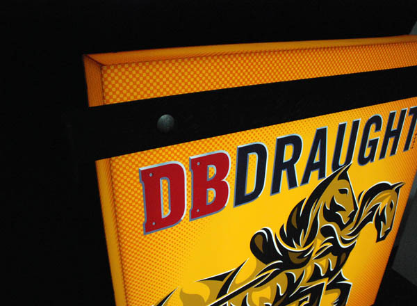
The themes of industry are successfully carried through to a typographical solution that utilises tall geometric letter-forms, steel tones and shading across the Draught logo-type, small carriage bolt and slab serif details of the DB monogram alongside the stacked and underlined content of the packaging. A classic script choice, set in red, introduces a subtle, personal and handcrafted quality to the weighty industrious aesthetic that delivers additional depth to the concept. The cans are iconic in their simplicity, free of superfluous detail and language they make the most of the Clydesdale hero with large coverage and an interesting contrast of horizontal motion and the vertical, almost structural quality of the logo-type and layout.
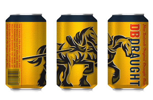
The colour palette gives the brand a sense of warmth and captures the rich amber colour of the product, a simple three shades approach to the illustration keeps it looking honest while the bronze highlight across the cans has a neat sense of traditional quality.
