Maldon Salt by Pearlfisher
Opinion by Richard Baird Posted 11 July 2011
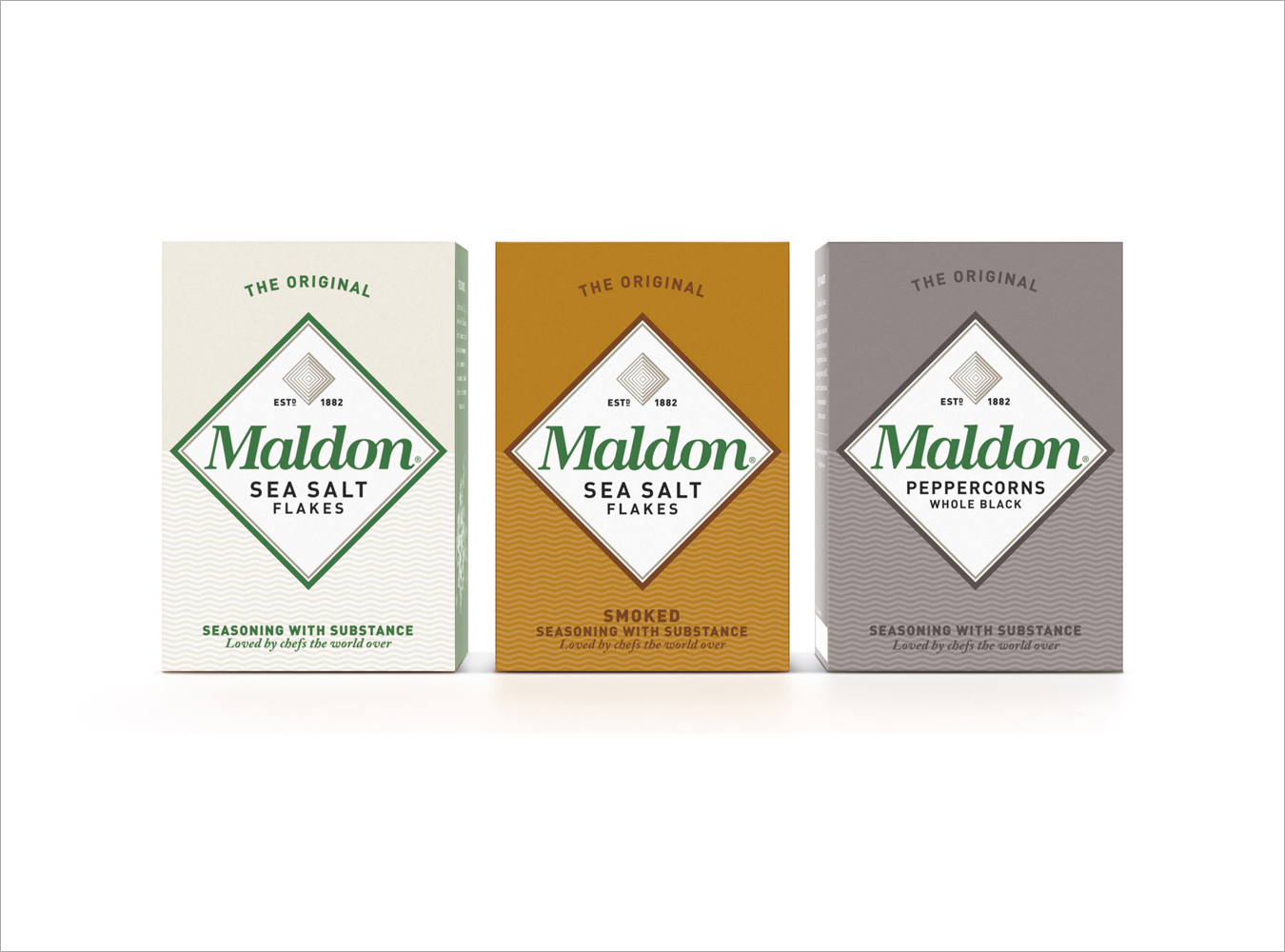
Maldon is a family-run UK manufacturer of salts located off the east coast of Essex where it continues the two thousand-year old tradition of harvesting in the area. They approached Pearlfisher to redesign their packaging and branding to better capture and express the quality and heritage of the brand.
There is a fantastic visual hierarchy to this packaging that manages to capture the product and brand’s key propositions in a very simple yet intelligent design solution that can essentially be broken down into three key elements, product, provenance and values.
The diamond, the largest element, has been utilised well as both a bold and distinctive visual brand component and as a smaller concentric and almost Art Deco aesthetic detail that firmly places salt at the top of the packaging’s hierarchy with an understandable abstraction that avoids the literal and generic. The brand values are captured in a neat typographical blend of classic script and modern sans-serif representing family values/heritage and a view to the future. The simple wave pattern delivers an underlying but clearly identifiable sea connection that forms the base of the hierarchy and reinforces the origin and genuine nature of the product. The new logo-type retains the neat ligature work of the original and drops the ugly transitive serifs, its smooth flowing letter-forms contrast well against the angles of the diamond and echo the undulating waves of the sea.
Pearlfisher has taken the simplicity of the product and brand to its most fundamental visual forms, extracting and expanding these into something that appears timeless in its simplicity, straightforward in its communication and premium in its proposition.