Moxham by The Consult
Opinion by Richard Baird Posted 20 July 2011

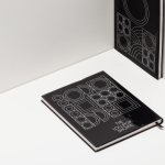
Moxham is the fashion label of designer and MA student Madeleine Moxham. Under the maxim ‘wearable construction’ her new identity, designed by London-based The Consult, emphasises the geometric and utilitarian nature of her work through an unusual and unique MX monogram.
There is a strong two and three dimensional aspect to this identity that works really well to capture the structural and angular aesthetic of Madeleine’s work, and while the monogram may not be obvious it is a neat interpretation of the more interesting elements of the brand. The letter-forms of the typeface are simple, well weighted with a utilitarian feel and a distinctly British sensibility (see the Ministry of Information posters of WWII). This is reinforced by a perfectly balanced lock-up that gives the logo-mark a modern crown like aesthetic that provides the brand with a sense of quality which is reinforced by a gold foil print finish.
The mark on its own has a strong identifiable character that is iconic and representative but with a timeless and almost classic fashion house style. For me this is an impressive piece of branding for a recent graduate that could easily fit amongst the more established premium brands.