Blingcrete by Onlab
Opinion by Richard Baird Posted 24 October 2011

BlingCrete, founded in 2009 by artist Heike Klussmann and architect Thorsten Klooster is a firm that specialise in developing unique materials through a collaborative process that unites architects, physicists, material engineers, technologists, artists, interaction and product designers. Their new identity, developed by Swiss agency Onlab, based in Berlin, fuses the unique characteristics of material and utility with a simple but fluctuating single tone logo-type.
BlingCrete “changes its appearance in relation to light. When one stands between the source of light and the material the concrete starts ‘blinking’.” “The logo plays with the perception of contour and fill. The letters appear to be illuminated when expanding the thickness of white contour in relation to black fill and vice versa.” – Onlab
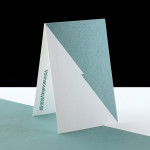
The logotype’s bold and geometric letter-forms are fairly straight-forward in their construction but manage to carry the weight and functionality of architectural materials. Each character holds a varying degree of negative space to convey a subtle reflective characteristic with a single colour and gives the standard forms a unique quality. Its stacked execution (presented at varying stages of reflection) across the collaterals reinforces the concept and gives each of these an interesting and ‘polished’ surface finish. The grey and black colour palette and uncoated substrate celebrates a truth to material while giving the identity a very utilitarian sensibility. The logo animation, while a little slow, emphasises the dynamic quality of the product range and gives weight to the experimental nature of the company.