The Super Cool by Studio Alto
Opinion by Richard Baird Posted 8 December 2011

The Super Cool is an Australian mobile retail experience that sells an eclectic and affordable mix of everyday household objects from both local and international designers. Their identity, created by Melbourne-based agency Studio Alto, resolves the brand’s vision of accessible design and quirky shopping experience with a hand drawn vintage aesthetic.
“In the fashion of vintage peddlers of old, TheSuperCool is a ‘mobile emporium that goes to the people.’ With hand-selected everyday objects from local and international artists, TheSuperCool retail experience is influenced by fashion, pop culture and the creative industries with a touch of the nostalgic and the handmade.”
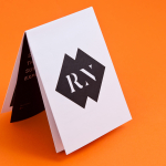
“Our visual concept for TSC was built around the carefully curated curios in their unique pop-up stores – ‘the unearthed gems, the super special, the things you fall in love with’. To reflect these sentiments, we crafted a hand-made logotype and series of signets to be scribbled, stamped, stenciled and stuck on their goodies.” – Studio Alto

The vintage and hand drawn concept has a quirky warmth that works really well to resolve the individual aspects of the brand. The logo-type has an intentionally loose and imperfect construction based around simple geometric forms that draws together both the human quality of service and the designer objects for sale. The heart logo-mark, reminiscent of the iconic superman emblem, is dynamic, full of life and quite retro while the diamond is neat idea that visually characterises the excitement of finding a gem (or a really good deal). The accompanying illustrations are really well executed and while they do not tie as well to the key identity they add an additional depth to the brand and appropriately represent the broad nature of the products. The stamp execution of the identity across a classic cream coloured tag design gives the brand a very tactile, functional and nostalgic quality but with a consistent and contemporary finish.