Fresh Point by Designers Anonymous
Opinion by Richard Baird Posted 19 March 2012

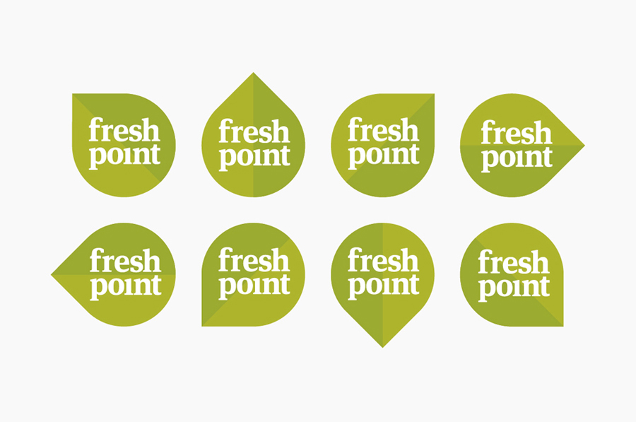
Fresh Point is a new and healthy fast food cafe that sells soups, wraps, sandwiches, fresh juice and yoghurt from its location on Nevsky Prospekt, St. Petersburg, Russia. The brand approached London-based agency Designers Anonymous who, utilising a simple leaf/arrow device to communicate fresh and fast, developed a complete visual identity system that included packaging solutions, interior design, POS, uniforms and signage.
“The pre-prepared cafe/eatery concept now commonplace in the UK is still a relatively new concept in Russia. Our challenge was to create a brand identity that expressed the fast & fresh eatery concept whilst also educating the Russian consumers to the individual benefits of the products and service.”
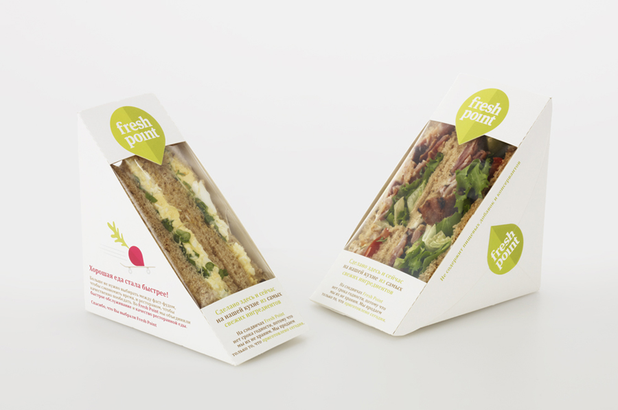
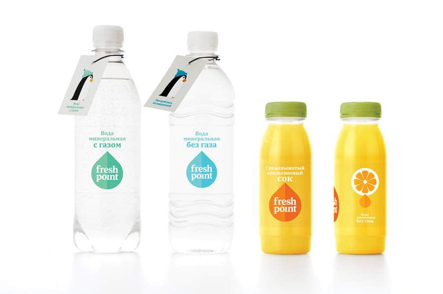
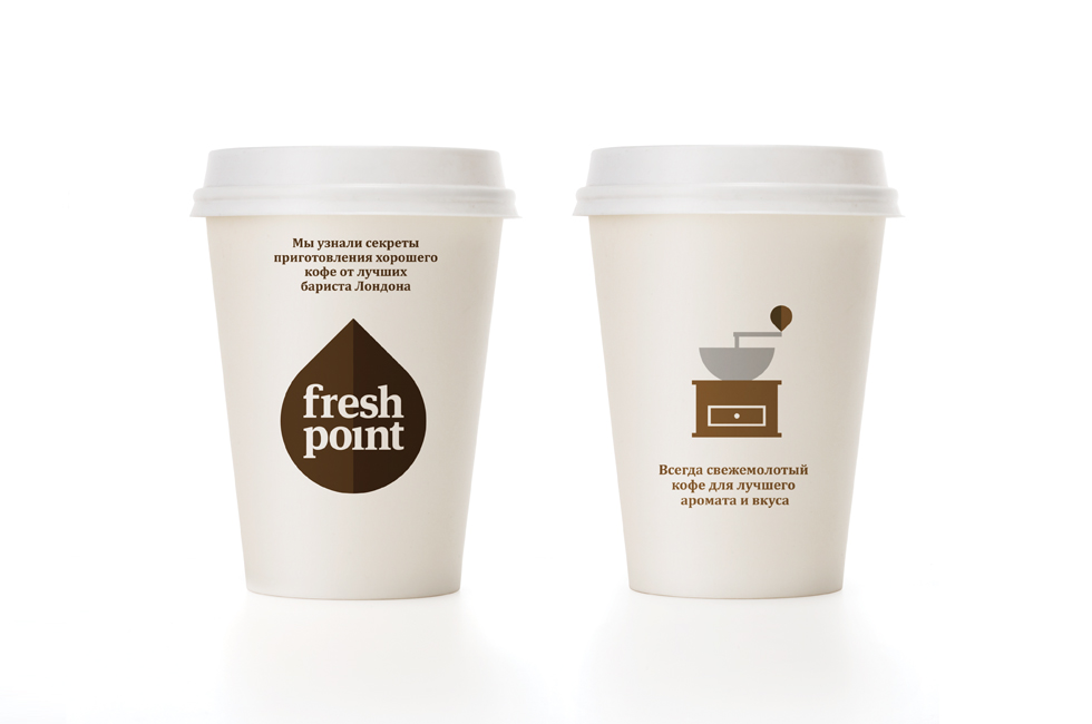
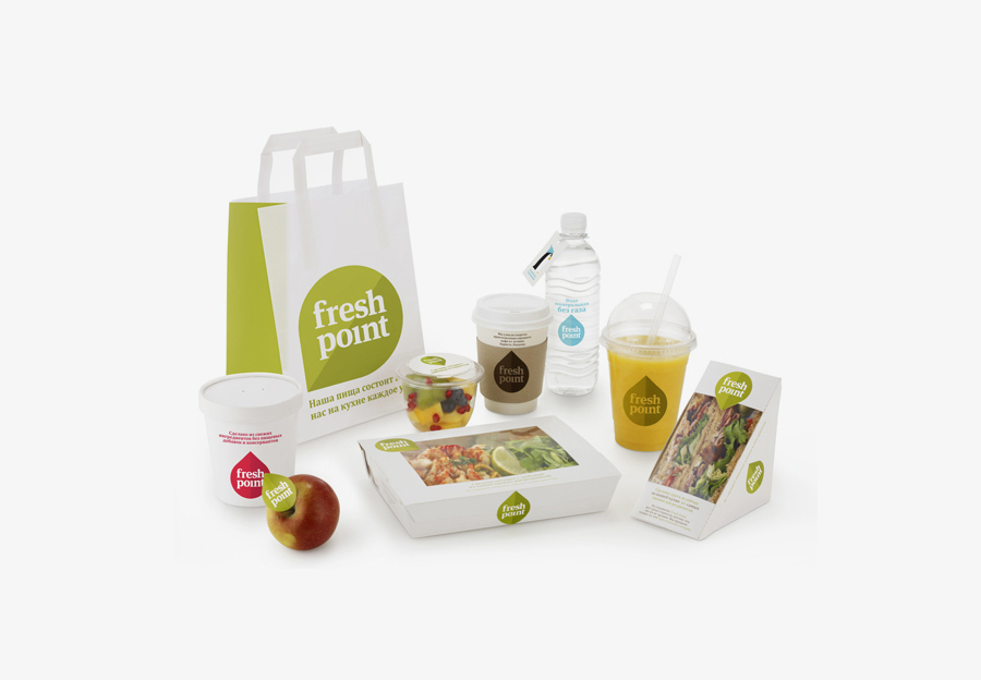
“We devised a versatile leaf shaped logo that doubles as a pointer. It points to a variety of fresh benefit messages, such as ‘Made fresh every morning’. The counter within the ‘e’ contains a small version of the ‘leaf pointer’ device. Each of the letters from the logotype was tweaked to suit. The leaf/pointer can rotate through 360 and can change colour to become either a blue water drop or brown coffee drop on a coffee cup. Sandwich pacakging is sealed with a Fresh Point leaf sticker that points to a message reading ‘This sandwich was made fresh in our kitchen this morning.” – Designers Anonymous
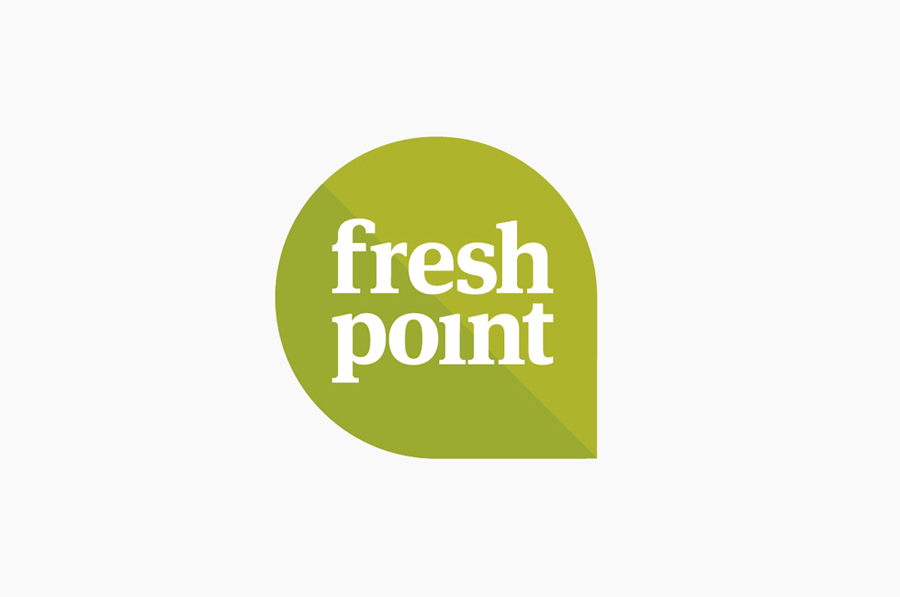
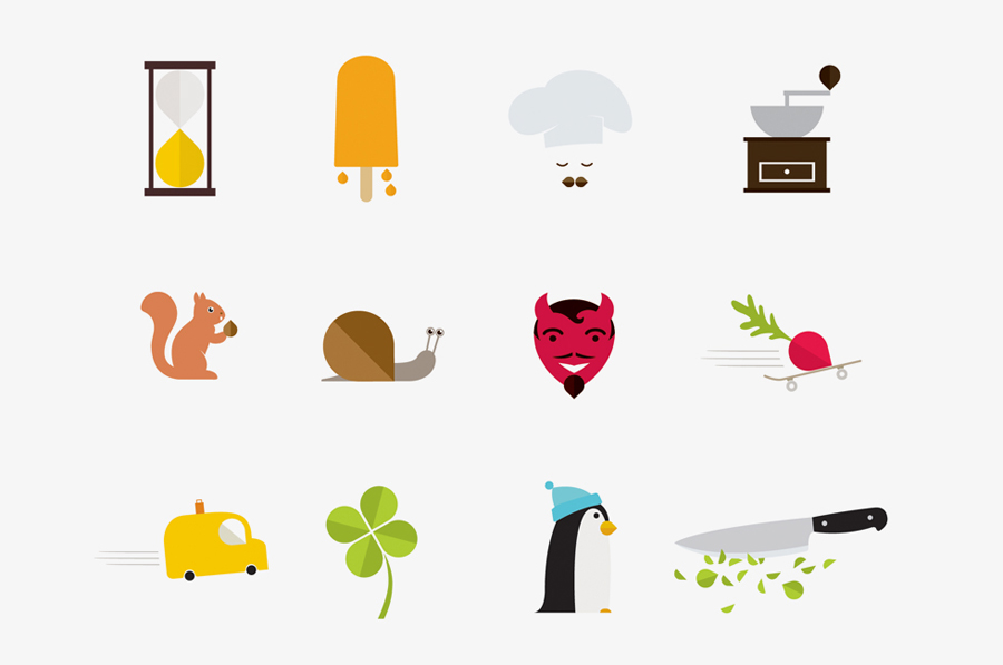
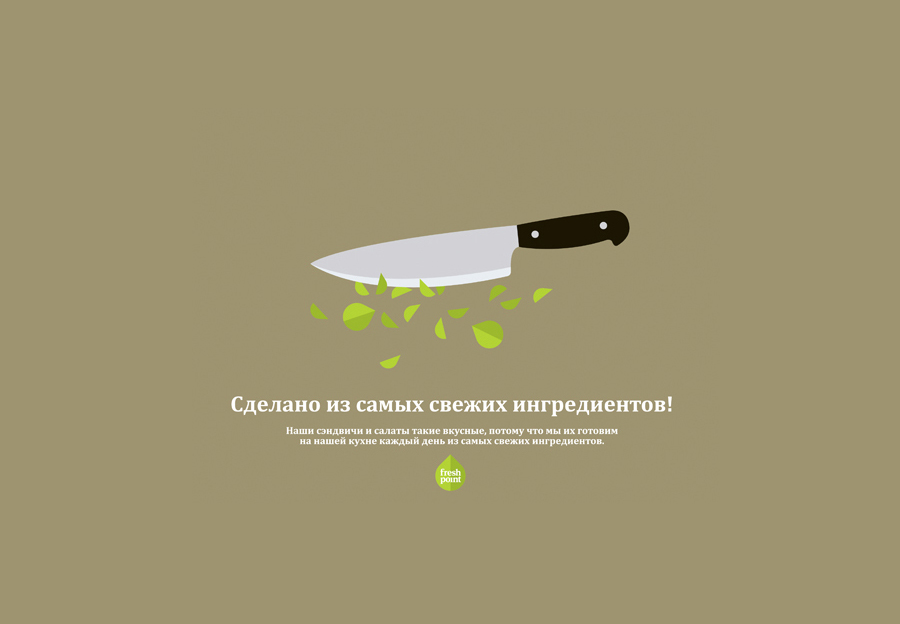
This is a very simple concept with a clear sense of communication and a smart triality that is ideal for an audience new to such a proposition. The resolution of leaf, arrow and droplet into a single logo-mark has been used to great effect throughout the type, packaging and illustrations. This never feels forced or saturated with the smaller details of the penguin’s beak, chopped leaves and my favourite, a pink horseradish, adding layers of detail to what is a fairly common form. The serif type choice appears earthy and practical and while I am not keen on the missing title or the tight spacing of the ‘p’ and ‘o’ the subtle customisation of the ‘e’ is a nice touch that ties it well to the other assets. Like the logo-type and mark the illustrations have been constructed with a straightforward simplicity that adds a playful quality but avoids becoming childish, each has a consistent character and their more organic execution offers a smart contrast against the geometry of the leaf. These brighter illustrations work well against a fairly conventional white and lime/natural green colour palette across the packaging and dining environment that together work to keep everything looking interesting, fresh and natural.
The simplicity of the idea does make it feel a little familiar but the attention to type and the consistent extension and execution of the leaf detail across multiple touch points and with a variety of functionalities give the brand a broad and unique personality.
