7GigaCloud by Face
Opinion by Richard Baird Posted 15 May 2012

7GigaCloud is a Saudi Arabian IT consultancy founded in 2011 by Ahmed Al-Okaili that advises companies on the utilisation of technology and delivers staffing support to both local and global business. 7GigaCloud’s visual identity, designed by supermodernist design agency Face, juxtaposes a bold but simple logo-type with fine line detail confidently executed as a silver block foil and UV varnish treatment across the stationery and collateral.
“7GigaCloud contacted Face to design a stylish, international-looking identity and we created a very basic and very aesthetic concept: 7 lines to symbolise not only the brand but the 7 billion people across the planet covered by their expertise.” – Face
I have recently been quite vocal and positive about the use of simple logo-types within the context of a broader and more communicative identity programme (read my article Helvetica vs Lobster here) and I think this is a really solid example.
Based around the typeface Akkurat, the 7GigaCloud logo-type has been really well constructed with plenty of space between characters and nice pairings (the ‘ga’ is a particularly highlight). The quirks across the curved lower terminals of the ‘l’ and ‘a’ and the subtle vertical spines of the ‘G’ and ‘C’ offer more of a proprietary character that along with its sentence case format suitably characterises a personal but experienced technical service proposition. Its abbreviation to 7GC adds a confident and significantly more technological sensibility and a secondary asset that plays with the associations of next generation telecommunication networks (3G and 4G) and gigabytes (GB) of data through its tall, blue and uppercase letter-forms.
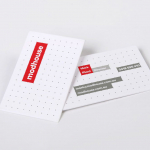
The heavier weight of the typography has been set alongside seven fine lines across the print work, as well as drawing its relevance from the brand’s name and a looser representation of the global population, these neatly connect various pieces of information like a circuit board and really highlight the idea of information networks. This detail also runs through the centre of a three-ply business card that adds a touch of luxury. The combination of black, grey, silver and the UV shine of the colour palette and photographic representation of clouds across the brochure is incredibly restrained (for an industry that favours superfluous detail) and appropriately tempers the technological cues of the letter-forms, blue highlight and line details.
Design: Face
Opinion: Richard Baird
Fonts Used: Akkurat