Ideo Architekci by For Brands
Opinion by Richard Baird Posted 25 May 2012

Polish design studio For Brands (formerly Artentiko) have published images of their latest visual identity project commissioned by Wrocław based architectural studio Ideo Architekci. Based around a modular and dynamic grid based framework, modernistic typeface and a bright industrial colour palette, Artentiko’s solution manages to capture the fundamental aspect of architectural planning and a consistent but expansive approach.
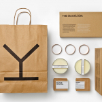
“The idea behind the logo is ‘maximum of flexibility’ & adjustable logo size and shape based on the ‘Cross Grid’ system. The basic logo shape expands on different media. The logo becomes a living form, filling out the space & adjusting itself to the ID area. The ‘Cross Grid’ system gives also a great possibility to create a ‘text fields’ inside the logo ID structure. It might be used for various purposes within ID or any other promotional materials. On the basis of the new flexible logo system, we have designed all necessary corporate materials plus extra elements such as tape, marking spray & yellow markers. The most characteristic element of the new identity is the design of business cards. They’re made of 3mm transparent material in which the refracting light creates interesting logo reflections depending on the angle of looking at their edges.” – For Brands
Constructed from simple geometry and a floor plan-like aesthetic, the expanding, modular and grid based execution of this identity, plus the logo animation, communicates a strategic and pragmatic approach, and the creation of space. The reference points are light and small, laid out with plenty of negative that provides a solid and open foundation for more elements (I could imagine handwritten notes looking pretty nice).
A simple well-rendered san serif typographic choice delivers a familiar Swiss style modernism which, through its lowercase typesetting offers a non-hierarchical depth that neatly references classic and democratic Bauhaus design principles and fits really well within the structure of the grid.
The colour palette avoids the monochromatic play of light and shadow (a reference to three dimensional space common to architectural identities) in favour of an industrial and creative fusion of bright yellow and cool grey that feels positive and energetic.


Its execution across the collaterals is austere but practical and makes the most of the identity’s expanding concept, fitting each application perfectly with subtle variety between each piece. The business cards introduce a material that is reflective of the elemental aesthetic of glass which features heavily in contemporary structural design and compliments the warming sun-yellow and the steel qualities of the grey type.
The idea is simple in its design and straightforward in its application but incredibly communicative, it delivers the necessary impact and a smart a conceptual resolution of pragmatism, practicality, functionality and a sense of creativity achieved through a solid foundation.