RNC Translations by Studio Constantine
Opinion by Richard Baird Posted 8 November 2012
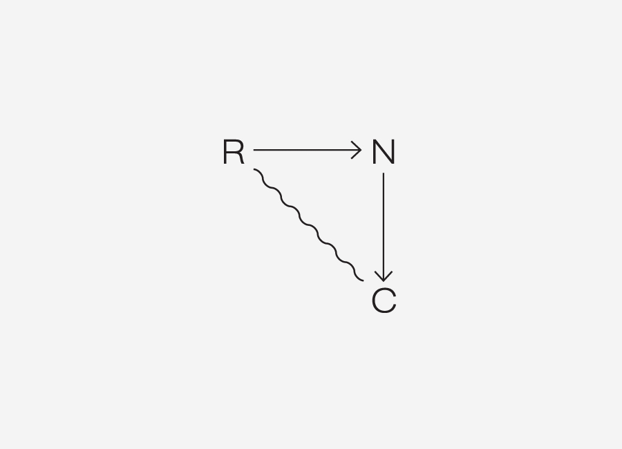
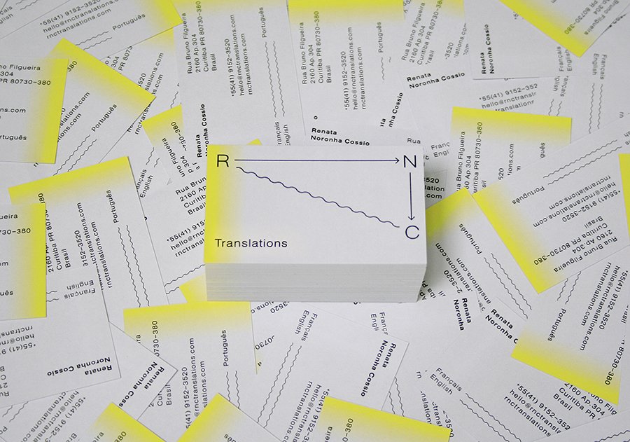
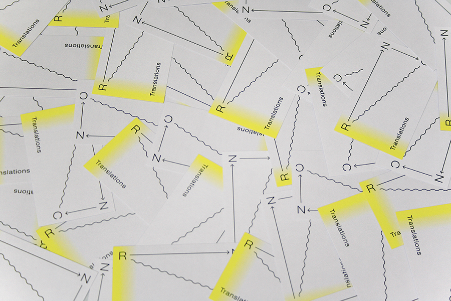
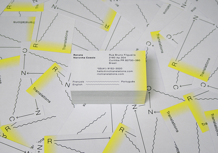
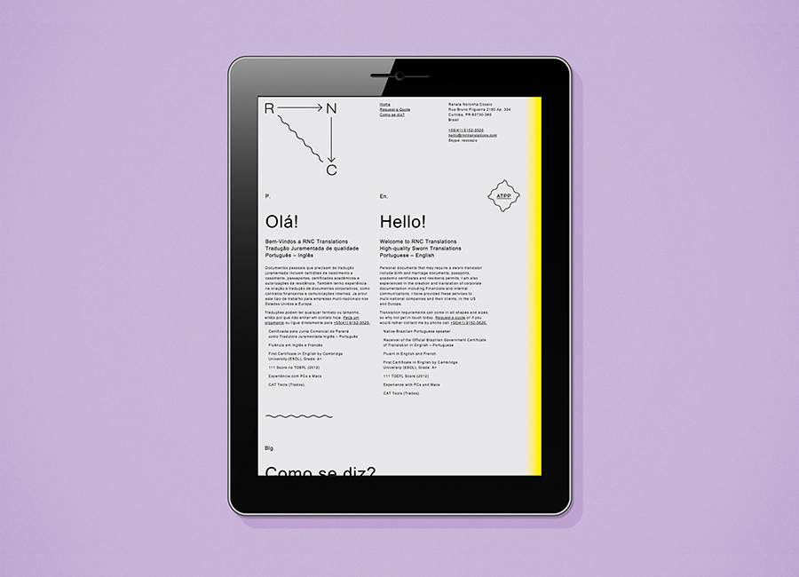
Renata Noronha Cossio is a Brazilian-based provider of ‘sworn’ Portuguese, French and English translation services that cover official documents such as birth, marriage and academic certificates, passports and residential permits. Her visual identity, developed by creative design agency Studio Constantine, is a really interesting and unusual diagrammatic interpretation of a classic monogrammatic presentation of personal service. Its combination of fine line work, arrows, light geometric type, use of space and complete three-point structure conveys a closed system privacy, a full service proposition that brings together Renta’s linguistic experience of three languages and a technicality that implies a high level of ability.
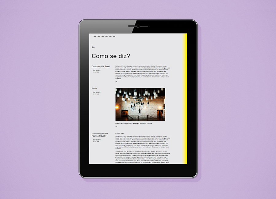
The expanding and contracting application of the identity across the stationery and website introduces both a graphic and metaphorical flexibility while a bright yellow spot—its gradation delivering a sense of transition that resonates well with the theme of translation—across a cool concrete grey uncoated substrate achieves a distinctive, urban and contemporary sensibility.
The result is a smart contrast of individuality, energy and transition alongside practical experience, authority, reliability and a structured approach, executed with an appropriate restraint.
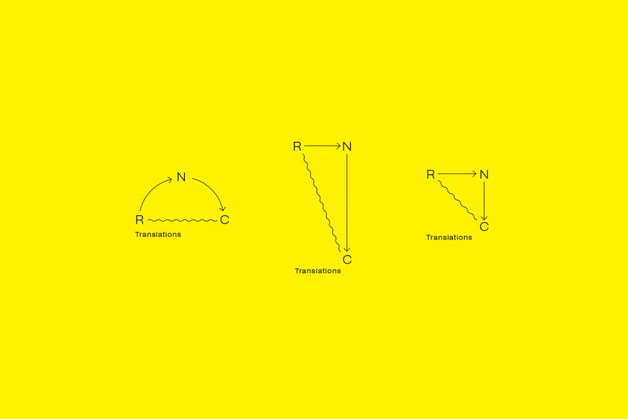
“We examined translation as a transformative process, expressing this graphically through both the marque and yellow/grey ombre background. A balance needed to be struck between the corporate context and audience of the business and the youthful exuberance that Renata brings to the work. Typography is restrained, yet dynamic through its application on the grid, also allowing for multilingual content streams. The result is a suite of materials that is professional and contemporary, but with a touch of individuality that is sure to leave an impression.” – Studio Constantine
Design: Studio Constantine
Opinion: Richard Baird
Fonts Used: Akzidenz Grotesk Extended
