Filmfaktisk by Heydays
Opinion by Richard Baird Posted 10 January 2013
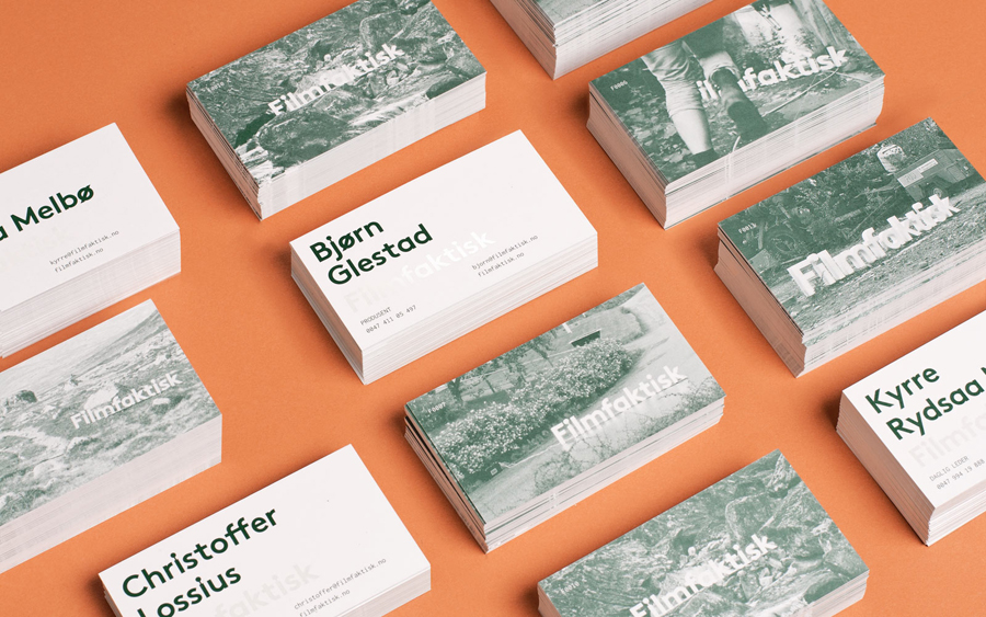
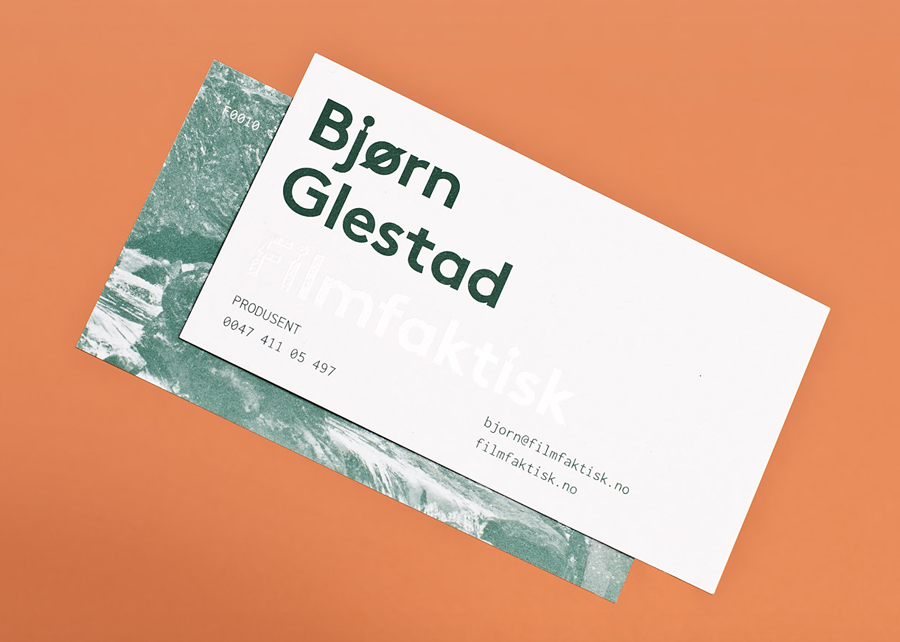
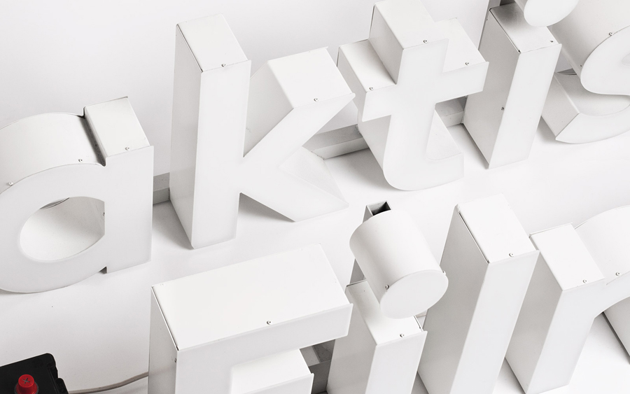
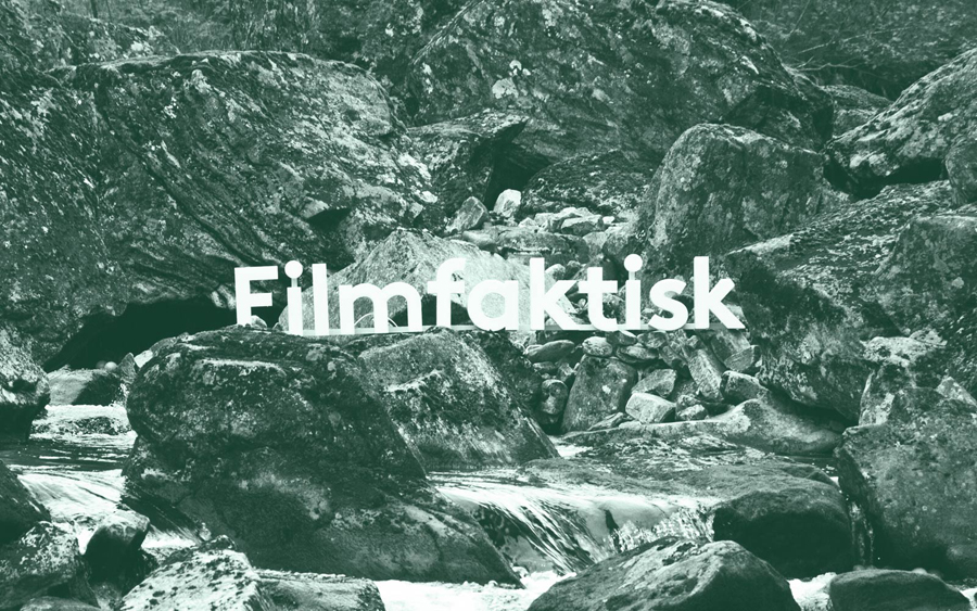
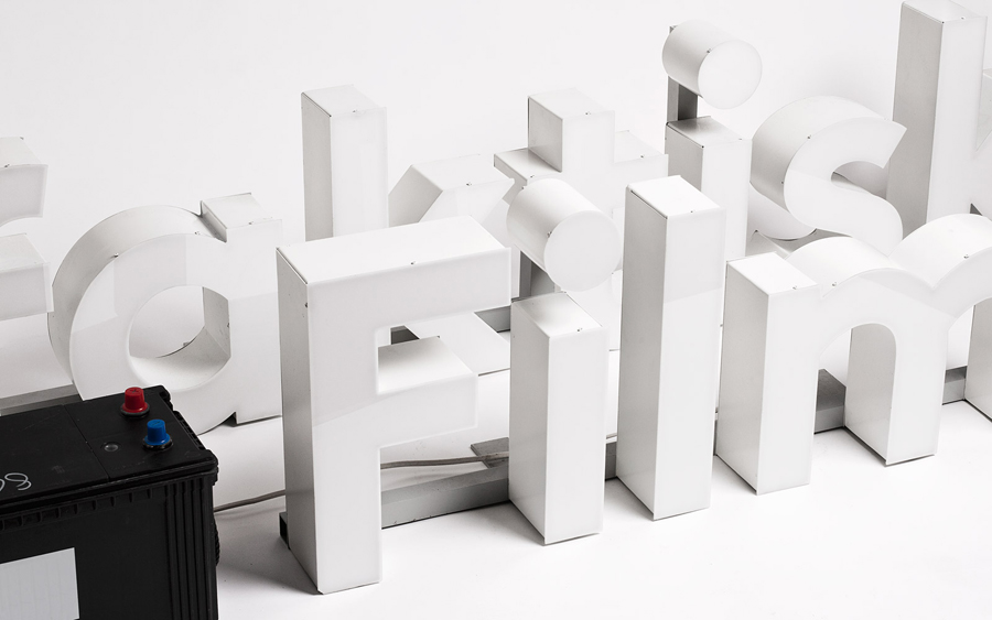
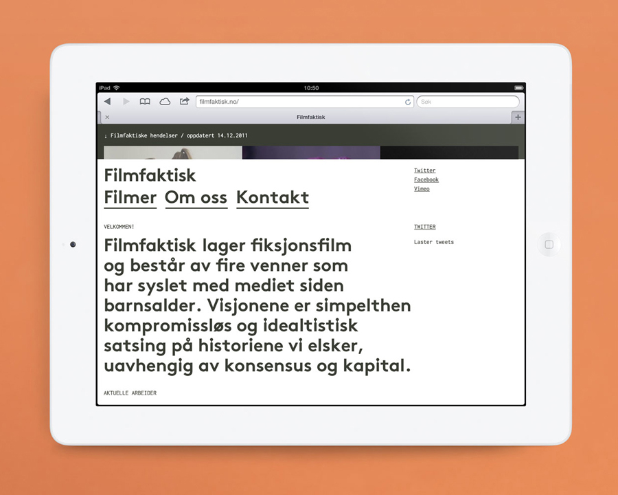
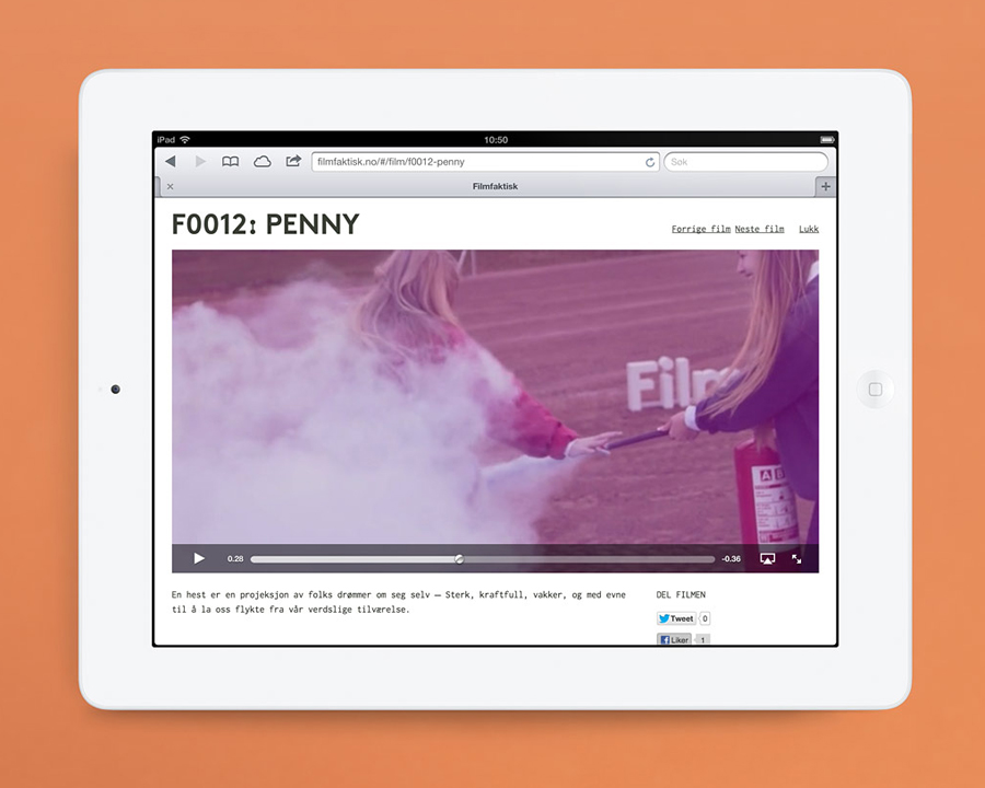
Filmfaktisk is a Norwegian team of film producers—with a strong focus on locations—that produce both commercial and fictional pieces work. Their visual identity, created by Oslo-based design agency Heydays, cleverly leverages the physical limitations of sign making and turns it into a positive and distinctive asset that visualises—through a simple line detail that connects the stems and the tittles of the i’s alongside an earthy, pine green tint applied to the texture and detail of on-site photography—a practical but creative approach to on-location shooting. It is a very simple treatment but one that brings a proprietary quality to a familiar sans-serif typeface that cohesively binds print, film and digital touch-points.
“…we wanted to create an identity showing their own presence in their work. By creating an identity based on the logo sign and customized typography, we created a concept for them to experiment and play with. A solution which ended up in several short films, from travels all over the country, involving their own identity in one way or another.” – Heydays
