Milieu Property by Studio Hi Ho
Opinion by Richard Baird Posted 30 January 2013

According to Studio Hi Ho, the branding and communications partnership responsible for this project, Milieu Property is a Melbourne-based ‘boutique developer with an emphasis on creating spaces of influence’. The moniker ‘Milieu’ immediately positions the brand at the cerebral end of the property development spectrum. Indeed, for those without a thesaurus brain, the highfalutin’ vocabulary is even explained on the minimal website.
Do the graphics live up to the name? For me, Studio Hi Ho appears to have risen to the challenge. Interpreting Milieu as a ‘mix of complementary opposites’ has allowed them to play with juxtapositions: in typography; in imagery; and in the choice of substrate. Guest Opinion written by Shaughn McGurk
“By definition, a milieu is the context or environment in which one lives and is influenced by. With this in mind, Milieu Property is a boutique developer with an emphasis on creating spaces of influence. Interpreting the milieu as a mix of complementary opposites, the stationery suite took cues from the physical nature of a building. Combining industrial box board with premium cotton stocks — playing on the relationship between the inside and outside. As an extension of the complementary opposites theme, a visual language was created that gave the brand meaning before the first project was off the ground. The Melbourne milieu was captured by photographer Leigh Crow and spliced together to create a feel of things to come.” – Hi Ho

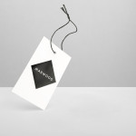
The logotype is certainly a ‘complementary opposite’ to the brand name. Set in what looks like Gill Sans Bold, with a robust underline, it supplies a solid foundation upon which to build the wider identity. Its utilitarian industrialism is further emphasised by monotone reproduction and a deep foil-blocked deboss on elements of the stationery. This may be property development for the intelligentsia, but it still recognises that construction is a steel-toecapped activity.
The designers don’t stop there. The juxtapositions continue: through the duplex business cards – grey boxboard against a luxurious white cotton stock; the typography, with bold humanist sans contrasted with capitalised classic serifs; and the contrasting imagery of Melbourne that flickers through the website.
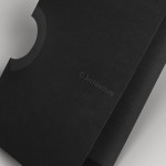
The stationery set contains one really notable element. I’m divided between admiration and antipathy for what I think might be the world’s most over-designed envelope. Two sheets of diecut, foil blocked boxboard and two pristine white rubber bands – all just to carry a sheet of A4 paper?
The print geek in me adores it. The cynic thinks that with such a delivery fanfare, the content of the letter had better be something special. One thing is for certain, the recipient would remember the occasion so, even though it’s a profligate use of resources, it’s a knockout punch from a branding point of view.


There’s a whiff of Peter Saville’s work for New Order, namely the covers for albums such as Power, Corruption and Lies, Republic and Substance. The work of the American conceptual artist Barbara Kruger also comes to mind. And I think Hi Ho have pulled it off.
As I write this, Milieu is a brand in its first stages of germination. The website is little more than a teaser. There is no portfolio of work to be examined, no intellectual blog missives to read. This is high-concept stuff – but it’s kept aloft by some elegant, highbrow graphic design. Let’s hope the properties they develop live up to the promises made here.