O Architecture by Heydays
Opinion by Richard Baird Posted 31 January 2013

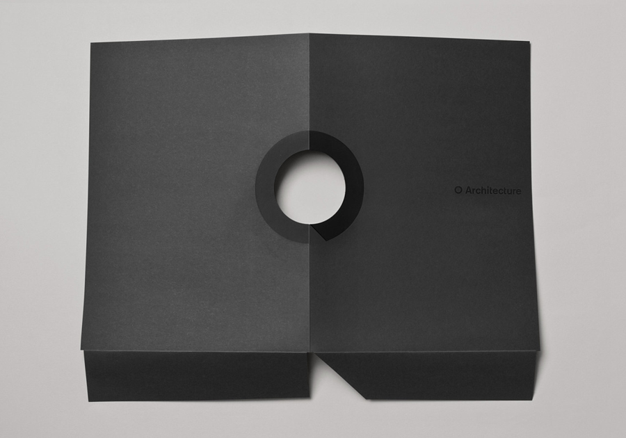
O Architecture is a small, Lille-based multidisciplinary studio whose practices extend beyond traditional architectural services to include artistic installations, educational courses and editorial work. Their visual identity, ‘a solid circle with a disruption that creates a triangle reminiscent of an A’ – created by design agency Heydays – , unites the broad remit of the studio under a simple symbol with a revolving, holistic quality that can be easily executed across a variety of collaterals.
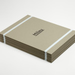
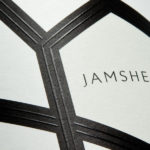
Although the abstract and reductionist combination of geometric shape, neutral san-serif logo-type, plenty of space, rough, uncoated and monochromatic material choices, die-cut detail, black ink across dark surfaces and a weighty plasterboard-like sensibilities of business card with an edge painted detail – are architectural standards, these neatly draw together the relevant themes of light and shadow, windows that connect partitioned spaces and a sense of construction. These ideas are coherently balanced across graphic, material and print decisions that, while not hugely original – something I do not believe is as much of a necessity as some -, are communicative, relevant and very well executed.