K2LD Architects by Studio Hi Ho
Opinion by Richard Baird Posted 12 February 2013
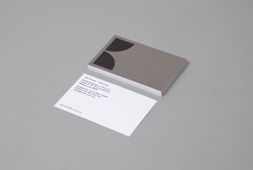
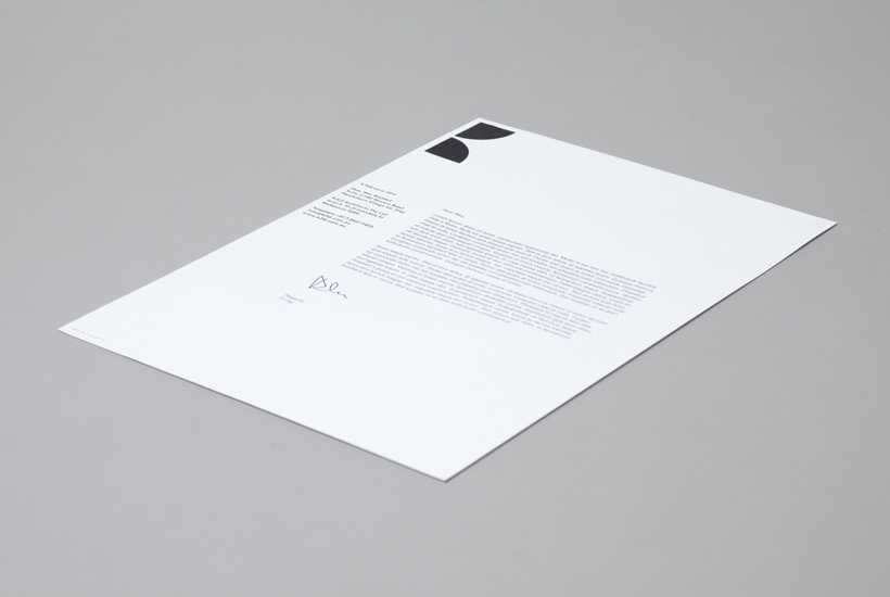
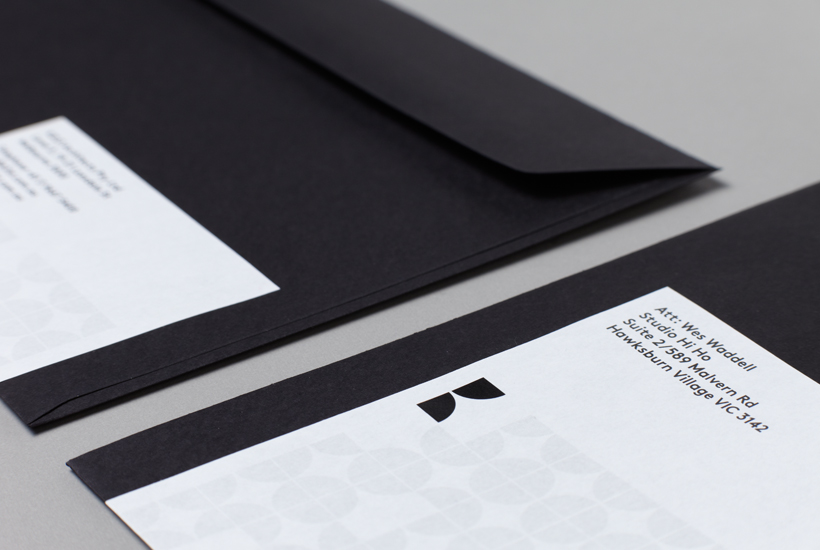
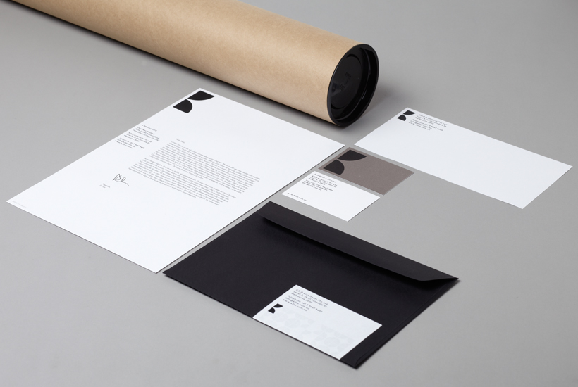
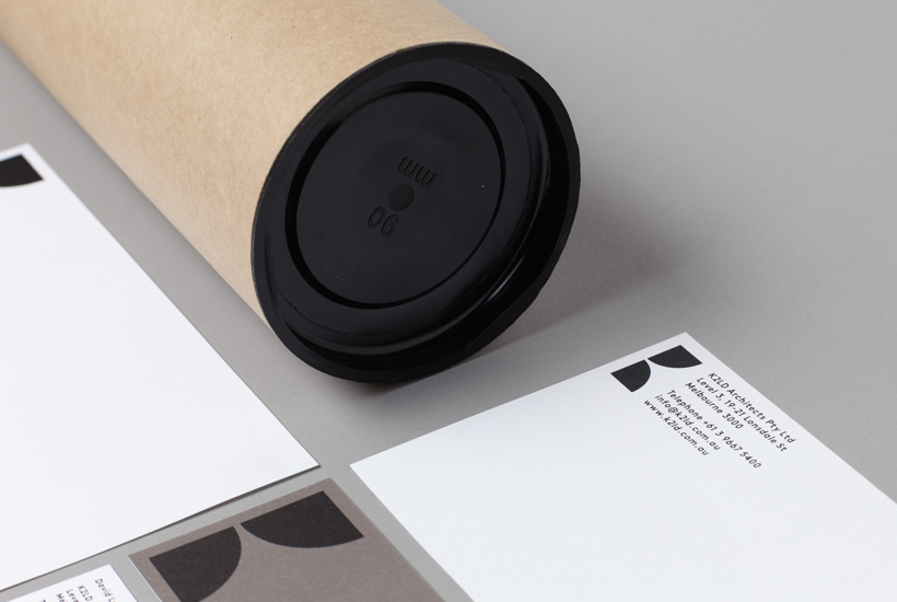
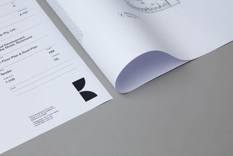
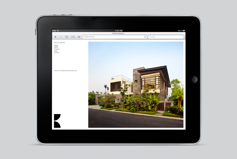
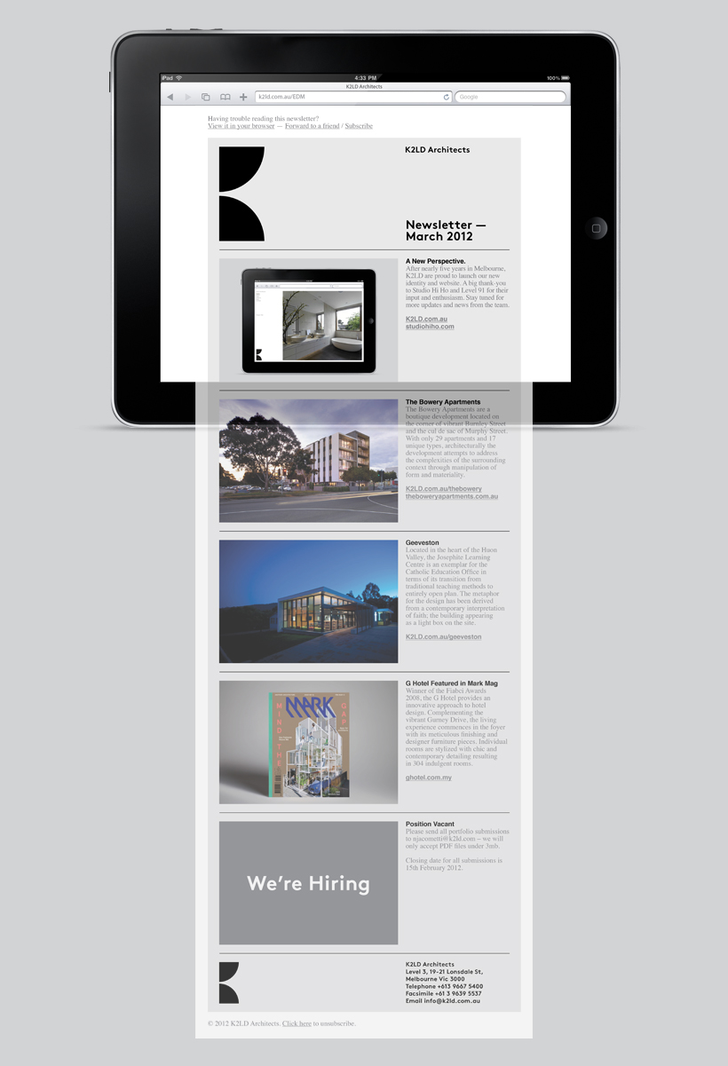
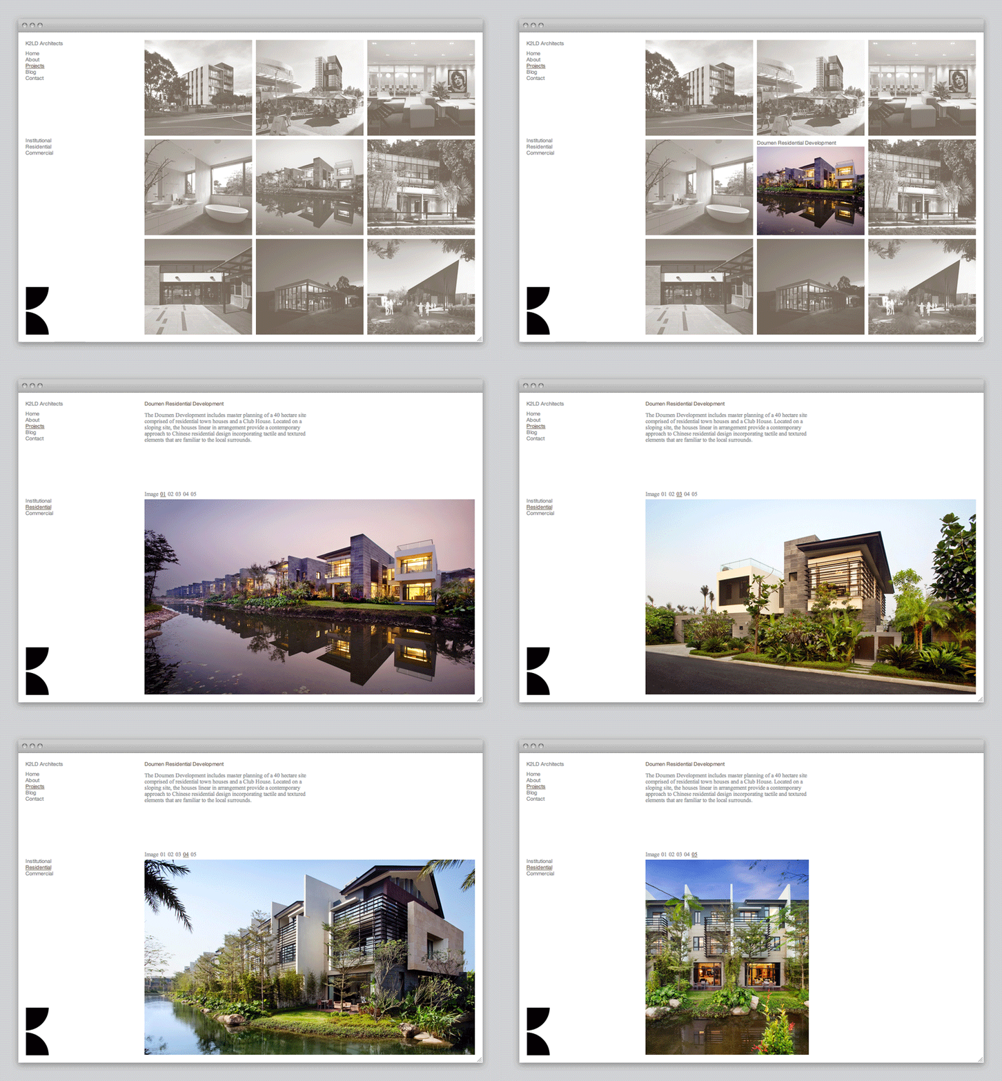
K2LD is a small Melbourne-based architecture and interior design firm with a project history that includes individual private homes, community precincts, multi-unit developments and large-scale commercial projects. The firm’s identity, an abstract, structural and modular amalgamation of initials (check the ideation animation here), uncoated materials and a monochromatic colour palette – developed by brand and communication studio Hi Ho – unapologetically embraces the established and reductionist cues of the industry.
“K2LD is a dynamic architectural practice with offices in Melbourne and Singapore, offering the personal touch of a boutique studio with the expertise of a large organisation. K2LD is dedicated to delivering design-focused solutions that appeal to the senses. The key to the re-brand was a timeless mark that gave meaning to an existing name, while focusing on simplicity to fit within their brand of architecture.” – Studio Hi Ho

I have written quite a lot of architectural identity reviews for BP&O and while this by no means deviates from the ‘book’—delivering the necessary communicative value through the perspective, sweeping corridor and plan-like, double door aesthetic of the monogram, the raw architectural qualities of a warm, concrete grey, uncoated substrate and the abstraction of light and shadow through a monochromatic colour palette—it appears bold and distinctive.
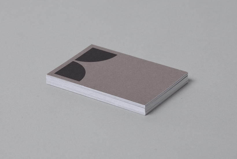
These are paired with the typographical utility of one style, size and format, and a subtle pattern detail—based on the standard form of the monogram—across the collateral that, without appearing superfluous, feels like a smart, visual articulation of elemental components being creatively but pragmatically remixed to create new structures.

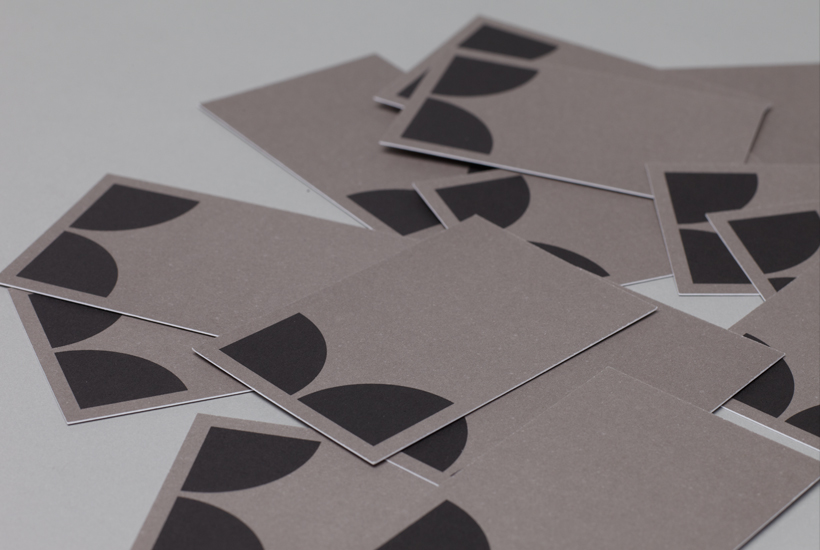
While K2LD’s website talks of the individuality of each of their developments, their identity feels very much more about standardisation and consistency, essentially framing their work with a simplicity and conveying the stable, reliable foundation from which the firm builds from.
