EMSCom by Moving Brands
Opinion by Richard Baird Posted 15 March 2013

EMSCom operate the Executive MBA Communications courses at the Università della Svizzera Italiana. With growing respect, ambitious new growth objectives and an increasing number of similar, competing courses, international design agency Moving Brands developed a strategy, print and identity solution, ‘ranging from restrained and functional to expressive and abstract’, that would define ‘a new vision to align the stakeholders and raise their profile and credibility among global professionals’.
“The brief called for an identity for the course that “must lead the conversation,” but the key challenge was defining a vision within the boundaries of the broader University. Stakeholder workshops and interviews helped clarify the ambitions and varied viewpoints within the organization, and enabled us to define a strong, individual voice for the course within the broader USI group.”
“A Brand Narrative® that captured their driving force would act as a reference point for many high-level decisions about the direction of the brand.We defined this narrative as “Change your perspective.” It highlights the transformational process, both personally and professionally, that stakeholders identified as essential to the course. It conveys that the program provides a learning and growing experience, acting as both a reminder for alumni, and as a promise for students. Importantly, for an organization with a complex architecture, it aligns closely to the Communication Management offer, but has the breadth to be applied to other Executive programs across the faculties.” – Moving Brands
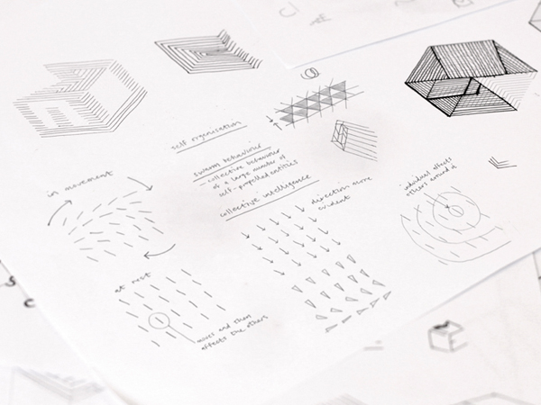
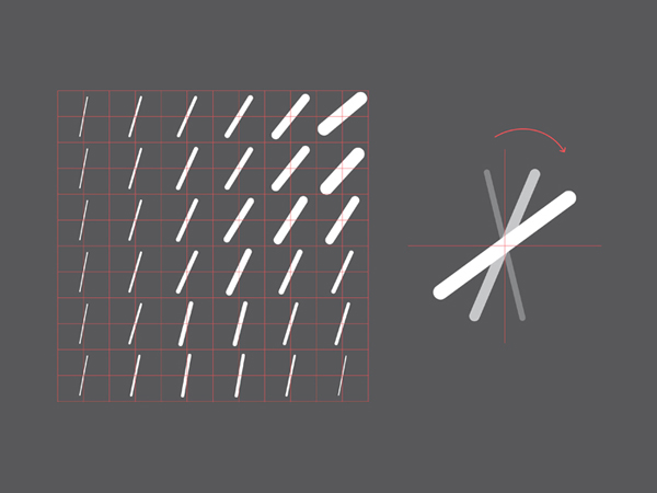
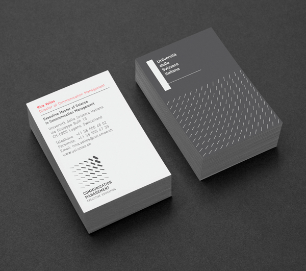
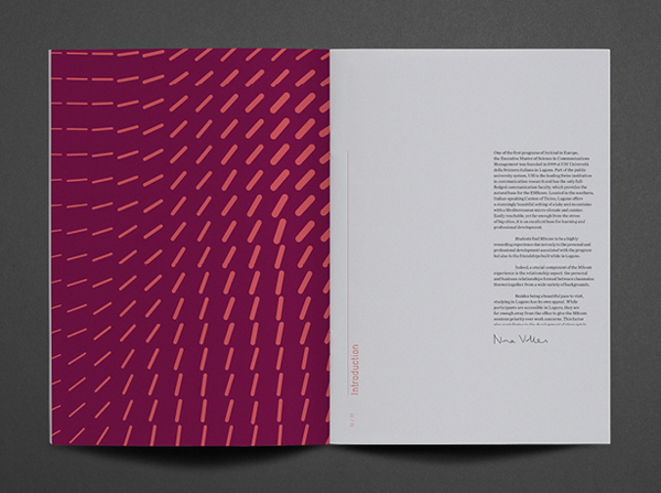
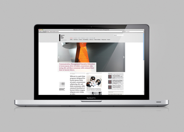
Based around the theme of ‘changing perspectives’, Moving Brands has created a ‘living identity’ that draws its inspiration from the natural phenomena of murmuration and infuses it into a logo-mark with multiple permutations and motion. Its thirty-six strokes, their changing weight and orientation – bound by a grid – really capture the concept of collective thought, structured learning and the dispersion of information – through shared educative experience and personal/proffessional development – with an abstract but understandable fluidity. These themes feel equally well expressed as both a pattern, grid and guide detail across the print work – managing to extract a sense of motion and dimensionality from a static form – and within dynamic, digital settings.
The mark is paired with a condensed, sans-serif with a single consistent line width and rounded terminals mirror the aesthetic qualities of the mark in a fairly straightforward manner. Its three-line and two weight combination works well to distribute and balance a lengthy name with an uppercase authority and a mono-spaced technicality, legibility and efficiency which feels appropriate for high level training.
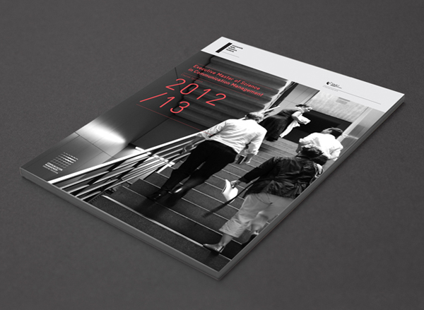
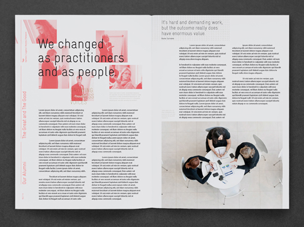
The identity is well executed when in motion and I am sure fun and engaging across the surface of a tablet. Its static multiplicity and animated interactivity could be perceived as a little indulgent, superfluous or on-trend but its abstraction – rather than an over the top sense of creativity – and the clarity of concept tempers this quite well. Like the mark and type, the colour palette mixes a sense of technology and corporate professionalism through a black, white and a red colour palette. The tinted people-centric photography, while a little crafty, has a single colour restraint which softens their generic ‘prospectus’ sensibility and introduce an important humanistic element.


