Marks by Marks
Opinion by Richard Baird Posted 21 March 2013

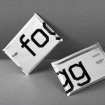
Marks is a Geneva-based multidisciplinary design studio that specialises in delivering contemporary graphic communication solutions to corporate business, institutions and the luxury goods and industrial art sectors. Their visual identity, a reverse, uppercase, italic logo-type with a consistent line weight, humanistic sans-serif build, square terminals, decent spacing and neat parallel diagonal strokes, now features across a new stationery set that, through a really nice combination of weighty, warm and cold concrete grey, uncoated material choices with a contrasting, high quality, glossy black and white foil print treatment, large point size and plenty of space, deliver an urban and subtle craft backdrop to the confident consistency and slightly unconventional qualities of the type and its layout across the collateral.