Jealous Sweets by B&B Studio
Opinion by Richard Baird Posted 2 July 2013
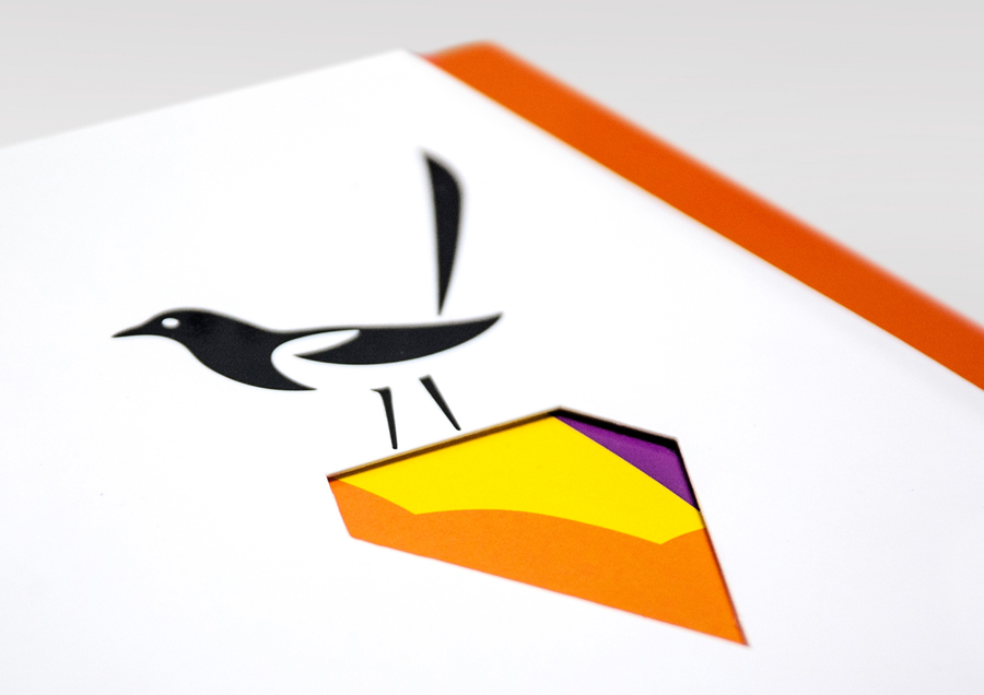
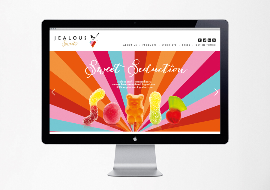
Jealous Sweets is a gelatine and gluten-free confectionery range made with natural fruit juices and no artificial flavours or colours. Design agency B&B studio were recently commissioned to develop a new visual identity and packaging solution for the range that would focus more on its premium position and purity of ingredients. Developed under the theme of ‘covetable candy’ – “a concept that we visualised using a precious jewel icon and a characterful Magpie with an eye for something special”, B&B’s solution juxtaposes classic flourishes and plenty of unprinted space with bright contemporary colour and illustrative detail.
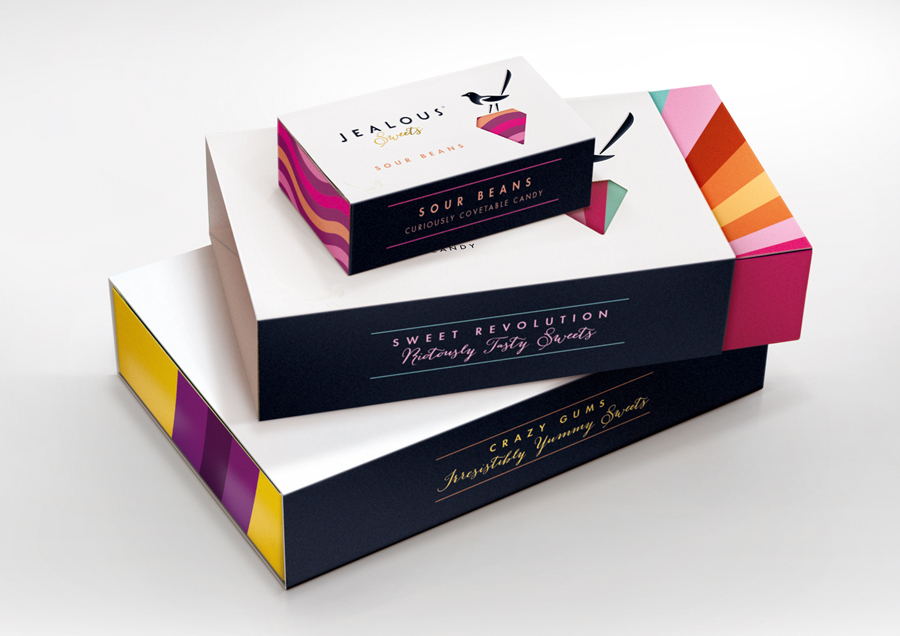
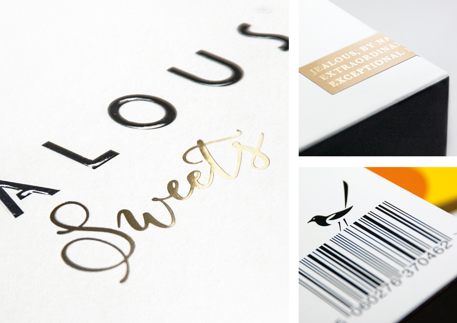
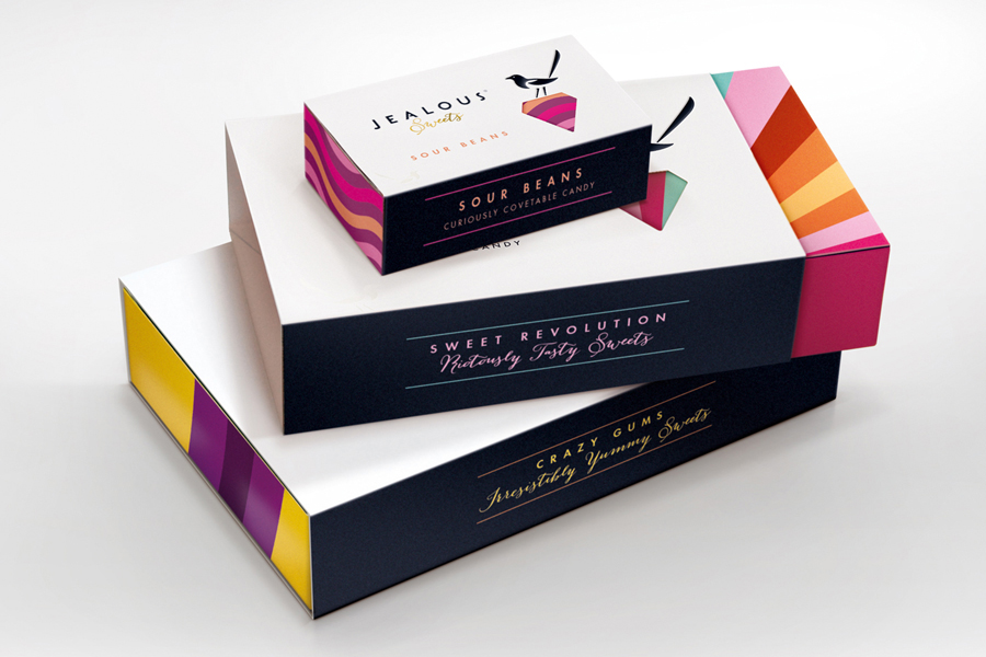
Describing giftability as key to differentiating the brand from the majority of sweets on the market, B&B took its inspiration from the chocolate category, “creating desirable and detailed luxury boxes for an extra special experience”. “The boxes comprise a die cut sleeve featuring glossing, embossing and foil blocking, which is secured by a gold foil tamper seal to a patterned lift-lid box” says Creative Partner Shaun Bowen. “Inside, the sweets are collected in individual branded bags surrounded by layers of tissue paper for a premium feel.”
“A series of colourful patterns are used across the brand’s range to aid differentiation and visually represent the intense sweet, sour and fizzy taste explosion that you can only get from these type of sweets. “It’s about reminding grown-ups of those amazing taste sensations from childhood,” says Senior Designer Claudia Morris, “but presenting them in a way that’s absolutely contemporary and adult-oriented. And because the full pattern is obscured by the sleek and minimalistic black and white sleeve, you only get the full colour hit after purchase.” – B&B Studio
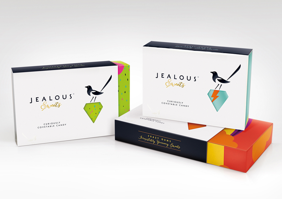
Like a lot of good packaging solutions this piece delivers distinctive impact through communicative contrast. It neatly manages to resolve the typographic efficiency and proprietary cuts of a black, generously spaced, uppercase sans-serif with the humanistic, handwritten and crafted ligatures, loops and flourishes of a sentence case script and the percieved luxury of its gold foil finish, the sleeve’s classic restraint and ample white space with the bright, contemporary artwork of the tray, the well-rendered curves of a magpie with the geometry of a die cut diamond window, as well as the tactile use of both a matt and high gloss varnishes.
This clear juxtaposition of polar elements that, when written it seems like a lot, however, the aesthetic appears very well refined and uncluttered, and works really well to take all the sharp fruity flavour you might associate with children’s confectionery, defuse any sense of the synthetic and infuse it with a premium sophistication that neatly conveys—by borrowing a little from the chocolate category—the quality of ingredients and a subtle sense of creativity and craftsmanship.
