Seafood Kitchen by Co Partnership
Opinion by Richard Baird Posted 8 January 2014

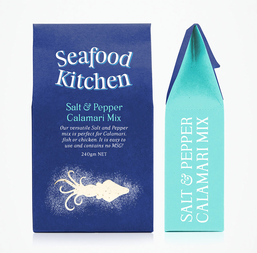
In response to an increasing consumer interest in seafood, the owners of Gourmet Blends, an accompaniment to meat, fish and vegetable dishes, “saw an opportunity to take ownership of a market category” and commissioned Sydney-based design agency Co Partnership, who renamed and repositioned the brand as Seafood Kitchen, to develop a new visual identity and packaging solution.
Co’s approach takes the traditional sensibilities of an old style uppercase serif and conversational italic and sets these within the context of a contemporary colour palette that mixes a consistent deep-sea blue with a brighter flavour specific highlight. There is a good sense of space across the surface of the packaging which enhances the playful flourish of a die cut window across the front which effectively conveys the nature of the product with a dusted quality whilst providing a simple iconographic contrast to the detail of the typography. A tactile, uncoated, folded paper structural design manages to transcend this union of old and new with a retrospective practicality and category distinctiveness.