BP&O
BP&O Plus

Cerovski by Bunch

Opinion by Richard Baird Posted 5 February 2014
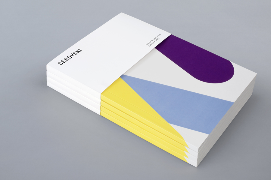
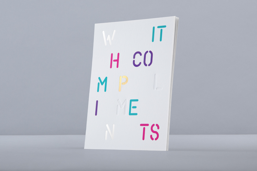
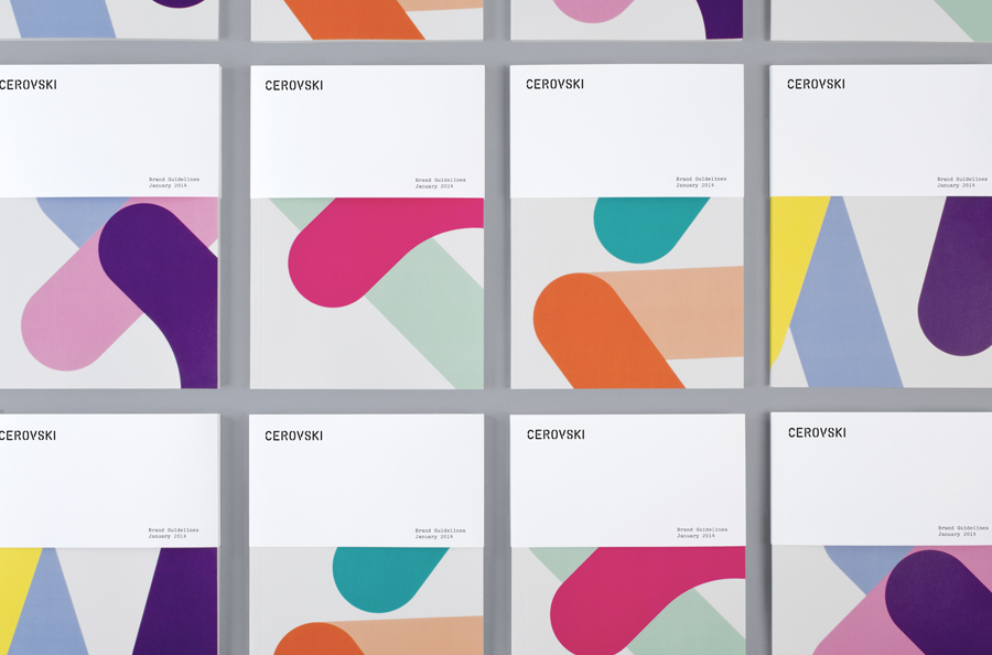
Brochure for print production studio Cerovski designed by Bunch

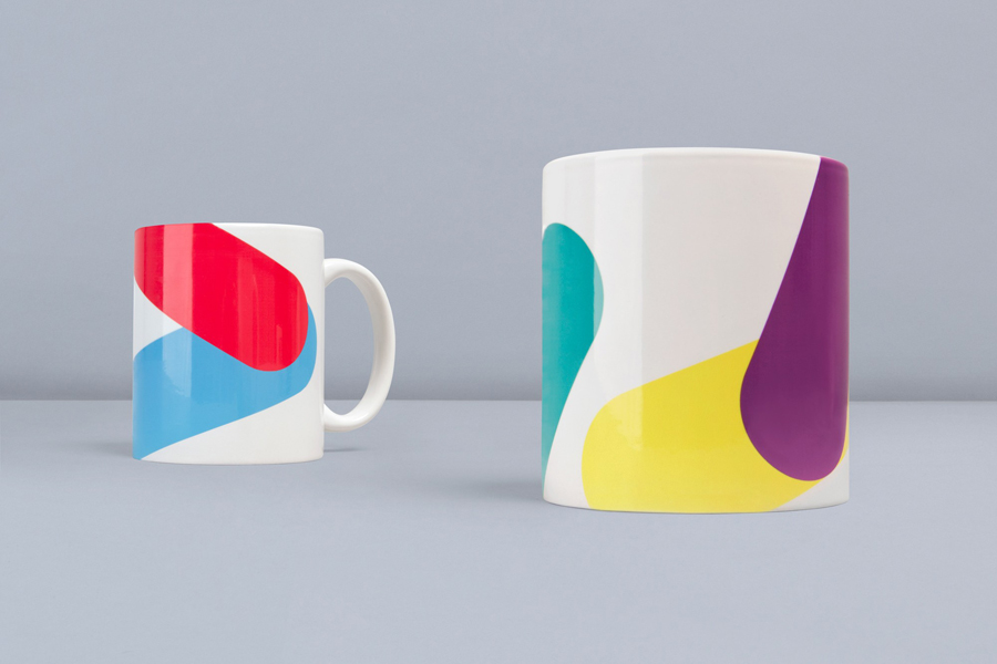
Cerovski is a young Croatian print production studio that revels in the challenge of “nebulous finishing, microscopic editions, absurd materials and crazy deadlines”. Bunch worked with Cerovski to develop a new brand identity for the studio—which included a custom logotype and typeface, website, and a variety of printed collateral—that delivers a distinctive contrast of utility and creative flourish, technology and individualised service through custom typography, a number of material choices, spot colours and print finishes, and a personalised but digitally generated daily planner.
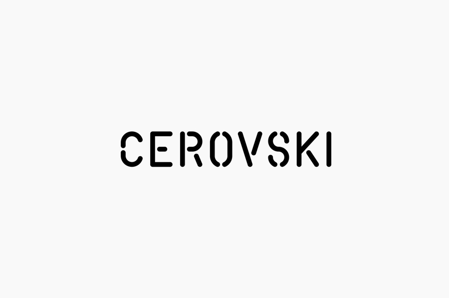
Logo for print production studio Cerovski designed by Bunch

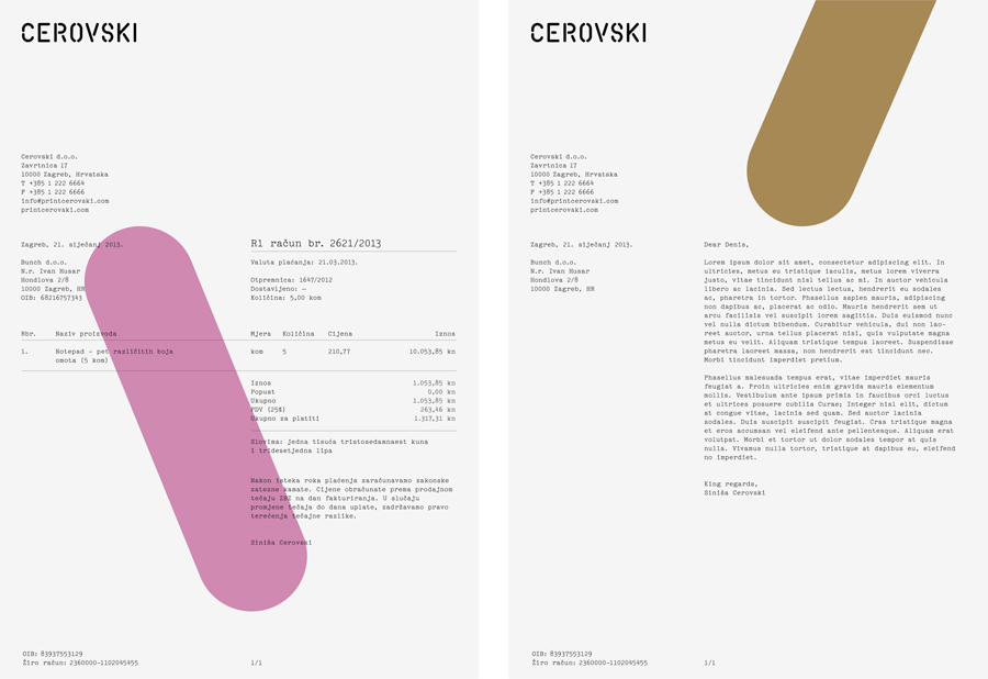
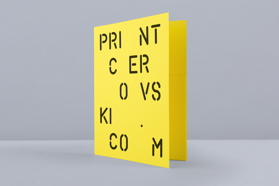
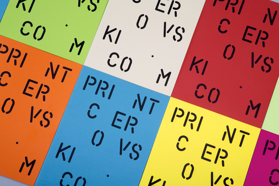
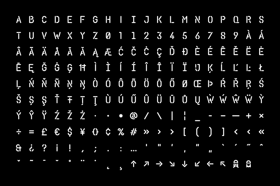
Ubiquitous in its stencil cut detail, contemporary in its monolinear build, and authoritative in its uppercase characters, the logotype leverages an unmistakable universal utility and industriousness to convey an efficiency, practicality and reliability well suited to a studio with clients expecting a consistent quality.

These themes are infused with the proprietary nature of a custom build and visualised through the more unusual condensed proportions of the letterforms, rounded terminals, shapes of the numbers and the contrast of horizontal and vertical breaks in those with counters. It is an unusual union of utility and individuality, and while this individuality is perhaps not going to be evident to the vast majority it is an approach that is true to the mix of man and machine that exists in modern print houses.
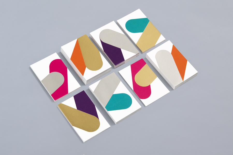
Business cards with metallic ink detail for print production studio Cerovski designed by Bunch

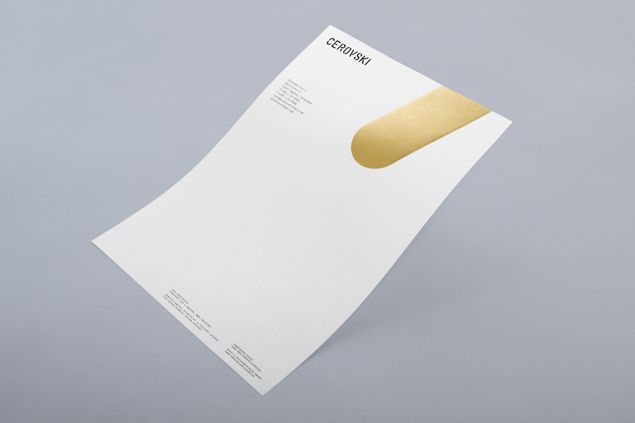
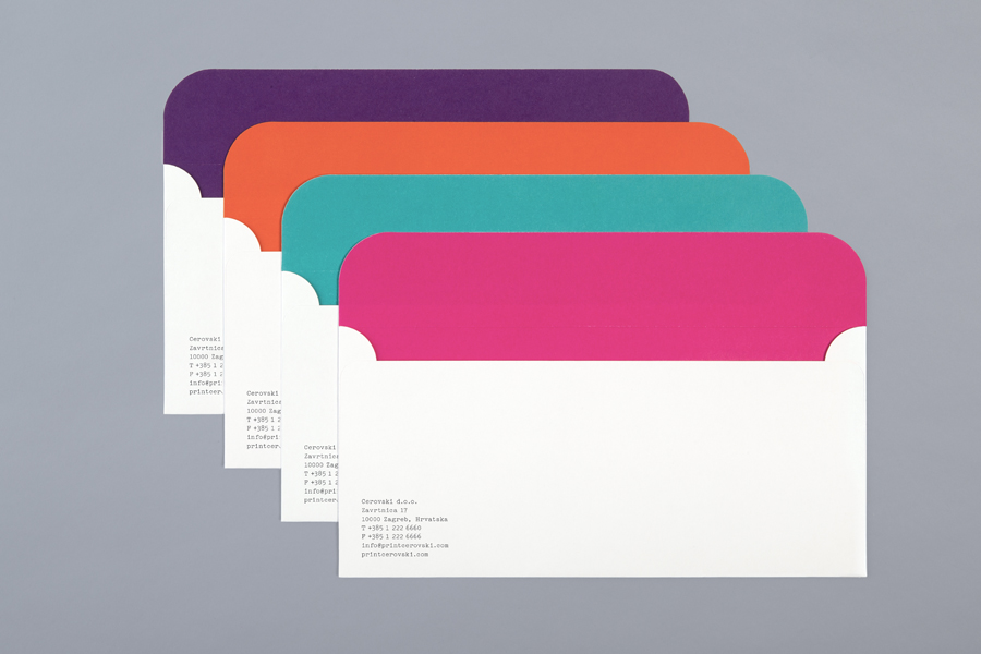
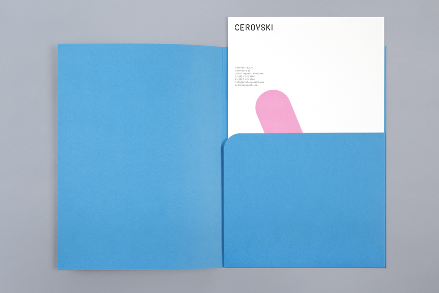
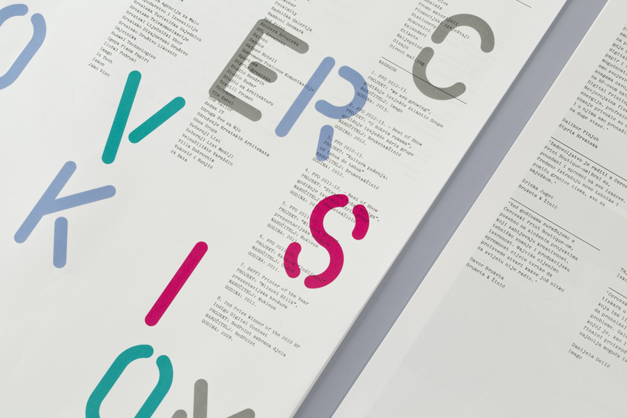
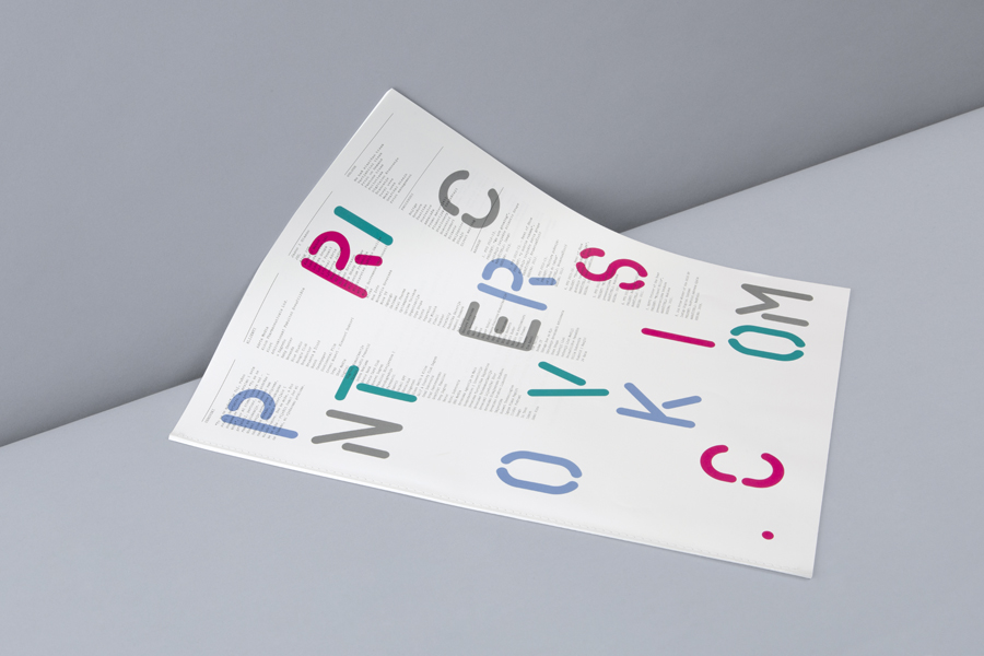
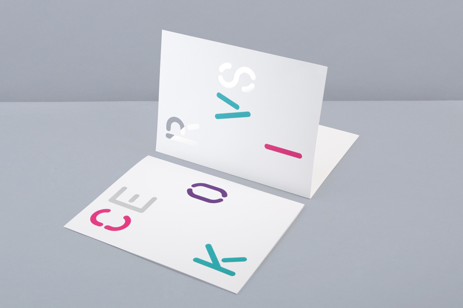
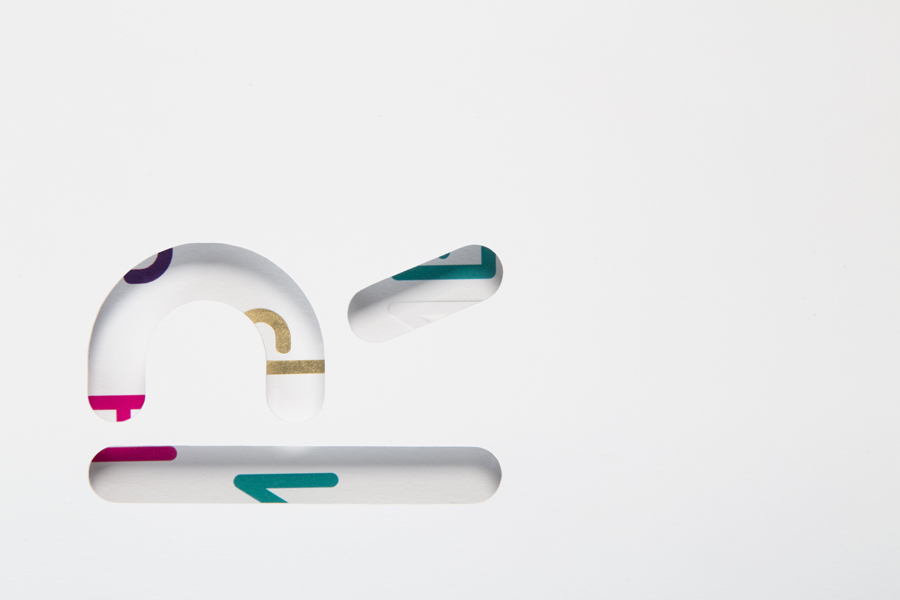
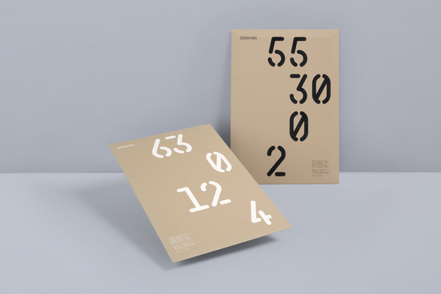
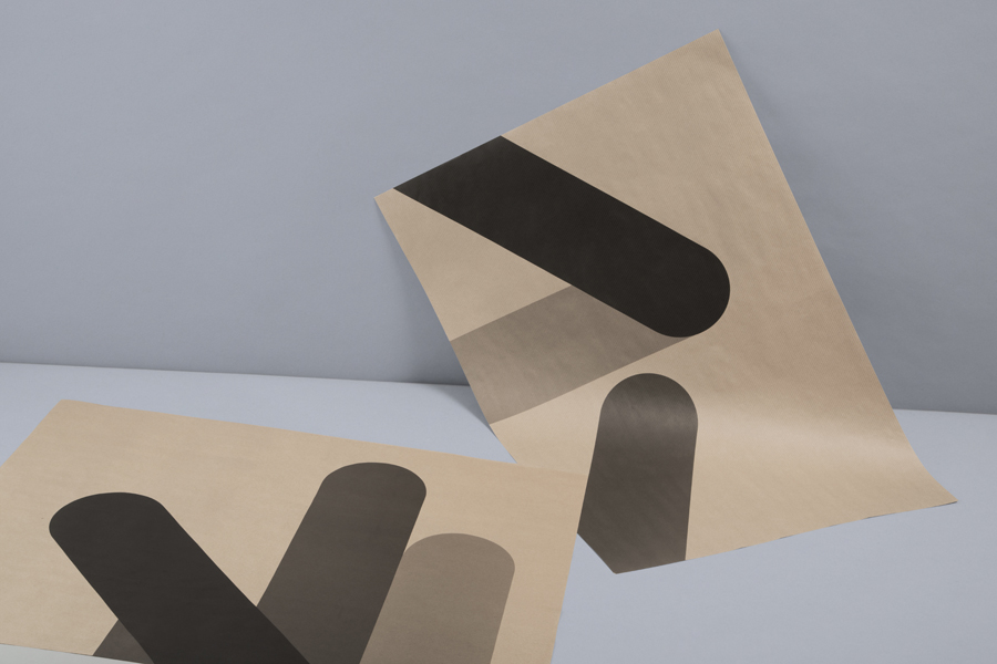
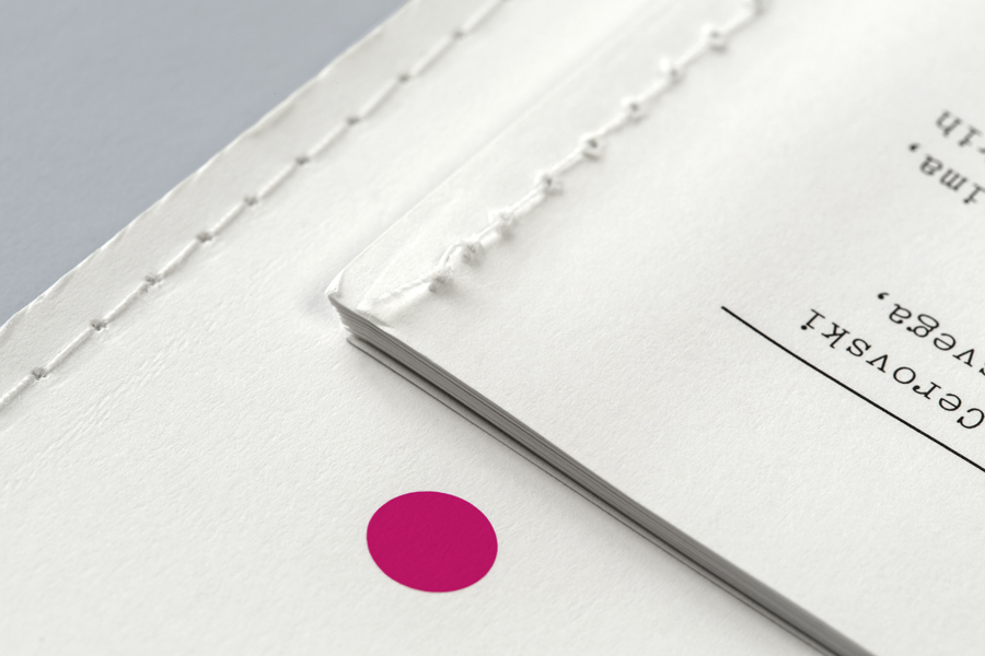
The utility of the logotype and extended typeface establish a robust foundation from which to cohesively implement a wealth of material choices and print finishes reflective of the creative potential of modern print and binding techniques. These include metallic and white inks, dyed and unbleached boards and papers, die cuts, debossed clear foils, open stitching and over-print details. The bold forms that contain these, drawn from the shapes of the logotype, successfully provide large areas to showcase the inks and finishes which are then enhanced by plenty of unprinted space, offering a stark contrast to the finer detail of a slab-serif body copy. These choices manage to balance a clear communicative value with a strong and distinctive aesthetic impact.
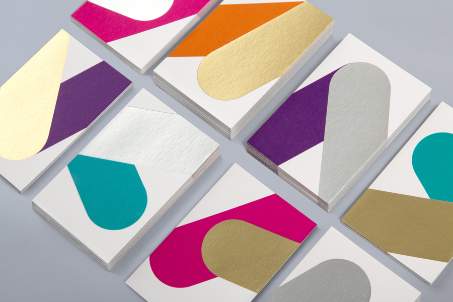
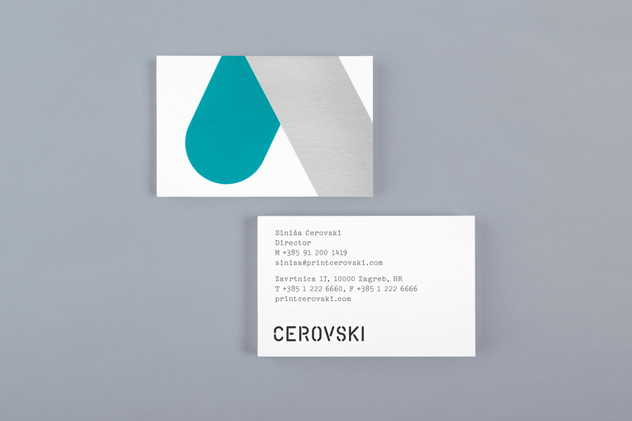
Business cards with metallic ink detail for print production studio Cerovski designed by Bunch Business cards with metallic ink detail for print production studio Cerovski designed by Bunch Letterhead with gold metallic ink detail for print production studio Cerovski designed by Bunch Letterhead with gold metallic ink detail for print production studio Cerovski designed by Bunch Envelopes for print production studio Cerovski designed by Bunch Letterhead and blue card folder for print production studio Cerovski designed by Bunch Yellow card folder for print production studio Cerovski designed by Bunch Coloured card folder for print production studio Cerovski designed by Bunch Print for print production studio Cerovski designed by Bunch Print for print production studio Cerovski designed by Bunch Print with metallic and white foil debossed detail for print production studio Cerovski designed by Bunch Print with die cut detail for print production studio Cerovski designed by Bunch Print with die cut detail for print production studio Cerovski designed by Bunch Print with white and black ink detail across an unbleached paper for print production studio Cerovski designed by Bunch Print with black ink detail across an unbleached paper for print production studio Cerovski designed by Bunch

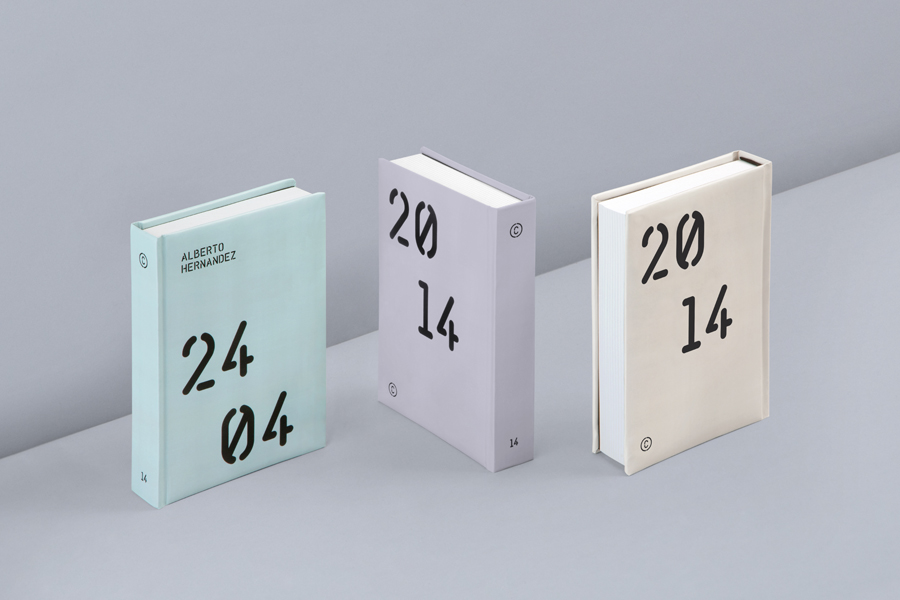
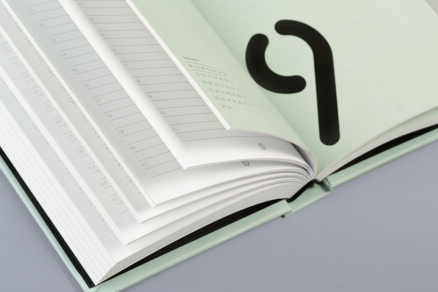
Bunch have also introduced a smart technological element, an app created by Vedran Gulin (who also developed the website) that generates a personalised cover for Cerovski’s planners, each with a coloured cover specific to a client’s birth date as well as printing their name across the front. It is an experiential detail that really elevates the more familiar aspects of the brand identity, and cleverly blurs the lines between customisation, technology and print reproduction in a new and interesting way.

Design: Bunch. Words: Richard Baird
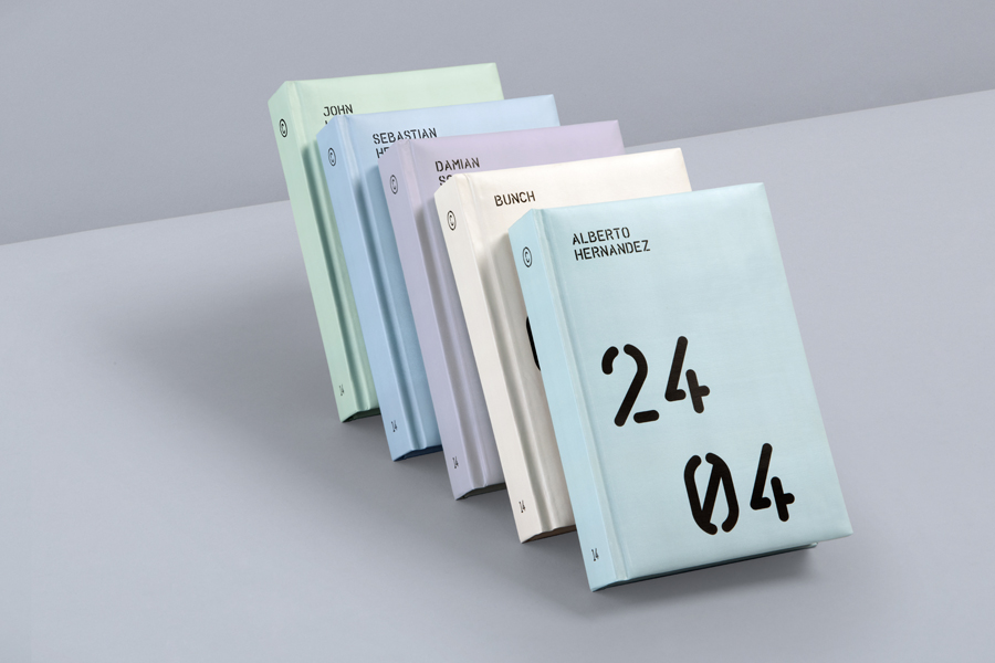
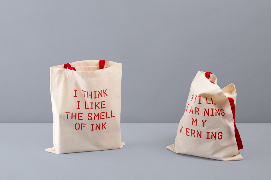
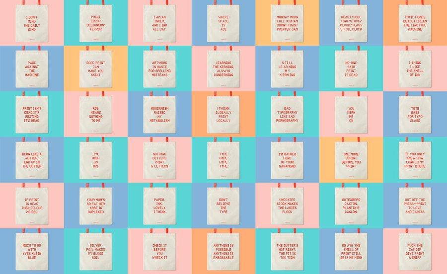
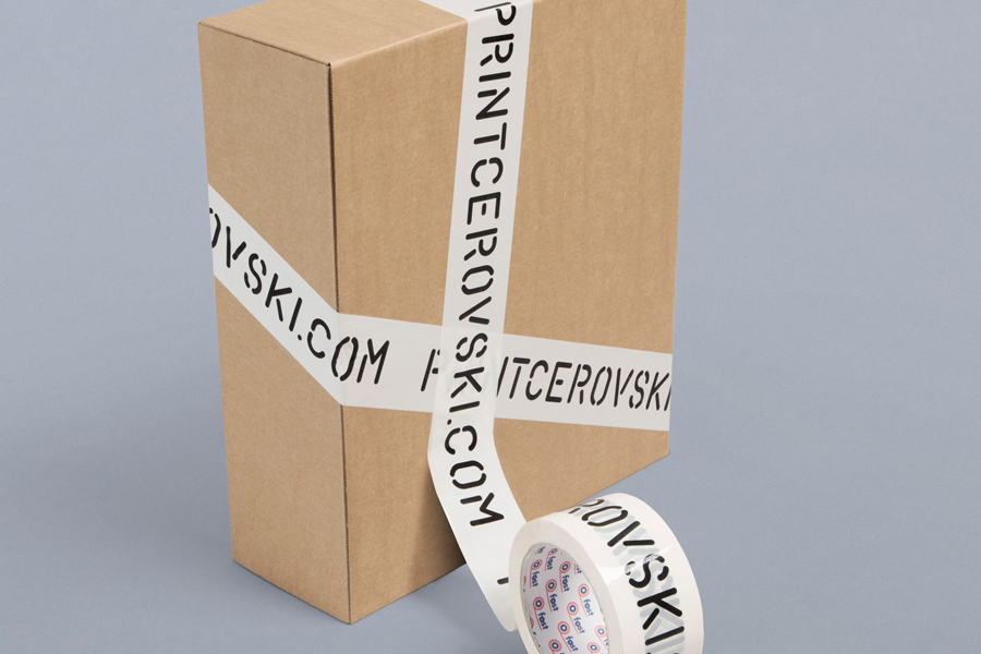
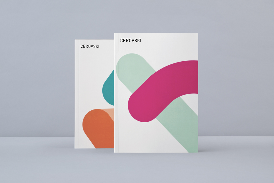
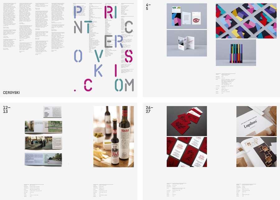
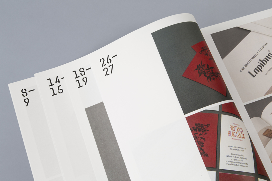
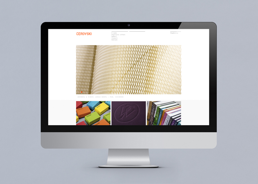
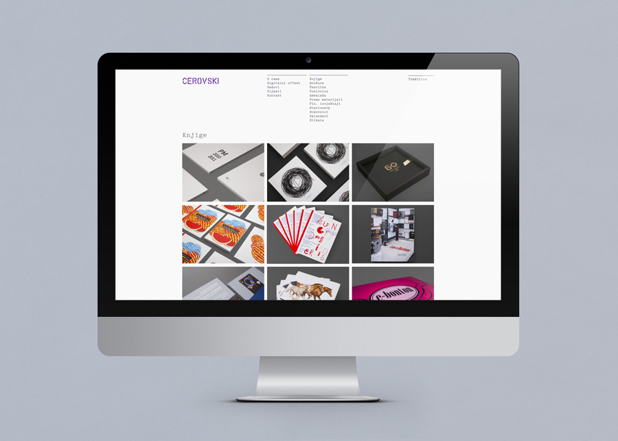
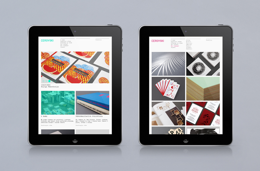
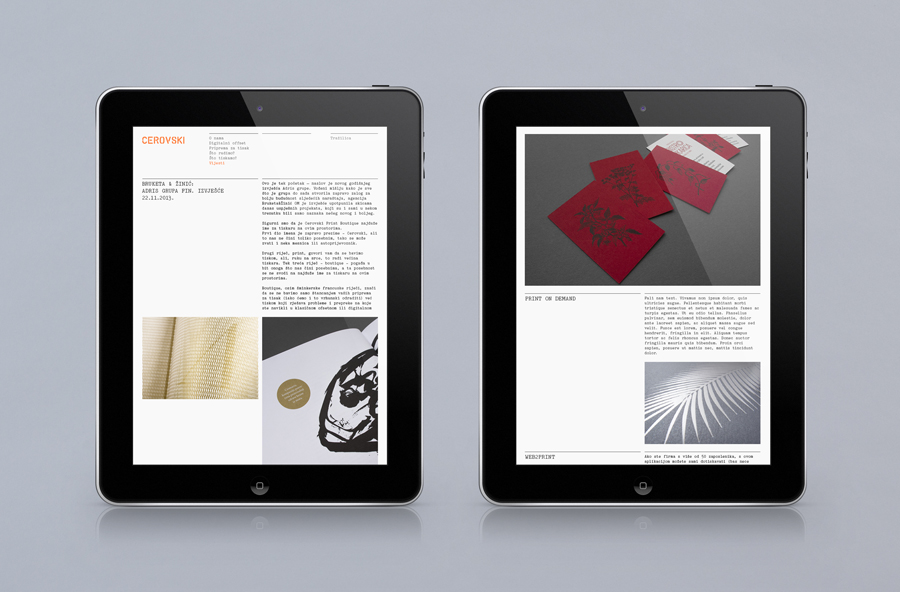
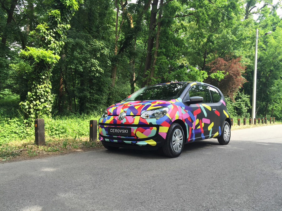
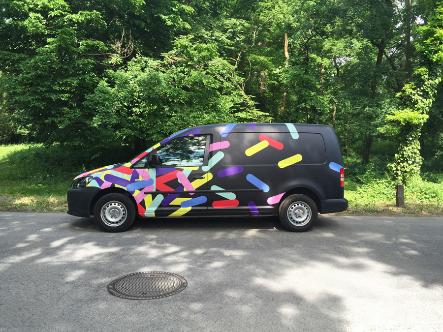
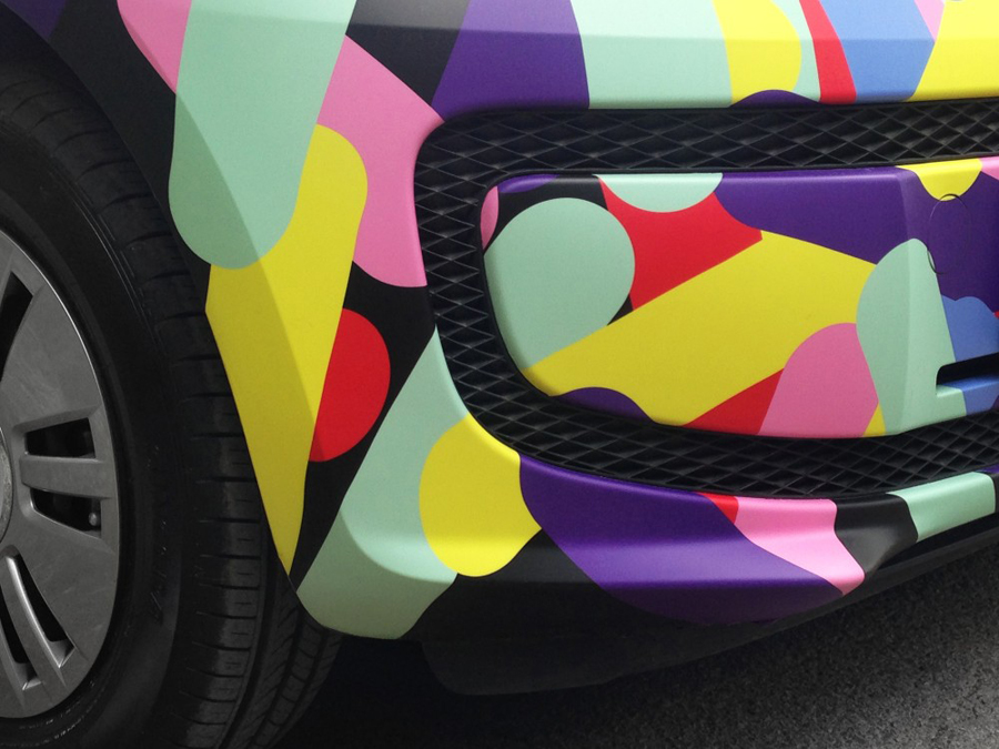
Personalised planner for print production studio Cerovski designed by Bunch Personalised planner for print production studio Cerovski designed by Bunch Personalised planner for print production studio Cerovski designed by Bunch Branded mugs for print production studio Cerovski designed by Bunch Custom tote bags for print production studio Cerovski by graphic design studio Bunch Custom tote bags for print production studio Cerovski by graphic design studio Bunch Branded box tape for print production studio Cerovski designed by Bunch Brochure for print production studio Cerovski designed by Bunch Brochure for print production studio Cerovski designed by Bunch Brochure for print production studio Cerovski designed by Bunch Brochure spread for print production studio Cerovski designed by Bunch Print with stitched detail for print production studio Cerovski designed by Bunch Print for print production studio Cerovski designed by Bunch Website for print production studio Cerovski designed by Bunch Website for print production studio Cerovski designed by Bunch Responsive website for print production studio Cerovski designed by Bunch Responsive website for print production studio Cerovski designed by Bunch Cerovski van livery designed by Bunch Cerovski van livery designed by Bunch Cerovski van livery designed by Bunch MG Frank a new typeface by Bunch, Alberto Hernández and Milieu Grotesque

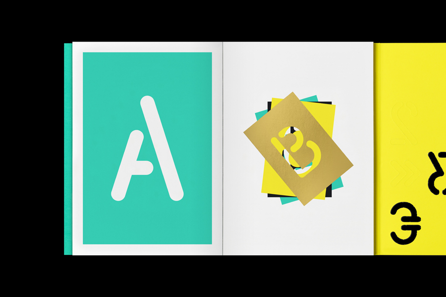
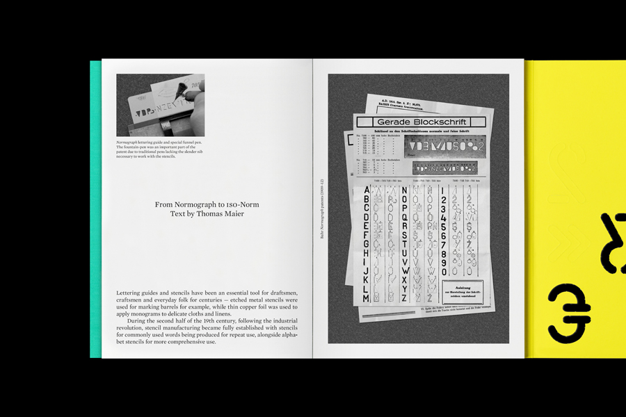
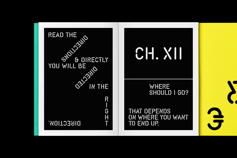
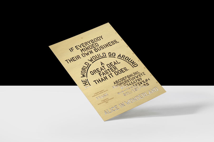
F R A N K is a limited edition typeface designed by Bunch and Alberto Hernández as part of the Cerovski brand identity project, and developed into a commercial full character set by Milieu Grotesque in 2015. To coincide with the release of the typeface Bunch developed a launch campaign that, much like their brand identity design work for Cerovski, plays with bright colour, tactile papers and high-quality print finishes.
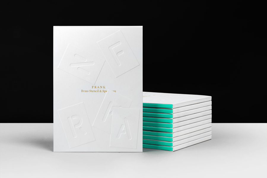
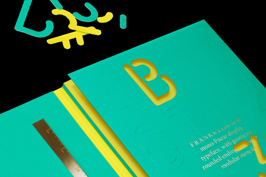
Launch campaign designed by Bunch for the launch of the limited edition typeface MG Frank Launch campaign designed by Bunch for the launch of the limited edition typeface MG Frank Launch campaign designed by Bunch for the launch of the limited edition typeface MG Frank Launch campaign designed by Bunch for the launch of the limited edition typeface MG Frank Launch campaign designed by Bunch for the launch of the limited edition typeface MG Frank Launch campaign designed by Bunch for the launch of the limited edition typeface MG Frank