Kings Biltong by Robot Food
Opinion by Richard Baird Posted 9 February 2014
Capitalising on the increasing demand for healthy protein-rich snacks and sports supplements Kings Biltong, a business established by three former England rugby professionals, have launched a three flavour, cured and sliced, grass-fed British-beef range that offers athletes an “alternative to chalky protein bars and other supplement snacks that miss the mark in terms of both taste and quality perceptions.”
Designed by Leeds-based Robot Food, Kings’ new brand identity and packaging solution takes the clinical sensibilities of the supplement market and fuses it with a traditional Britishness, a union described by the studio as ‘clean, confident and bolder’ with a ‘simplified brand identity, message and colour way’ and a ‘vintage sporting appeal’ that places quality, taste and provenance at the heart of communication.

Like their work for Under Your Skin, Robot Food’s approach is an interesting symbiosis of two communicative agendas handled in a way that avoids compromising the clarity of either.
The inverting of what was originally a black pack, and the leveraging of what I tend to describe as a professional kitchen white or clinical effectiveness, conveys a healthier and higher quality proposition using contemporary standards but with the same ration pack utility and use of language that works well for the sports market. Losing the male imagery, dark tones and the ‘high-tech’ edge of the typography the solution appears far less aggressive and should appeal to a broader market.

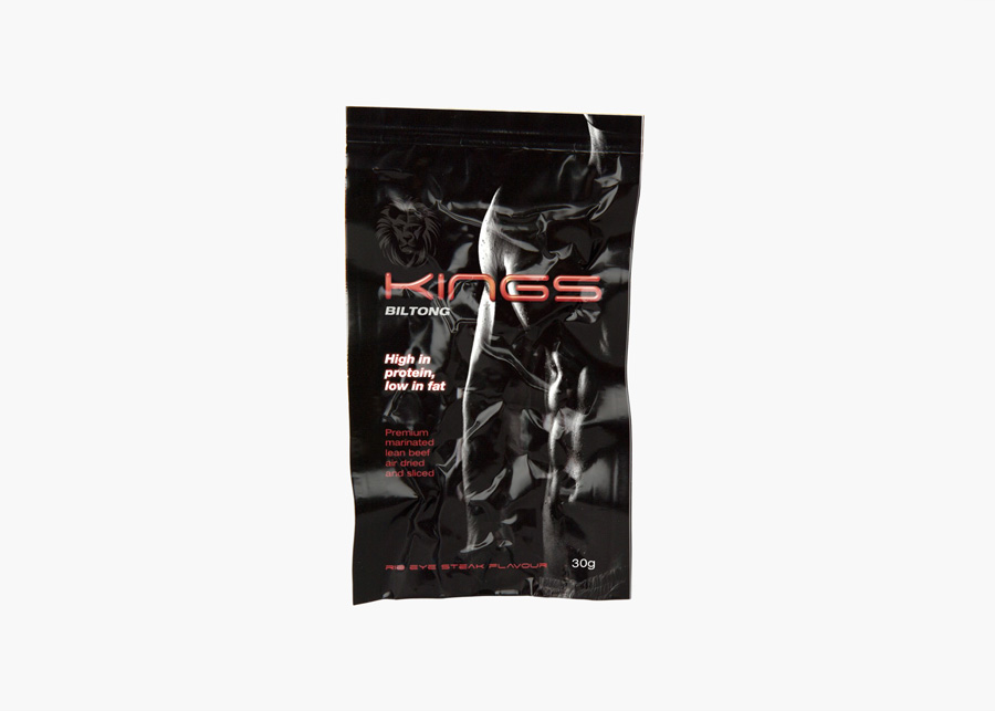
The dated ‘high-tech’ sensibilities of the original typography are replaced by a retrospective Britishness that utilises an on-trend combination of the uppercase humanist sans-serif characters of what looks like Brandon Grotesque, crown, flat colour and layout reminiscent of public information posters of WWII. Set alongside a ribbon, cattle illustration, the letterforms of Courier and stamp, these choices clearly convey the traditional values of good quality, honesty and provenance suitable for the snack-food market and offers a distinctive contrast to the contemporary white and practicality of the structural choice.

Each pack is well laid out with a striking juxtaposition of bright flat colour and plenty of white space, graphic assets that are clear in their communicative value and although the typography is a little loose between the Bi in Biltong, it is well structured and unique but with a familiarity that keeps its unusual supplement and snack proposition clear. More from Robot Food on BP&O.
Design: Robot Food. Opinion: Richard Baird. Fonts Used: Brandon Grotesque & Courier.