Freies Theater Hannover by Bureau Hardy Seiler
Opinion by Richard Baird Posted 3 April 2014

Freies Theater Hannover offers a diverse programme of classical and contemporary theatre, multimedia productions, musical experiments, modern dance and educational initiatives for both children and adults that take place across many of Hannover’s independent theatres.
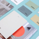
Bureau Hardy Seiler, working in collaboration with Created by Monkeys, was recently commissioned by the organisation to develop a new brand identity solution that would unite the diverse programme and the variety of locations under one unified visual system, deliver a recognisable visual impact across the city and convey some of the emotion of live performance. This was achieved through the juxtaposition of sans-serif and serif typography, bright geometric illustrative detail, black ink and unprinted white space across a stationery set and a bi-monthly mailer that doubles as a poster.
Bureau Hardy Seiler’s solution, like any good brand identity piece, effectively utilises a contrast of colour, form and type to deliver both aesthetic and communicative impact. This contrast is founded on the robust characters of a well stacked logotype built from tall uppercase san-serif characters that manage to balance a consistent corporate reliability—capable of binding the breadth of the programme and their locations—with subtle references to posters and signage of the industry, past and present.
The logotype is paired with a marque that resolves the organisation’s initials within the context of an inequality symbol, a symbol chosen to represent variety. It is undeniably abstract but at the very least appropriately informed by intention and functions as a bold graphic anchor.
These two assets are effectively bound by a shared consistent line weight and a single black ink print treatment.


The illustrative detail effectively mixes form, direction and a contrast of bright flat and contemporary colour to achieve a sense of motion and energy reflective of modern performance. This is suitably enhanced by regions of unprinted white space, the black ink of the logo and, while perhaps in service of aesthetic rather than communication, a conventional typographic density on the reverse of the poster. Type and image are well resolved through a shared sense of geometry.


The contrast of bright illustrative detail and dark austere typography, their straightforward communicative agendas and strong aesthetic are given depth through the finer detail of a serif, drawing in the more traditional elements of the program, and the economy of a bi-monthly mailer that doubles as a poster, sharing some of the basic functionality of the typography.
The result is a clear and well handled fusion of uniformity and diverse artistic expression but with enough nuance to keep it from appearing frivolous, superficial or a little too trendy. It provides a interesting and consistent foundation for the organisation from which to unite a range of activities and initiatives through appealing and emotive imagery.