Taco República by Bielke&Yang
Opinion by Richard Baird Posted 24 April 2014

Taco República is described by Bielke&Yang, the design studio behind its visual identity, as Norway’s very first genuine taqueria. Wanting to avoid some of the Mexican restaurant clichés, Bielke&Yang juxtaposed classic typography and a guacamole based color scheme with a colourful and contemporary illustrative panel created by Uglylogo, which offers a humorous take on the “enthusiasm and craziness” of the local community prior to opening, to convey traditional quality and a contemporary experience.

Like their brand identity work for Vitenparken, Bielke&Yang effectively utilise a clear communicative contrast and leverage the specific high quality you get from outsourcing.
Uglylogo’s illustrative work is incredibly well rendered. It provides Taco República with plenty of distinctive personality and energy through a mix of references (comics, Japanese animation etc), strong characters and sense of motion that neatly resolve the themes of hunger, spice and Mexican origin. The single illustrative panel establishes a strong consistency between interior, print and digital experience but, through some solid crops across the business cards, also manages to extract variety. Its detail and colour stand out well within the context of an interior utility, and together create a distinctive environment.

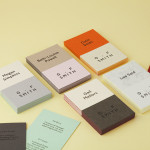
Like the illustration the logotype, built from Klim’s font Domaine Display, has plenty of crafted character but an opposing retrospective quality. The traditional flourishes of the serifs, the enthusiastic terminals of the c’s and the curve at the foot of the b are an unusual elements for a taqueria but choices that work well to ground the contemporary enthusiasm of the imagery with a sense of tradition and quality.
Further assets such as food photography, a clear approach to print, a good use of space and flat colour and the sans-serif Atlas Grotesk provide a more conventional approach to communication that supports experience, provides a break in the interior and illustrative detail and expresses a freshly made value.
Design: Bielke&Yang
Illustration: Uglylogo
Photography: Mathias Fossum and Veslemøy Vråskar
Opinion: Richard Baird
Fonts Used: Domaine Display & Atlas Grotesk