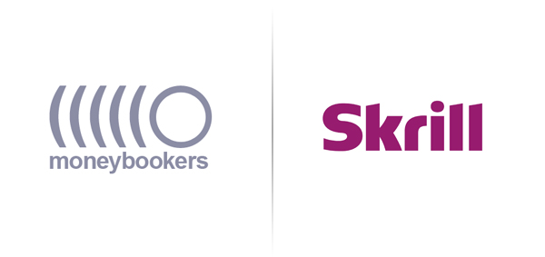
Moneybookers
Opinion by Richard Baird Posted 18 March 2011

Moneybookers.com was launched in 2002 and is a UK based company that provides on-line payment services competing with companies such as paypal. In response to questions about the international viability of the name moneybookers and its potential association with ‘bookies’ they have changed there name to Skrill and introduced a new typographic word-mark with the full branding process to be completed by the end of 2011.
The original word-mark was set in Helvetica and is technically well handled, it is considerately spaced while its grey colour gives it a modern clean feel and an association with money. Unfortunately the logo-mark doesn’t show the same restraint, its representation of a moving coin appears very generic in nature and fails to express the technology or security aspects integral and desired in such a service. The mark is oversized in proportion to the type so it suffers when downsized and lacks any impact.
The name Skrill was chosen from a list of 1,500 and developed in collaboration with language specialists, in an interview with eGaming head of marketing Julian Artopé explained the reasoning behind their new name:
“We were seeing that a lot of non-English speakers didn’t understand [the connotations of the name Moneybookers], especially those not within the gambling sector.”
“We drew up a long list of about 1,500 alternative names and got linguists to test them – what was important was that we got a universal identity that we could own.”
“We could have gone for something like ‘pay.com’ but you still get problems with different languages in that case. We wanted something that could become like Google or Skype in its universality.”
Whether the name is something that will resonate with its service users has yet to be proven but as a visual it certainly has a more resolved feel than their previous identity. The letter forms are well weighted and spaced but the ‘S’ is possibly a touch light, it might have been a good choice to use a circle over the ‘i’ as a small nod to currency. The angle on the tops of the ‘L’s’ and the ‘K’ come across as a little sharp and aggressive in contrast to the curves of the ‘s’, ‘k’ and the ‘r’. The colour is an unusual choice and doesn’t really represent any of the key service traits but it does bring it more in line with the gaming industry for which they are handling an increasing number of micro payments. (The colour choice is very similar to the UK retailer ‘Game‘)
Overall this is a significant improvement, the name, colour and type choice seem unusual but it is certainly likely to stand out against its competitors.


