Ambrosia by jkr
Opinion by Richard Baird Posted 29 March 2011

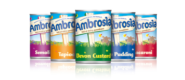
Ambrosia is a UK brand based in Devon producing a range of cream and milk based desserts since 1917. Owned by Premier Foods the packaging has recently received a refresh undertaken by UK design consultancy JKR.
JKR were tasked to “re-establish the brand’s authentic Devonshire roots and reaffirm its position in the heart of the nation, the new look places the countryside at the centre of the design, bringing the world of Ambrosia to life.”

This is a much needed change for the Ambrosia brand, the original labels felt too detailed in their presentation to deliver a strong impact on the shelf and didn’t convey the nature of the products. The new illustration style really expresses a light playful sensibility and is engaging with a range of simple but well executed animals. The sign creates a friendly local theme and the colours are warm and inviting.
“The use of luscious fields, lowing cows under a bright, azure-blue sky really help bring to life the warm and comforting emotions that enjoying Ambrosia actually creates.” – Donna Trist, Design Director, jkr.
While the changing grass colours feel a little odd it really works well with the flavour variations but seems a little simplistic when defining the products beyond the custard range. While the overall style is well executed, playful and sure to stand out on the shelf this seems to be at the expense of maintaining the Devonshire authenticity which feels a little overlooked.


