Seiland House by Eirik Gihle
Opinion by Richard Baird Posted 31 March 2011
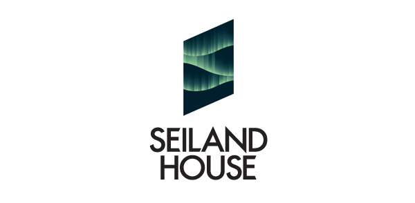
Seiland House is a hotel and conference centre in the north of Seiland Island off the coast of Norway where visitors can experience its glaciers and northern lights. A former boarding house and school, Seiland House has recently undergone a re-brand by Norwegian based designer Eirik Gihle who has captured the essence of the islands countryside.
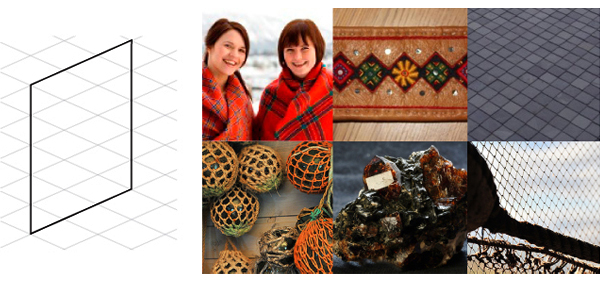
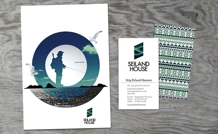
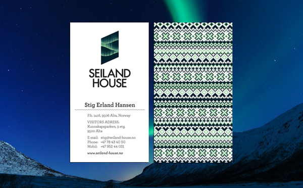
The shape of the logo-mark is based on a grid inspired by local traditions and culture, combined with the angular typographical choice it really expresses the cold, fresh, Nordic environment. The representation of the northern lights is very well executed both conceptually and technically and is immediately identifiable with this part of the world. The printed collaterals blend a cool crisp logo-mark and illustrated knitted patterns (a nice personal touch) with a modern colour palette resulting in an intelligent, thoughtful brand experience that suitably reflects the hotel’s proposition.
