Hotel Ambrose by Miklos Kiss
Opinion by Richard Baird Posted 8 April 2011
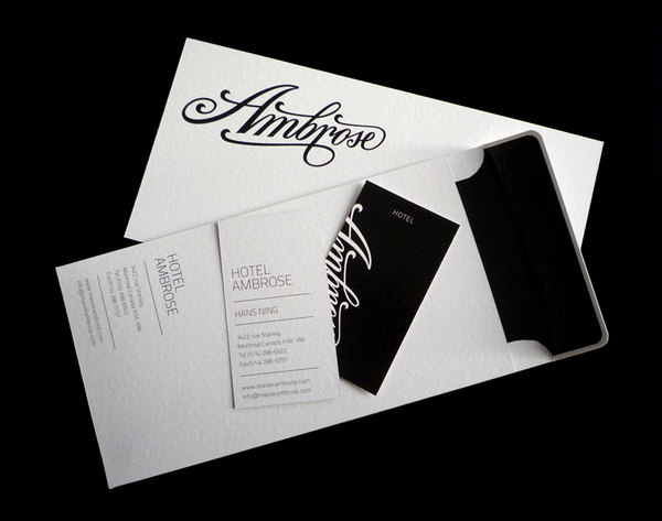
Ambrose is a hotel situated in two Victorian styled buildings with rooms uniquely dressed, featuring original architectural details and character. Built in 1910 the hotel is located in the historic Golden Square Mile of Downtown Montreal, Canada. This year they will update their identity handled by Hungarian designer Miklos Kiss who took a fresh approach to a Victorian style.
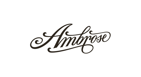
“I wanted to design a logotype, which is classic like Victorian style but fresh, and suited very well to the building. It’s a classical building which – I think – is needs a classic logotype, but not very conservative. My inspiration was the Victorian style letters, and handwritings. I drew the logo in this style. And when I designed the identity, the business card, hotel card and envelope… etc. I attached to the logo a simple and nice sanserif font family, TittiliumText. I think the logo and the TitilliumText 1wt and 250wt light font, constitute a very elegant mix, and qualify for a higher position in the hotel.” – Miklos Kiss
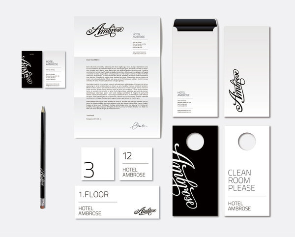

This is a great project and a good example of a strong suitably designed logo-type based identity where everything else falls easily into place around it. The word-mark is strong, bold and well balanced capturing a sense of history without being fussy, its application is simple and clean which is supported by the use of a neutral secondary typeface.


