NYC Parks by Pentagram
Opinion by Richard Baird Posted 17 May 2011
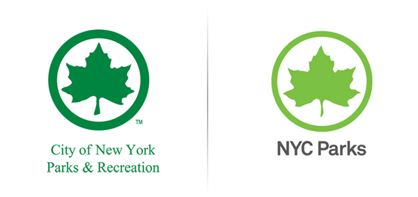
The green leaf represents over 29,000 acres of New York park land, properties, and attractions which include Coney Island Beach, Flushing Meadows and Central Park. Managed by the New York City Department of Parks and Recreation the spaces and facilities are visited by millions of New Yorkers and tourists throughout the year. This month will see the launch of a new identity system that was developed by Pentagram and led by Paula Scher that includes refinements to the logo-mark, a new typographical treatment and revisions to its application across a wide variety of touch points.
“The Parks Department was initially looking for standards for the consistent application of its identity across agency materials. Despite having one of the most familiar logos in the city, many of the department’s communications for the public were not immediately recognizable as “Parks.” At the same time, Parks Commissioner Adrian Benepe was looking for a system to visually link Parks and its partnerships with high-profile community initiatives such as the High Line and Madison Square Park, which have their own distinct identities. And Parks needed a cohesive system of signage and environmental graphics in the parks themselves.” – Pentagram
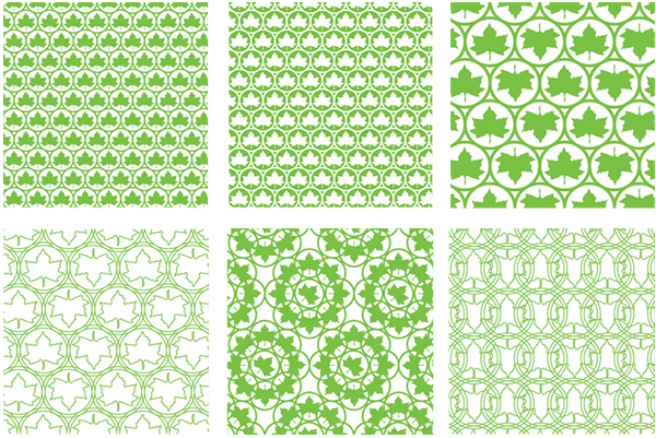
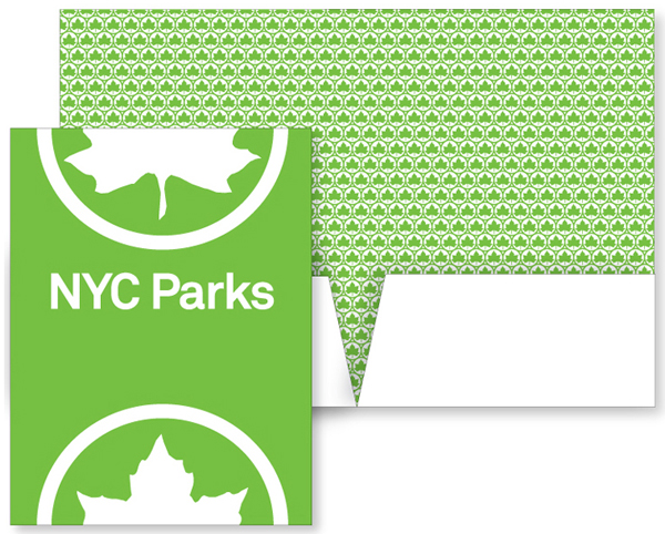
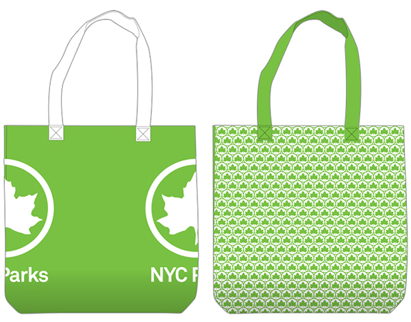
The key leaf identity has undergone some subtle revisions that give it a less symmetrical and smoother appearance. The new green appears more lively and modern while the adjusted weight of the container allows the leaf to stand out far more. Its implementation as a pattern is a little simplistic and obvious but well executed across stationary and promotional products. The typographical revision is a significant change in direction, set in Akkurat and shortened to NYC Parks it looks far snappier and modern in comparison to the heritage sensibility of the previous version.
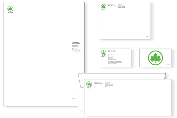
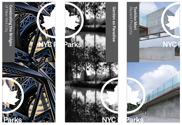
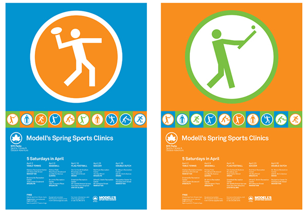
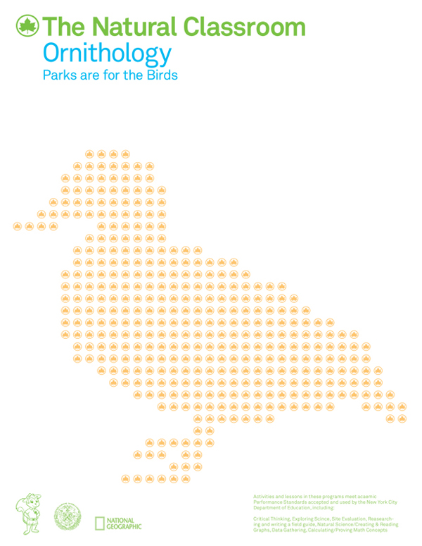
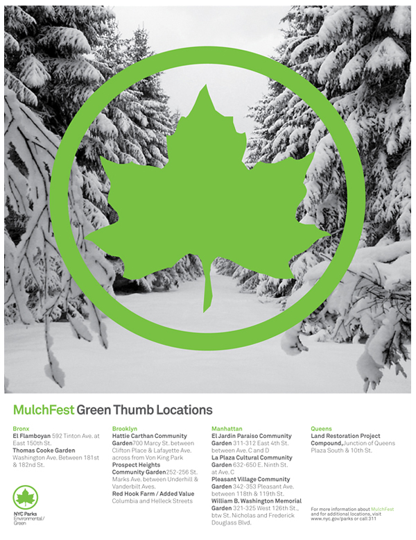
As a very broad and all-encompassing identity program the leaf logo-mark plays a small role in the overall brand architecture. Its simplicity works well to unify different attractions and destinations in a way that frees each of these to be presented in a variety of ways, from the bright colours of the ‘Modell’s Spring Sports Clinic’ to the more sophisticated ‘Mulchfest’ posters. I really have to admire the complexity of such a project and the extent to which Pentagram has taken such a simple logo-mark and developed it into a more sophisticated, unified (yet diverse) system of communication while retaining its familiarity throughout.
These are just a few choice pieces that grabbed my attention, a variety of other collaterals can be viewed on the Pentagram website.
Design: Pentagram
Opinion: Richard Baird
Fonts Used: Akkurat
