Vastese by Two Of Three
Opinion by Richard Baird Posted 8 July 2011

Vastese is a family run, Italian bakery with over 50 years of experience supplies products across Australia. Their new visual identity, as part of a re-branding exercise, was created by design studio Two Of Three to better embody the family’s heritage and passion for fresh, good quality products.
“The branding had to reflect this heritage so we created a logo that both signified their Italian background as well immediately communicating their industry; a hybrid of an olive branch and a wheat sheath. The aim of the project was to elevate Vastese’s branding to a premium level to reflect the quality of their products while still maintaining a rustic Italian aesthetic.” – Two of Three
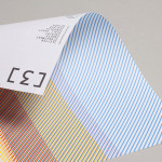
I really like the idea behind the ‘V’ logo-mark, the blend of olive branch and wheat sheath feels subtle and smart enough to mark it out as unique amongst a multitude of other wheat logo-marks. Its asymmetrical form creates a natural sense of movement and could be perceived as a tick (representing quality) or the impression it is blowing in the wind. The gold and black colour choices are a little generic but suitably reflect the aspects of heritage and high quality while the green, white and red add a touch of Italian authenticity to the brand. I personally have difficulty with an outlined type and from a distance it looses a bit of its impact but the modern style contrasts well against the serif selection. On-line the brand is complimented with some nicely shot photography that reinforces a distinctive, rustic and traditional charm.