WrapperRhymes by Effektive
Opinion by Richard Baird Posted 14 July 2011

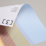
Inspired by the English poet Ted Hughes (who famously wrote a poem on a Tunnocks confectionery wrapper), WrapperRhymes provides an on-line platform for aspiring ‘wrapper poets’ to send in their work, have it photographed and featured on the website. To visualise this concept, Glasgow based studio Effektive, now Freytag Anderson, designed a modern and geometric identity that captures the simplicity of the wrapper and the aesthetic of the printed word.
The simple geometric representation of a wrapper is an interesting and well thought out concept that draws on the idea of expectation and discovery associated with opening gifts. Its monochrome and angular style while unusual in its direction creates an interesting contrast against a very visceral art-form adding to the originality of the design. The typographical selection fits well within the concept of the typewritten word and within the lock-up provides the logo-mark with the proportions of a sheet of paper.
This is a nice simple resolution that combines multiple aspects of the website’s proposition with a subtle consideration for detail and relevance.