Ikaati by Studio MPLS
Opinion by Richard Baird Posted 9 August 2011
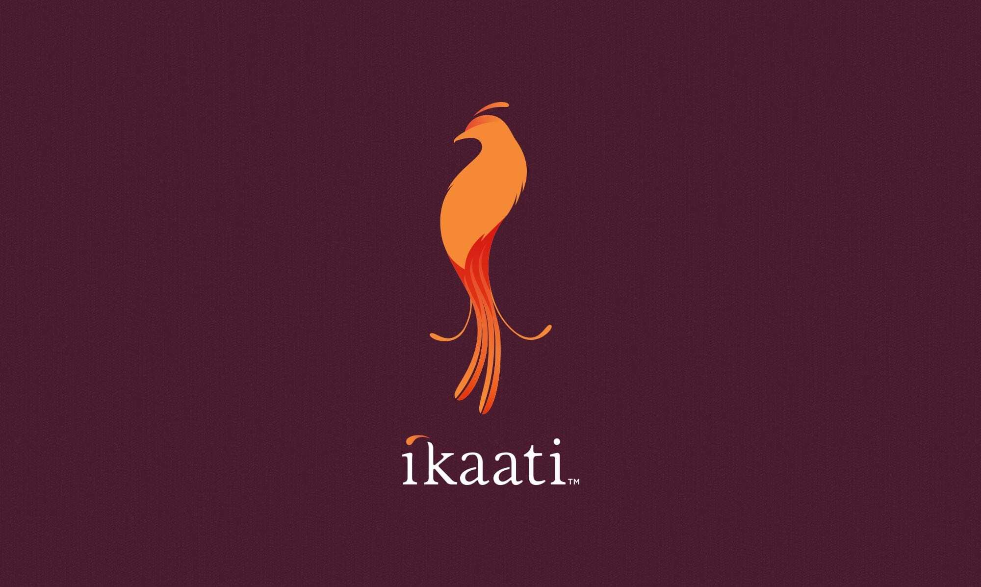
Ikaati (meaning ‘to tie by hand’) is a new range of Indonesian, handcrafted luxury tea infused with organic flowers, fruits and herbs designed specifically to enhance the luxury spa experience. To capture this unique proposition Minneapolis based Studio MPLS designed an identity and packaging solution that combines culturally inspired illustrations, an iconic bird logo-mark and a rich and vivid colour palette delivering a modern interpretation of an authentic Indonesian style.
“The identity and packaging are inspired by batik artwork and patterns—a rich aspect of Indonesian culture for millennia. Combined with an iconic, majestic tropical bird in the new logo the brand language suggests the intrinsic value of the product itself: an elegant fusion of unique ingredients to provide a transformative experience.” – Studio MPLS
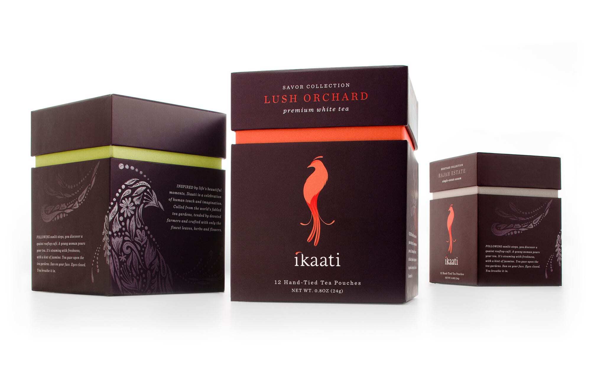
The bird logo is nicely rendered, subtle in its execution and solid enough to be used as the basis of the detailed illustration work. The accompanying serif logo-type has a light and delicate sensibility with a neat little flourish across the ‘i’ and the ‘k’ that adds a touch of juice while mirroring the feather elements of the mark. The layout and accompanying typographical choices are traditional in their approach and sparingly applied allowing the images to predominantly carry the key brand messages. The contrast between the luxurious purple and the vivid highlights is really nicely balanced and carries the luxury infusion message well.
The spa sensibility, quality and hand-crafted nature of the product have been confidently expressed in a traditional but sophisticated culmination of background texture, warm colour palette and delicately rendered illustrations.