Axioma by Anagrama
Opinion by Richard Baird Posted 6 October 2011
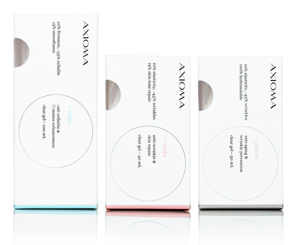
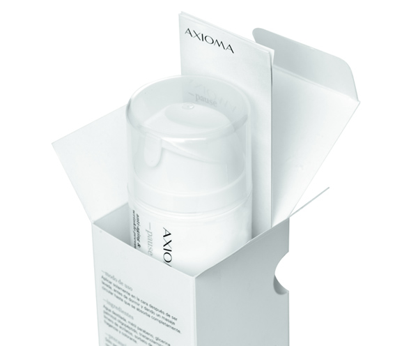
Axioma is a cosmetics brand that specialises in high quality and active skincare products. Their identity and packaging propositions were developed by Mexico based brand development agency Anagrama and utilise a clean and minimal aesthetic to communicate the clinical effectiveness of the ingredients.
“Axioma is a new company specialized in skin care products for which we had to create a corporate identity that would reflect the company’s philosophy: Offer the highest quality products made with authentic active substances. Based on the fact that the effectiveness of each of the products is clinically proven, we chose honesty as the brand’s leading value, therefore, we decided to use the name Axioma, which means “irrefutable truth”. We developed a clean visual language that would represent the products’ honesty and its clinical purpose. However, the typographic selection was carefully handled so that it would evoke the high-end fashion industry.” – Anagrama
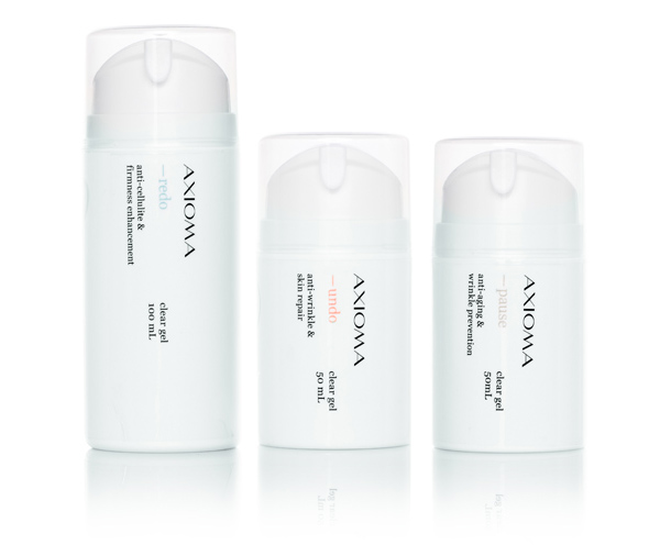
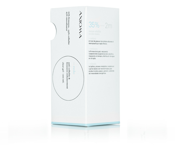
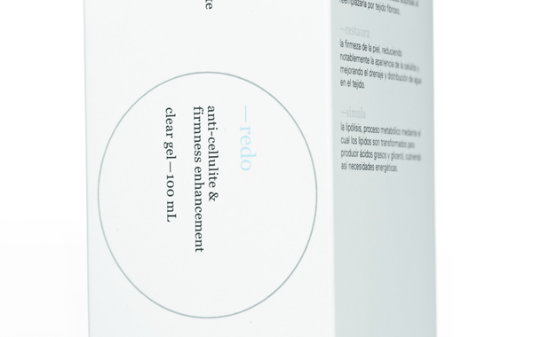
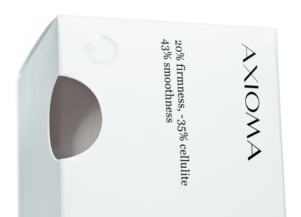
I love the very restrained, minimal and information based layout of this project and how it successfully blends a medical and prescription based aesthetic with small cosmetic twists, neatly placing it within the premium cosmeceutical category. The logo-type, a wide format sans serif juxtaposition of light and heavy stems and stresses has a distinctive and classic fashion sensibility that contrasts well with the secondary serif type choice. A circular container carries the message of complete care and helps to isolate information and establish a pack hierarchy in an interesting way. This form is mirrored across the corner with a die cut detail through the exterior packaging to reveal the interior bottle emphasising the theme of ‘irrefutable truth’.
The pause, undo, redo has an unusual masculine and technological tone that utilises language rather than design to express the scientific qualities of the product and feel unique within this application.
A predominantly black and white colour palette enhances the clinical proposition of the products and helps to reinforce the brand position of honesty while the three pastel highlights differentiate the range in a subtle and assured way.
