Snarveien till by Strømme Throndsen Design
Opinion by Richard Baird Posted 6 October 2011
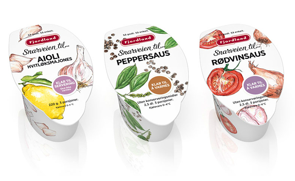
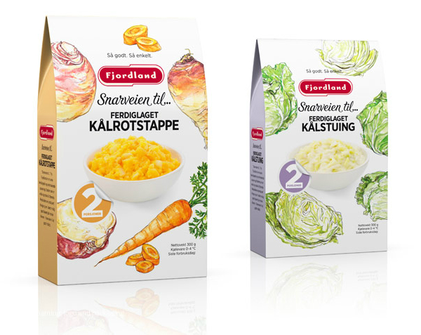
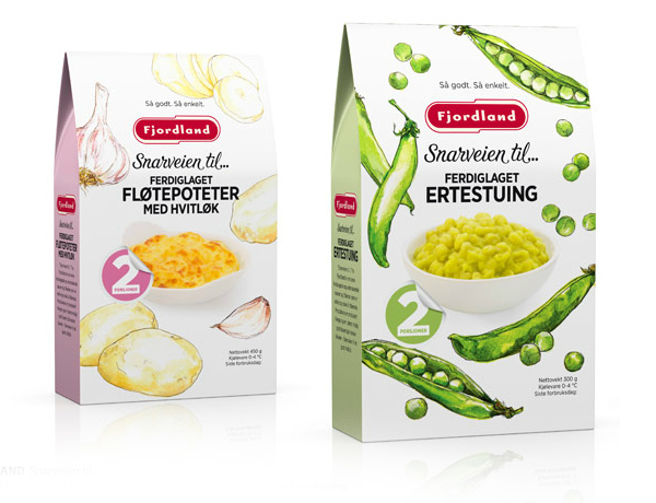
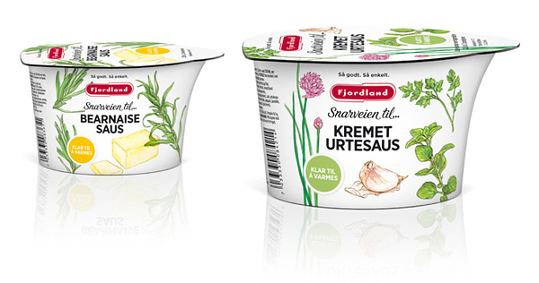
Fjordland is a Norwegian food producer specialising in ready meals, dairy products and deserts. As part of a continuing relationship Oslo based brand strategy studio Strømme Throndsen Design was commissioned to rebrand and repackage Fjordland’s ‘Snarveien till…’ range creating a series of hand drawn and water coloured illustrations, a script logo-type and bold typography to visualise the quality of the ingredients.
The sketch illustrations are what you might expect from a home made cookbook in their loose style that implies good, wholesome and honest ingredients. The watercolour treatment is vibrant and lively standing out well on the white background that gives the pack a fresh and distinctive style. The ‘Snarveien till..’ logo-type has a light energetic aesthetic that compliments the line work of the illustrations and contrasts against the weight of the sans serif typeface that combined have a healthy but hearty sensibility. A spacious layout allow the images to easily distil the brand message and while the peeling sticker is an unnecessary detail on the box its absence on the pots is a sensible choice. The colour palette is bright, light and natural with key tones to clearly differentiate the individual varieties and should give the brand significant shelf impact.
