Level Ground Fruit & Sugar by Subplot
Opinion by Richard Baird Posted 27 October 2011
Level Ground is a Fairtrade and organic brand established in 2007 with a diverse range of coffees sourced from small farms in South America. As part of an expansion to their product range, Canada based brand design agency Subplot, who were responsible for re-branding and packaging Level Ground’s previous lines back in 2010, have created the packaging for their new dried fruit and sugar products utilisng new materials and visual devices to reinforce the brand’s key propositions.
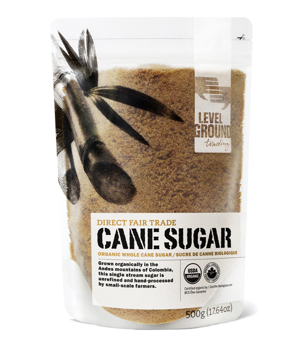
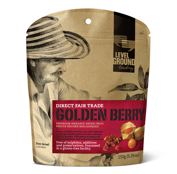
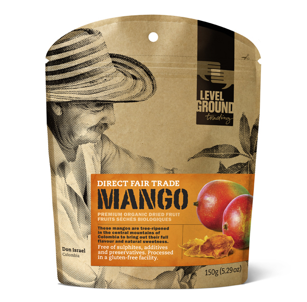
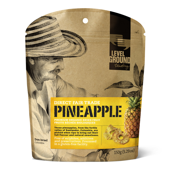
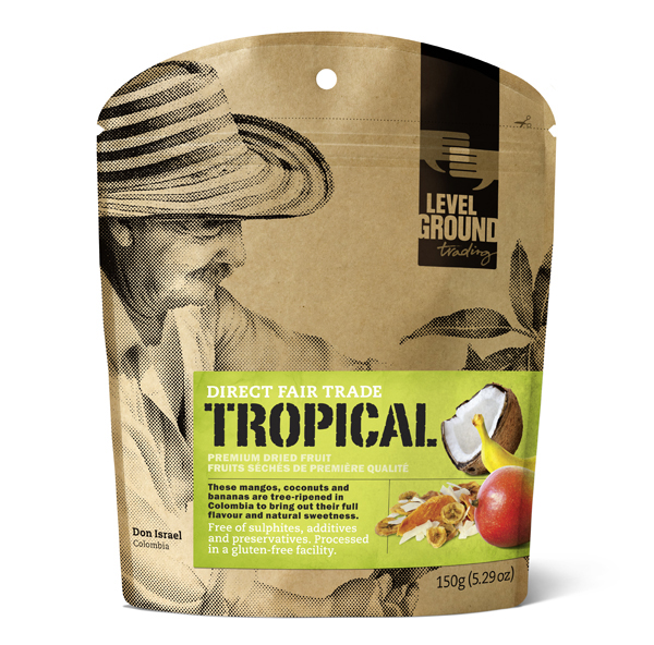
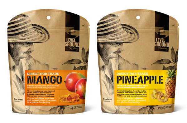
“The packaging platform extends the system created in 2010, with innovative kraft paper, vapour-barrier bags with resealable zips for freshness. The Dried fruit build on the coffee platform with full-colour fruit imagery, to help play up the extraordinary taste and freshness of the product itself. Clear bags for Cane Sugar allow the colour and texture of the sugar to shine through. And a new stamp graphic signifies the MicroLot system, with a revised design layout to help distinguish it from the line of regular coffees.” – Subplot
Subplot’s initial packaging work for the earlier coffee ranges really had a distinctive and local quality that fused tactile, uncoated materials with the technologies that retained freshness and quality. This new range fits neatly into the established system with a number of neat additions that lift the design and differentiate these from the core coffee products.
The image of a farmer inspecting his produce remains the hero on the fruit and efficiently resolves the themes of locality, small production and fair trade through its simple single colour and half-tone execution that appears genuine and in the moment. The distressed and stencilled typography still works well to carry the idea of hand stamped quality and shipment straight from source while the accompanying slab serif has agricultural undertones. The addition of colour photography contained within the label takes the place of the geographical details established by the coffee packaging and rebalances the pack hierarchy in favour of freshness. These, set against the earthy tones of the recycled substrait, deliver a neat level of contrast and enhance the established pack architecture.
The most significant difference is the introduction of a clear pouch for the sugar which, in conjunction with the lighter tones of the label, adds a nice level of contrast against the darker and richer tones of the sugar and really draws attention to the brand’s pride in quality. This new material choice works exceptionally well with the half-tone screen print (now a sugar cane plant) in establishing new visual devices for expansion into future ranges.
