Cure Life Products by Mucho
Opinion by Richard Baird Posted 20 December 2011
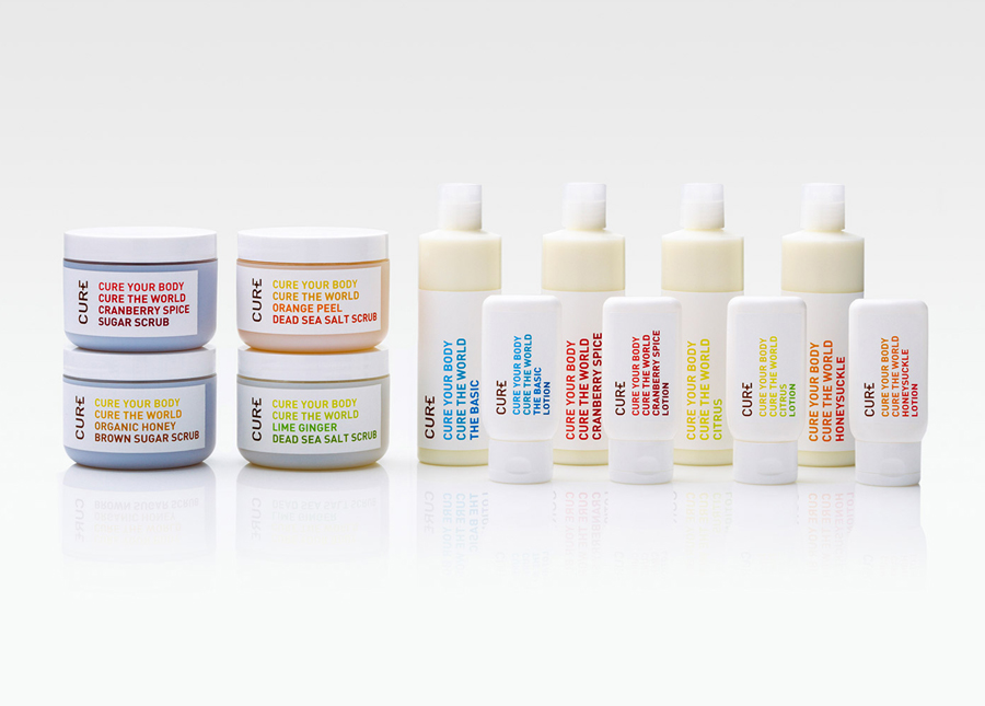
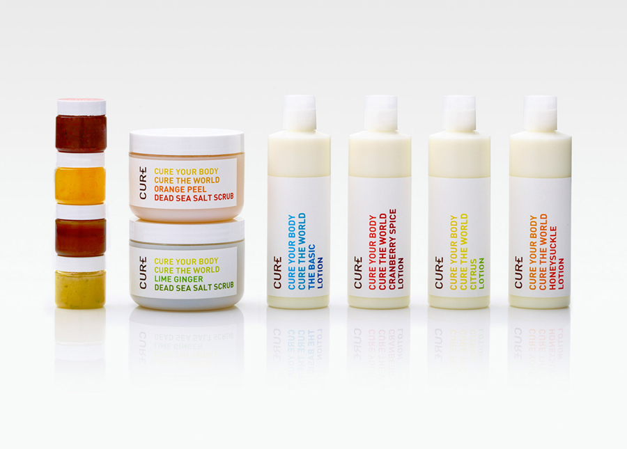
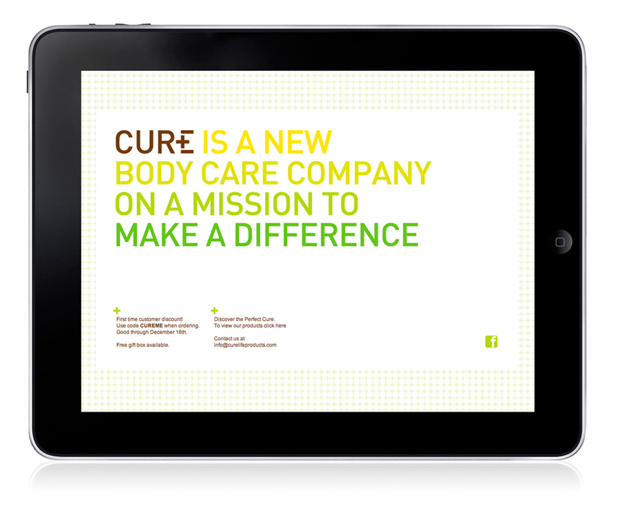
Cure is a Californian based handcrafted body care company that formulates products to alleviate daily stresses and donates 20% of all purchases to global charities. The company’s branding and packaging was managed by multidisciplinary design studio Dowling Duncan, now Mucho, and based around a simple logo-type solution and a clean, bright typographical labeling system.
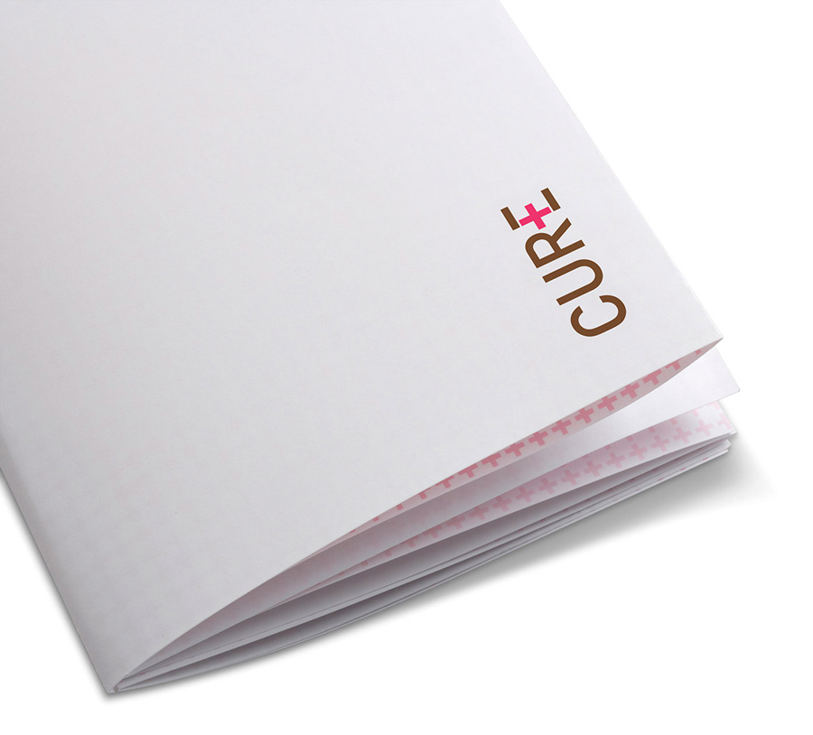
“The company’s mission is promoted clearly by pulling out a cross in their logotype, a motif that is instantly recognizable as the symbol for ‘aid’ throughout the world. This reinforces and plays on the idea that these products are first aid for your skin as well as having the additional benefit of aiding charities around the world. A packaging system that embodies the same brand mission and spirit was developed across the full range of body lotions and scrubs at a variety of sizes. The products were launched in San Francisco in November and can be found online at curelifeproducts.com” – Dowling Duncan
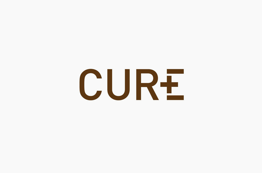
The logo-type is fairly straightforward but well executed with a nice twist that gives the short and potentially generic name a visually strong character that clearly communicates, through the duality of the plus sign, the propositions of health and well-being and the aspects of giving and positivity. The brown tone has a warm and natural quality that works well to emphasise the quality of the ingredients while the red within the cross carries with it the usual medical connotations and also a neat reference to the global aid organisation, (a detail that now appears to be being phased out – 12/13).
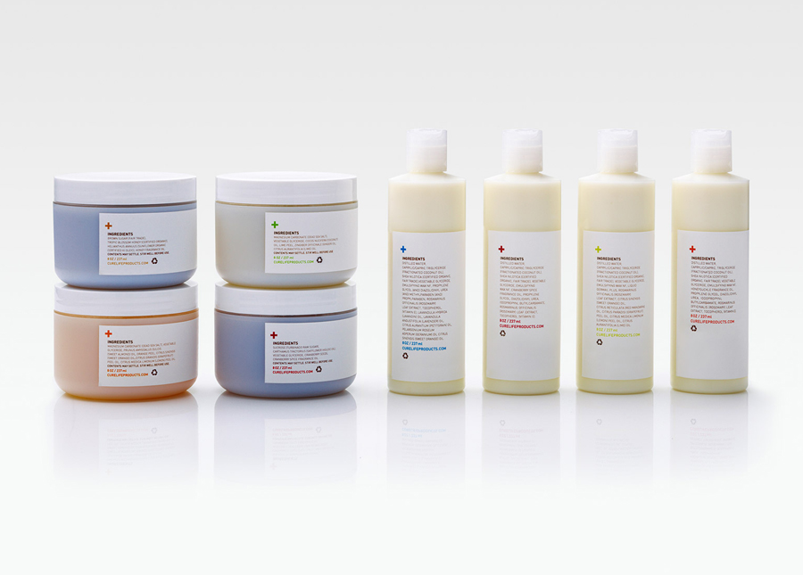
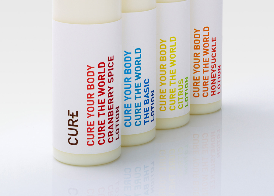
The single colour version implemented throughout the packaging, for me, is more appropriate and sidesteps a clinical aesthetic that could be perceived as over-promising its effectiveness. The brightly coloured type work across the labels look great against the clean white space and the slightly warmer/pastel tones of the creams that also functions well, albeit conventionally, as a distinction between varieties. As a packaging designer myself I can appreciate the difficulties of type setting ingredient information but this has been very well handled and competently reflects the aesthetic established on the front.
