Top 5 Brand Identity Projects of 2011
Opinion by Richard Baird Posted 23 December 2011
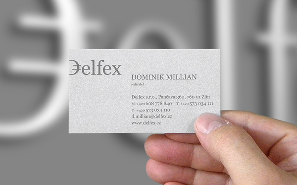
Delfex is a Czech based trading and consulting company that specialises in foreign currencies and works within the public, private and non-profit sectors. They approached brand designer Jan Zabransky to develop a complete and consistent identity that included logo design, stationery, web design, programming, copy-writing and brand guidelines.
I really wanted to mention Jan’s work for Delfex as it really represents the quality freelance designers can produce against agency work. The identity really manages to capture the aspect of currency in the simplest of ways and is fittingly translated across the collaterals with an uncoated metallic substrate. You can follow Jan’s work on Dribbble.
Read the review and see more of the project here
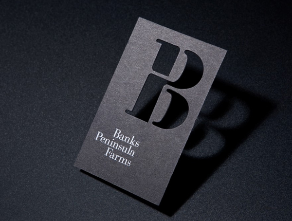
Banks Peninsula Farms is an effort to unite the wool growers of the Banks Peninsula region of New Zealand and increase the value while globally promoting their unique strong wool product under a new Provenance brand. Independent design agency and recent finalist of the Best Awards, Strategy, designed an identity that captures the collaborative nature of the initiative and the premium quality of the product with an iconic BP monogram.
The stencil cut monogram is a really effective way of characterising the unified nature of the peninsula’s individual farms that also manages to have a twisted wool like and utilitarian sensibility that captures the aspects of commodity. The slab serif, black and white colour palette and rich photography neatly balance this functionality and deliver a premium and global aesthetic to a regional brand.
Read the review and see more of the project here

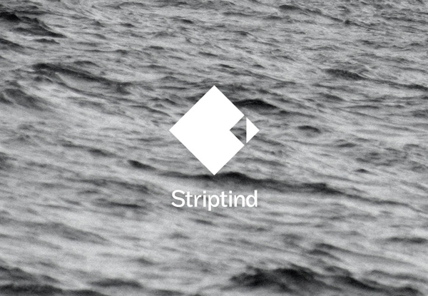
Striptind is a provider of guided deep sea fishing experiences based in the Artic surroundings of Kjøllefjord Norway. Their new minimal identity designed by Neue (famous for their interactive Visit Nordkyn work) was inspired by the exclusive nature of halibut and the prospect that there is ‘always a bigger fish to be caught’.
The Striptind identity is remarkably simple in its representation of halibut that could be seen as rudimentary but within the context of the brand through colour, patterns and photography takes the characteristics of a premium experience and really captures the sharp and icy cold environment of the Barents Sea.
Read the review and see more of the project here
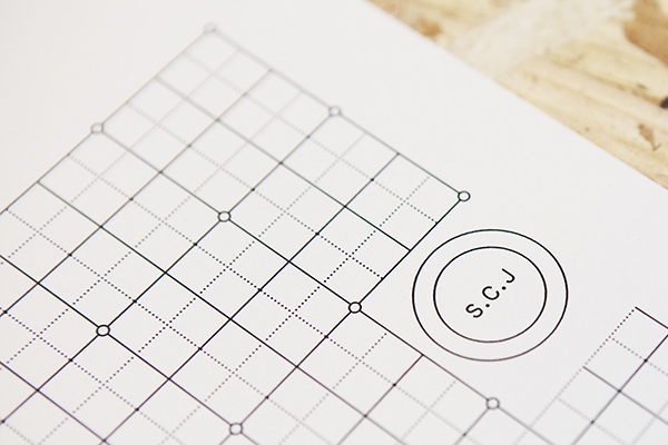
Sebastian C. Johansson is a Swedish bespoke furniture designer and manufacturer based just outside of Gothenburg who specialises in modernistic and functional pieces described as ‘intentionally rough around the edges’. He comissioned design studio Lundgren + Lindqvist with creating an identity system that represented his approach to design, view of materials and functionality while delivering the consistency of a professional business practice.
Functionality and practicality take centre stage in Lundgren + Lindqvist’s work for S.C.J. The concentric circles of the logo-mark and simple execution of the initials neatly resolve the ideas of a complete and personal service while embodying the dual process of design and manufacture. The collaterals are simple and utilitarian in nature allowing the untreated substrates to communicate the company’s straightforward approach to furniture.
Read the review and see more of the project here
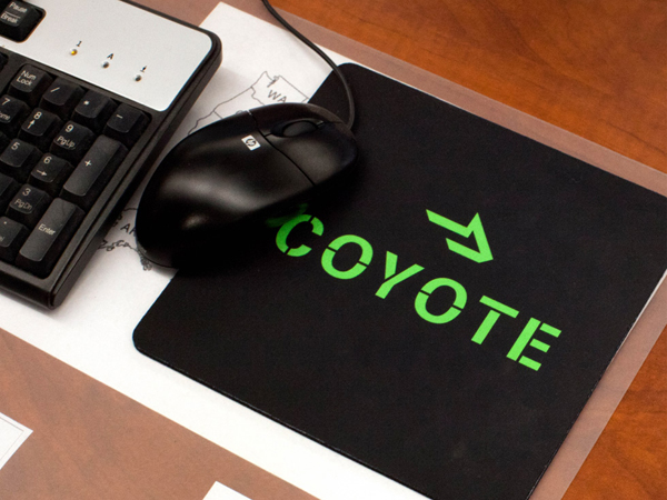
Coyote is a Chicago based third-party logistics business working across a variety of industry sectors and boasts a network density unlike its competitors. Coyote commissioned independent and international brand development agency Moving Brands to create an identity that would represent the company’s dynamic work force and their energetic forward momentum.
It was a close call between this and Moving Brand’s work for 46 Parallels and in the spirit of fairness and avoiding the post becoming the Moving Brands show I have selected Coyote for the duality contained within the logo mark, the utilitarian nature of the logo-type and the impressive, confidant use of neon green.
Read the review and see more of the project here
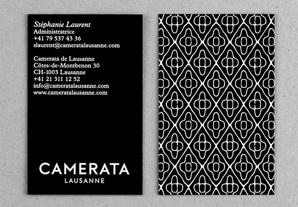
Camerata de Lausanne is a group of thirteen international, classical musicians founded by Pierre Amoyal in 2002. The group’s new identity, developed by Swiss based Demian Conrad, who pursue a research-led and technological approach to design manages to visualise the complex nature of music through the union of graphic design, technology and science.
Science, music, design and technology all meet within Demian Conrad’s brand work for Camerata Lausanne. This, for me, is a great example of effective brand architecture, tailoring each asset to an appropriate expression. An intriguing scientific visualisation of music executed as a series of patterns takes centre stage with the logo-type playing a secondary and supportive role within a greater experience. The visual work has an exceptional conceptual foundation that manages to represent the beauty, complexities and geometry of music in a unique and engaging way.
Read the review and see more of the project here