Klar Tale by Strømme Throndsen Design
Opinion by Richard Baird Posted 12 January 2012

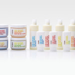
Klar Tale (Clear Voice) is a new brand of sugar free lozenge produced by Dent created to provide fresh breath and a clear throat for the young adult market. The brand’s new packaging, designed by Oslo based studio Strømme Throndsen, has a light but playful aesthetic that manages to balance a sense of effectiveness with a style that plays well to a social, communicative and self conscious demographic.
“Strømme Throndsen Design have created a new and engaging design concept with a corresponding sub-brand name, inspired by the product’s physical attributes. The strong fresh taste of the lozenge makes people talk and gives a freshness to the mind that helps you express yourself clearly.” – Strømme Throndsen Design
This project really struck me as a very interesting combination of visual qualities that manages to successfully tread the fine line between candy, in its bright colour way and loose typographic direction, and a semi medicinal sensibility through its clean, white background and written content. The speech bubbles, name and exclamation mark have an expressive conversational style and an aesthetic that neatly characterise a social environment while resolving content associated with effective health related products (sugar free, menthol and formulation etc) in a straightforward way. The packaging is a neat solution that manages to distil a verbal world in a visually clear but informal manner.