SoftKinetic by Method
Opinion by Richard Baird Posted 5 March 2012

SoftKinetic is a leading Brussels based developer of gesture recognition technology for the consumer electronic and private sectors. As part of a rebranding exercise undertaken towards the end of 2011, SoftKinetic approached user-centric independent design agency Method to develop an identity that would capture the company’s changing technological focus.
“Challenge – SoftKinetic was aiming to launch a new gesture-based, depth and dimensional sensing image platform to their product offering. Their brand identity had to align with this new offering.
Approach – When developing SoftKinetic’s refreshed identity, Method looked to new metaphors for gesture, moving away from the accepted principle of the human form. Instead, we aimed to create an identity that invited gesture and responded to it.
Outcome – The resulting identity is a wordmark connected by texture and frame. Used together, they are able to indicate gesture statically. Method integrated the idea of kinetics through an optical pattern that was malleable and gave the impression of motion and interaction to express the brand. Applied globally, the new SoftKinetic brand identity represents their offering and company core.” –Method
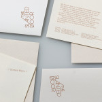
Although a project from late last year this identity recently received a distinction at the 2012 Rebrand 100 Global Awards and I felt that it was worth publishing a quick opinion. I love to see how technology can influence identity development but in a positive way, there has been a propensity to utilise certain algorithmic solutions for the sake of appearing expansive and contemporary but with little relevance. Method’s use of gestural technology within the context of this project is a neat way of visualising such a ‘kinetic’ and interactive product across a static identity. There is an almost topographical quality that gives it a sense of depth and dynamism while the disk has a fairly straightforward global implication. The sans-serif typographical construction carries with it technological weight but some of the spacing, the ‘ft’ ligature and width of the K make it appear a little too distinctive alongside such an interesting concept and appears far neater in its simple presentation across the front of the poster. The waves of the logo-mark are appropriately extended outside the disk and form the backgrounds of the stationary, these seem to have a raised ink or vanished quality that should deliver an interesting three-dimensional, tactile and experience led quality.
Relying on such a technology to underpin an identity operating in a highly transient industry perhaps gives it an unforeseeable limitation but its simple single colour resolution and an almost universal interpretative form that captures basic environmental interactions (such as moving a hand in water) should remain relevant regardless of how it is technologically executed.