Beito Ysteri by Strømme Throndsen Design
Opinion by Richard Baird Posted 22 March 2012
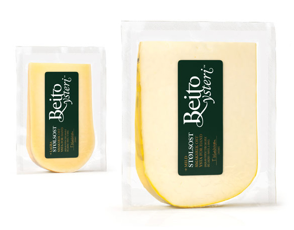
Beito Ysteri is a small dairy located in the region of Oppland, Norway that creates artisan cheeses made of milk produced on site and sourced from local farms. Beito Ysteri approached Oslo based independent design studio Strømme Throndsen to develop a visual identity and packaging solution that would unite the high, natural quality and authentic, handcrafted individuality of their cheeses.
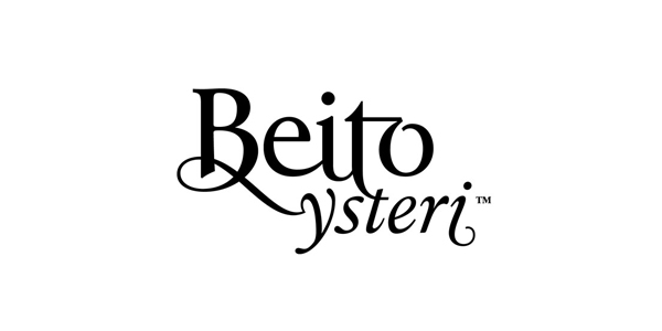
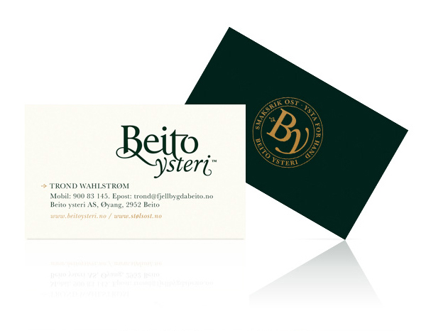
Much like their work for Kavli Moen Gård the logo-type for Beito Ysteri is an interesting example of creative and perhaps more unorthodox ligature work. There is a neat fluidity between characters and across the two lines that delivers a smart and visually analogous unification of craftsmanship, tradition and quality but with a contemporary restraint and simplicity in its application. Each of the letters feel distinctive and hand-carved, the B and Y subtle and ornate and while the ‘t-o’ ligature is perhaps a little adventurous the juxtaposition of regular and italics conveys a nice sense of character and depth that ties in well with the diverse flavour profiles of the products.
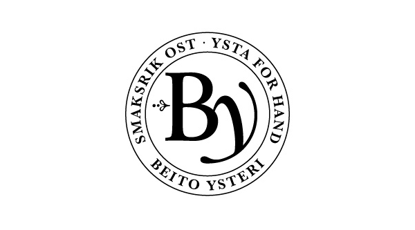
The BA monogram and roundel appear a little inconsistent in its translation of the logo-type unfortunately loosing most of the unique qualities of the ‘b’ and awkwardly shoehorning in the ‘y’ but does however succeed in distilling a sense of pride, tradition and heritage through its clear seal-like aesthetic.
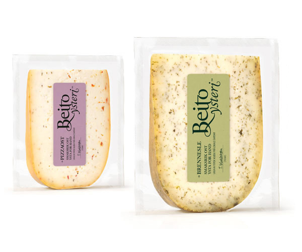
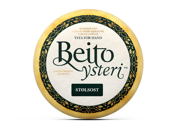
An incredibly neat packaging/labelling solution makes the most of the logo-type, placing and proportioning it as the key graphic component and allowing its sweeping descenders, ligatures and classic bracketed serif to emphasise the sophisticated and smooth quality of the cheese.
The introduction of a script signature detail (see top image) reinforces the individual handcrafted sensibilities established by the logo-type and seal while a gold, deep green and cream colour palette, complimenting the fine line weights and flourishes of the type, add a premium sensibility.
