May’s Top 5 Projects 2012
Opinion by Richard Baird Posted 31 May 2012

Reflect Lights is an architectural lighting design and supply firm based in the Greek city of Thessaloniki. Their new identity, created by independent design studio Designers United, visualises converging and refracting light trajectories as an abstract and three dimensional structural form to capture the concept of light moving within a contained three dimensional space.
Read the review here


Size is an independent record label owned and run by Swedish DJ and producer Steve Angello. This month sees the launch of the labels new visual identity, created by ‘supermodernist’ design agency Face in collaboration with Vltranegro, that moves it away from a saturated club aesthetic and appropriates the art-house qualities of high fashion.
Read the review here

Spritmuseum (formerly Vin & Sprithistoriska Museet) is a Stockholm based art gallery, museum, tasting room, meeting-place, bar, restaurant and open-air café with a unique spirit theme.
Read the review here

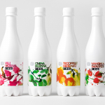
San Miguel 1516 is a Spanish brand of premium beer that is founded on the principles of the Germanic purity law of 1516 which identifies water, malt, hops and yeast as the only four ingredients to be used in beer production.
Click here to read my review and share your own opinion of Design Bridge’s work for San Miguel on The Dieline.

Quarterly Co. describes itself as ‘a new way to connect with the people you follow and find interesting’ and is an on-line subscription based service that delivers, on a quarterly basis, curated products selected by influential bloggers, designers and artists.
Read the review here