Plow by Perky Bros
Opinion by Richard Baird Posted 3 September 2012
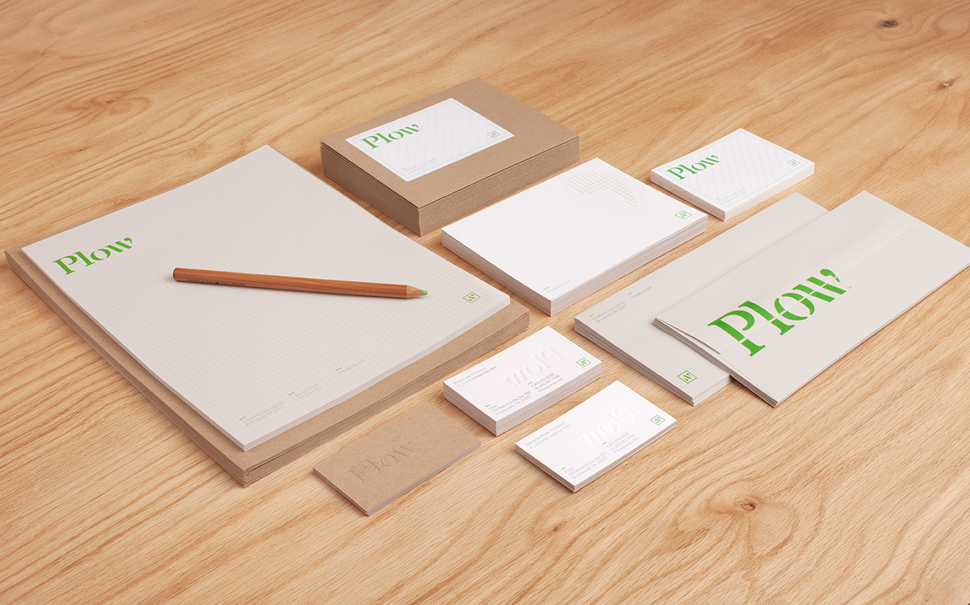
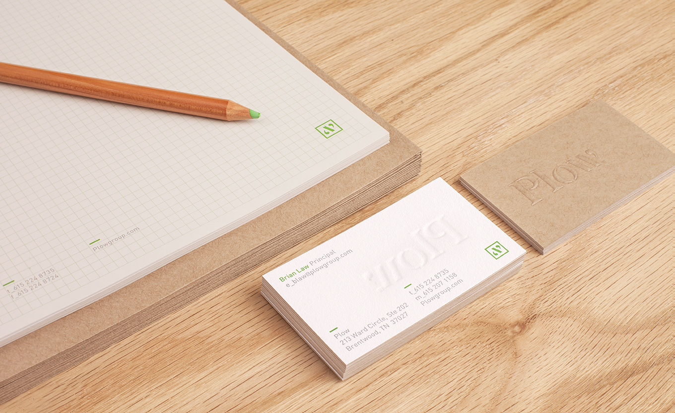
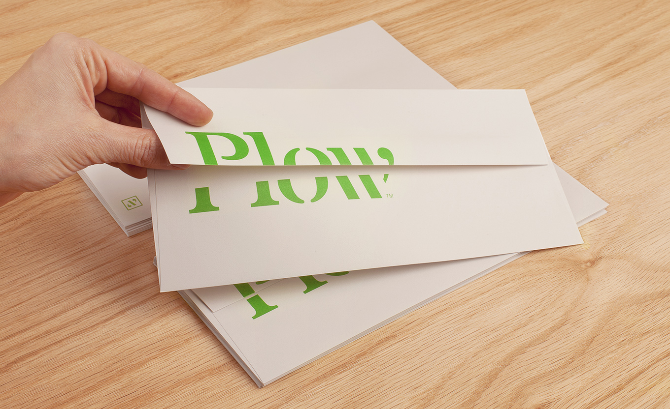
Plow is a Tennessee based customer acquisition service and telecom/energy contractor for the large to mid-size business sector. Their identity, created by multidisciplinary design agency Perky Bros, neatly communicates the experience, professionalism and advisory nature of Plow’s service, the commodities they manage and their renewable energy options through a logo-type built from a stencil cut serif typeface and apostrophe detail set across a stationery solution that utilises an unbleached recycled material choice and a website with a mixed fibre background.
“Plow does dirty work. They deal with telecom carriers so you don’t have to. The identity draws inspiration from its agricultural namesake with stencil lettering & recycled materials, but reinvigorates it with organized design & remarkable production techniques.” –Perky Bros
There is a really interesting triality to this identity that cleverly mixes the professional—the formal knowledge, experience and advisory nature of the company expressed through a classic typographical choice and apostrophe detail. The practical—drawing together the everyday nature of the utilities sector through simple stencil cut detail, a single colour choice and untreated materials. And the conscientious—an open and honest service with an environmental dimension delivered through the recycled constituency of the stationery and the mixed fibre background and distressed type of the website.

The grid-based background of the letter-head, the two-ply juxtaposition of earthy unbleached and conventional bleached substrates of the business card, the mixed fibre background and distressed typography of the website, and the tactile, high quality finish of a deep blind emboss, deliver depth and a technical but personal duality to the brand.
It is an incredibly rich visual resolution of relevant ideas appropriately distributed across a number of touch-points and while the logo-type feels thematically a little heavy within the context of these other assets it remains distinctive and communicative