ReGen by Studio Brave
Opinion by Richard Baird Posted 11 September 2012

ReGen, formerly known as Uniting Care Moreland Hall, is a not-for-profit drug and alcohol treatment and education agency established in 1970 for the Victoria and Tasmanian regions of Australia. Following the recent name change Studio Brave developed a new visual identity that would better reflect the ReGen’s evidence based practices and the positive, practical outcomes it achieves, through a combination of vibrant colour, a simple linguistic device and a weighty sans serif typeface.
“Sometimes the changes we make to organisations change lives. We have been fortunate to be part of a revolutionary branding project with leading alcohol and other drugs treatment and education agency UnitingCare Moreland Hall.”
“For the first time in UnitingCare’s history the franchise brand model was broken to allow us to build a distinctive independent identity and engage the community. We were even permitted to change the organisations name to establish relevance. Embracing this change has provided ReGen with the bold voice they needed to be influencers in the AOD sector. Through the central theme of optimism and hope we have changed the way the organisation is perceived, and shifted the AOD landscape.” – Studio Brave
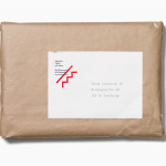
The consistent prefix and changing suffix of Brave’s name and graphic concept, based around the ‘Re’ e-mail abbreviation of ‘regarding’ (a very smart idea that places additional weight on the word), provides ReGen with a flexible tone of voice that appropriately communicates intention and an empathetic ‘personality’. The ‘highlighted’ execution of this name neatly draws on a cue commonly associated with eduction and learning.
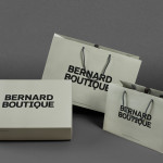
A vibrant, diverse and complementary colour palette suitably reflects a broad range of needs and services while remaining inclusive, energetic and positive, and is a choice that contrasts well against the practicality and formality of a simple but bold sans serif typeface.
The secondary typeface has plenty of character space and a mixed vertical and horizontal layouts in print. Alongside an uncoated material choice, craft-binding, cut-and-paste nature of the type and the single tone treatment of the photography makes sure that each printed piece introduces a little more depth and quality to the overall identity. It is a combination that suggests a creative but professional approach that generates lasting solutions.