October’s Top 5 Projects 2012
Opinion by Richard Baird Posted 8 November 2012
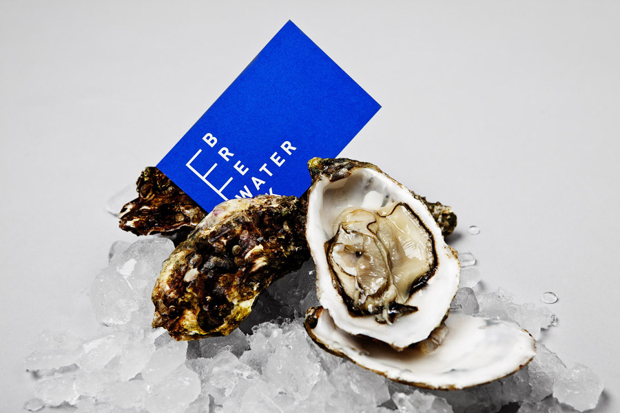
Breakwater is a Swedish logistics company that services the marine cargo sector. Their visual identity and stationery, created by Gothemburg-based studio Lundgren + Lindqvist, brings together the themes of open sea, systems and cargo through the vertical and horizontal intersection of a geometric sans serif, simple grid-based layout, plenty of space and a vivid blue and icy white colour palette.
Read the review here
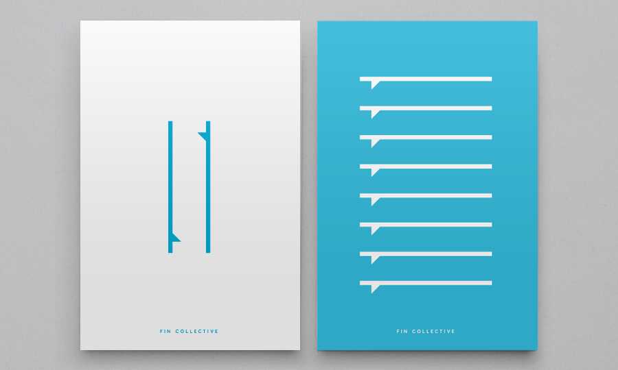
New York-based creative studio DIA have recently developed the visual identity for Fin Collective, a new custom surfboard business from Rick Malwitz, a craftsman who began producing boards in 2004 from a ‘dusty basement in landlocked Philadelphia’. DIA’s solution establishes a minimal but professional platform which avoids the over-enthusiastic, excessive energy and sharp design cues typically associated with the industry, in favour of a restraint and consistency that reflects high quality, craft and a close personal relationship with the sport, through an abstract logo-mark, uppercase word-mark, intimate photography and broadly spaced lowercase typography.
Read the review here.

Naturepaint is a British brand of ‘earth-friendly’ powdered wall paint formulated from biodegradable, non-toxic, sustainable and locally sourced ingredients. London based studio B&B recently created a new visual identity and packaging solution for the brand which replaces the saturated visual cues of the original with a distinctive duality and contrast of contemporary form and classic type that better reflects the high quality and hardwearing qualities of the paint.
Read the review here.
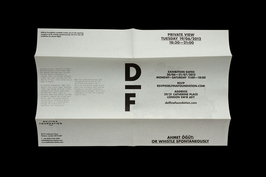
‘Delfina Foundation is an independent, non-profit foundation dedicated to facilitating artistic exchange and developing creative practice through residencies, partnerships and public programming, with a special focus on international collaborations with the greater Middle East & North Africa’. The foundation’s visual identity, developed by London-based design agency Spin, mixes a bold typographic solution and underline detail, a modern take on a classic monogram, large images with wide borders and a pastel, black and white colour palette – delivering utility and functionality to contemporary arts and crafts.
Read the review here.
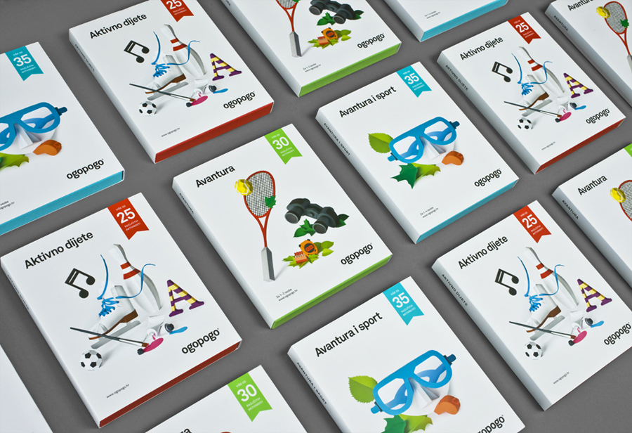
Ogopogo is a start-up that is introducing the boxed experience concept to the Croatian market. Their visual identity and packaging solution, developed by creative design agency Bunch, juxtaposes the corporate formality and geometric consistency of a simple sans serif logo-type with the bespoke, crafted and playful qualities of bright folded paper photography.
Read the review here.