Top 5 Brand Identity Projects of 2012
Opinion by Richard Baird Posted 30 December 2012

Evo is a new bank with a customer first proposition and over 120 planned branches across Spain. Evo’s identity, developed by international design agency Saffron, utilises a geometric and monochromatic approach to visualise a clear, honest and understandable banking practice and its single product offering.
Read the review here

Launched in 2006 Little Black Book is a printed guide for the advertising industry to share new ideas and was brought on-line in 2009 with the inclusion of new features such as e-newsletters, job boards and show reels. This year sees the launch of a new visual identity, created by Glasgow based interdisciplinary design agency Berg, which takes a simple and literal visual approach to frame a broad variety of content.
Read the review here

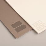
Established in 1996 The New Zealand Antarctic Research Institute is the body responsible for developing and managing New Zealand’s scientific research and conservation activities in Antarctica, Southern Ocean and Ross Sea region while also raising ‘public awareness of the international significance of the continent’. The institute’s new identity, which replaces an illustrative fern and penguin mark, was designed by Auckland based BRR and delivers a broader and more scientific sensibility through symbology, metaphor, simple geometry, monochromatic colour and a neutral typeface.
Read the review here

Krohn is a ‘young but experienced’ Oslo-based furniture, interior and architectural design studio that develops holistic solutions that strengthen and add value to brands through interior environments. Krohn’s visual identity, website and stationery, created by visual communications agency Commando Group, captures the multi-disciplinary nature of the studio and juxtaposes architectural structure and interior space with fine detailing through an abstract, multi-perspective logo-mark, interactive applet and the union of an uncoated concrete grey substrate and gold block-foil finish.
Read the review here

Madefire is a browser-based digital publishing platform and app created by Ben Wolstenholme, Liam Sharp and Eugene Walden to aid graphic novelists in the development and sharing of motion books and to provide readers with a new and dynamic digital experience. International design agency Moving Brands was responsible, from inception, for developing and defining Madefire’s purpose, visual identity, complementary assets, printed collateral and digital interface.
Relevant and conceptually multi-dimensional, Moving Brands’ identity solution delivers a huge amount of communicative value from such a simple, iconic monogram, the narrative and 50’s screen-play associations of a typewriter typographical choice and an underlying 80’s sci-fi aesthetic from red scan line details.
Read the review here