Bedroc by Perky Bros
Opinion by Richard Baird Posted 2 January 2013
Bedroc is a Tennessee-based consultancy firm that takes complex business issues and simplifies them with technology to reduce risk, optimise efficiency and creating revenue for its clients (ROC). The firm’s visual identity, created by multidisciplinary design agency Perky Bros, avoids the conventions of the industry and instead favours a direction that draws an analogy between bedrock and technology—the physical stability, sub-surface and base nature of bedrock and the in-depth and founding technological principles and practices of the business—through a logotype and collateral combination that has a layered and earthy quality.
“Bedroc is about simplifying technology by applying people & ideas rather than fancy widgets. The idea of simplicity is the backbone of Bedroc’s identity—positioning them far & away from the visual conventions of their industry.” – Perky Bros
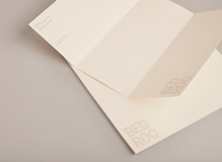
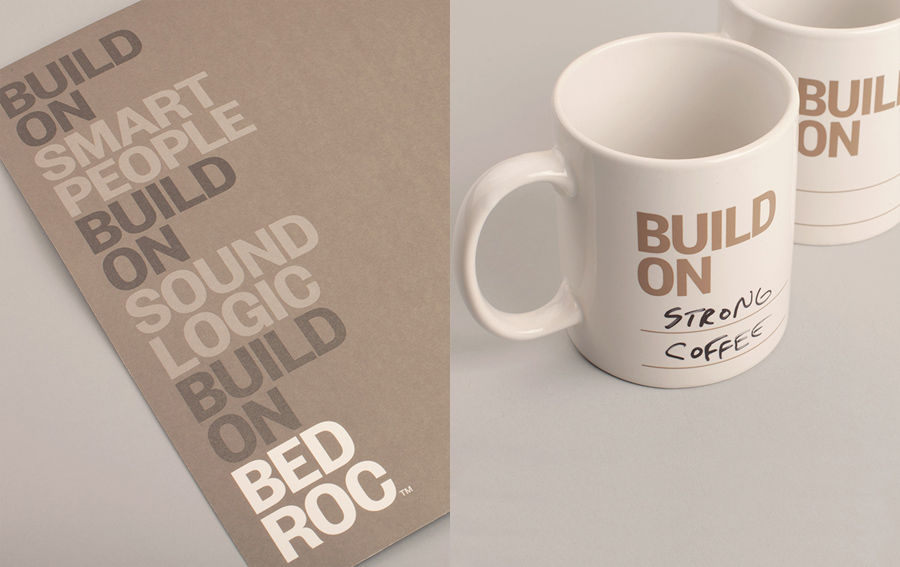
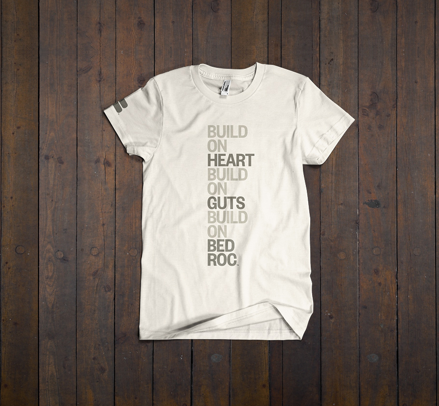
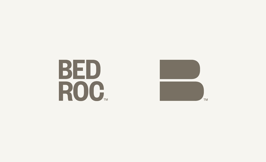
Taking its cues from the company name and the very physical associations it conveys, Perky Bros’ design solution establishes an unusually grounded and natural quality for a tech firm. The logotype—constructed from well-spaced, tall and bold uppercase sans-serif characters that share a single, consistent line weight—fuses corporate professionalism and confidence, structure—emphasised by its two-line stacked structure—and, through the lack of any superfluous detail, the founding of simple but solid infrastructures.
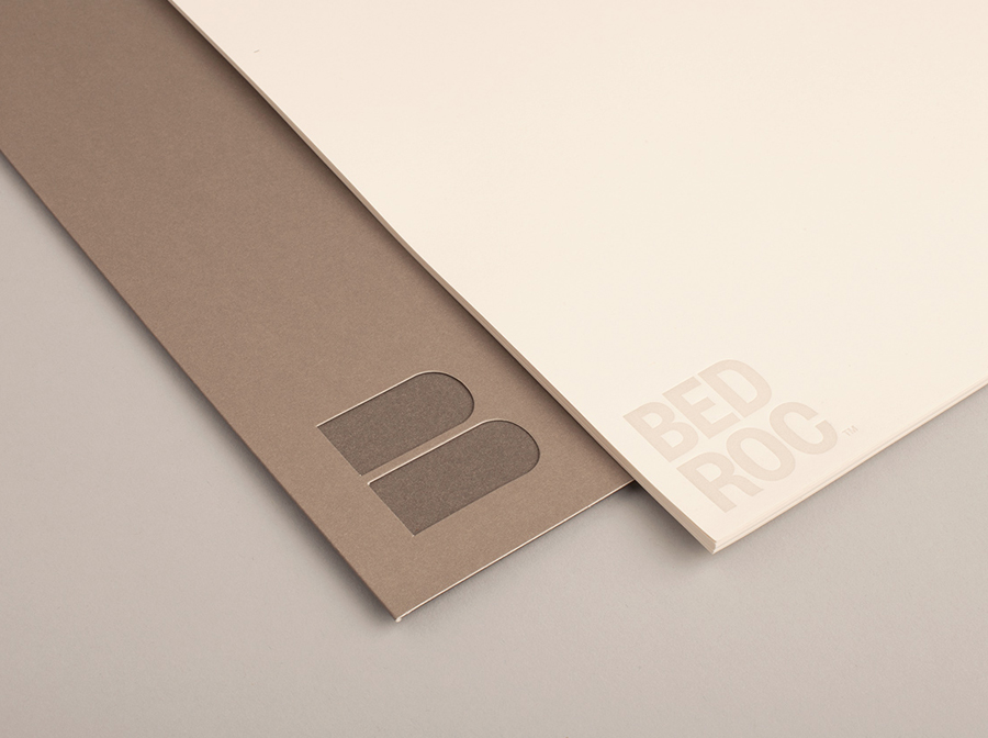
A simple ‘B’ monogram mirrors the left aligned and two-step quality of the logotype but with a rock-like weight achieved through the absence of counters.
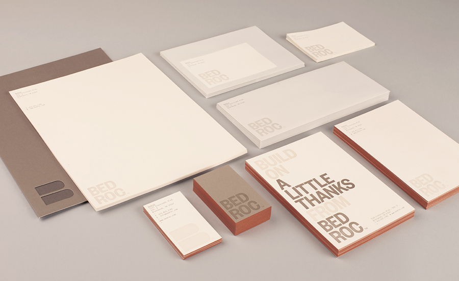
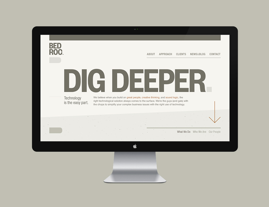
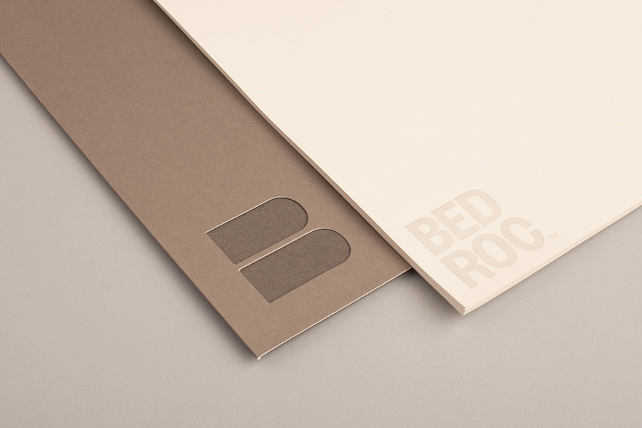
A stacked typographical approach across the collaterals, the edge-painted detail and heavy stock of the business card, washed/sun-bleached ink effect, earthy colour palette, die cut detail and a website with a graduated background—with what you might describe as mixed fibre background detail—creates a cohesive sense of excavation and sub surface layers that really emphasises the idea of in-depth research.
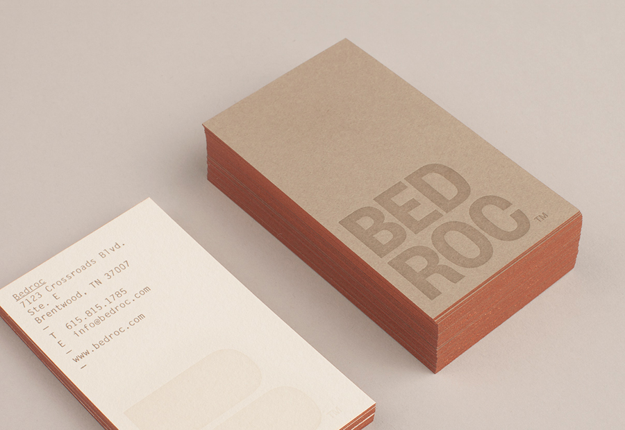
It is a divergent but far from irrelevant piece of visual identity work that manages to draw a lot of visual and conceptual equity from the name, appropriating the themes of structural stability, reliability and solid foundations, and applies these to digital services. And while it does perhaps rely on some degree of context – isolated my initial perceptions were of heavy industry, mining and landscaping – it is visually unexpected and distinctive with a conceptual weight that suitably reflecting solid fundamental rather than superfluous philosophies, moving it away from the fast-food nature of today’s technology and infusing it with the longevity and solidity of stone.
Design: Perky Bros. Opinion: Richard Baird. Fonts Used: Founders Grotesk & Letter Gothic.
