Helsinki Food Company designed by Werklig
Opinion by Richard Baird Posted 4 January 2013
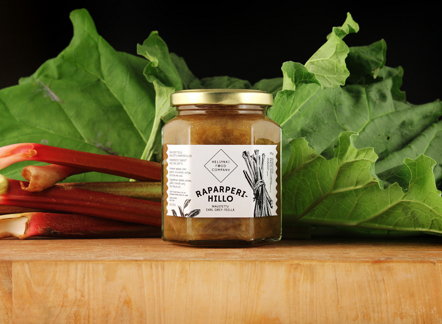
The Helsinki Food Company provides design and production services – including consultation, styling, photography and recipe development – to regional broadcast, print and event sectors. Created by visual communications agency Werklig, their visual identity – an economical single colour print treatment of a logo-type constructed from a single consistent line weight and culinary-related letter-forms across a variety of tactile and dyed craft substrates – sets a playful and contemporary tone with an underlying sense of local industry.
“Our assignment was to design a versatile, easily modified and cost-efficient brand identity stemming from the celebration of food culture. The spearhead of the identity is the logo of Helsinki Food Company. It includes different, somewhat self-evident but stylish, topical references to food and eating (a fork, a plate and a wine glass).”
“To compliment the logo a fitting typography, colour palette and pattern were designed. The colours are based on chosen, favourite delicacies. Pattern summarises Helsinki Food Company’s core idea (We Love Good Food). It has been derived from HFC office space, more specifically from their floor tiling.
“Visual identity comprehensively covers all the Helsinki Food Company communication, from online design and package labelling to stationery and window signage.
“Cost-efficiency was kept strictly in mind, so most of the applications can be executed and produced easily in-house. This gives great freedom to HFC personnel—and it also saves a lot of money. Good design and luxurious appearance does not always require a big fat bag of money.” – Werklig

I really love the logo-type, conceptually it could perhaps be considered a little expected but its art deco and humanist combination of slim and broad uppercase characters, their mono-line weight build, square terminals and consistent spacing alongside the elemental, illustrative, gastronomic flourishes appears well restrained, infusing the functionality I associate with signage of the past with a quirky, creative and professional quality without appearing childish. The diamond container, additional typographical detail and lock-up across an uncoated, Gravure embossed and dyed material choice add texture and a traditional sense of craft and local industry that, in conjunction with the colour palette, captures the dimensionality of good food.