Michael Barley Photography by 3advertising
Opinion by Richard Baird Posted 10 January 2013

Michael Barley is a Texas-based commercial photographer with experience in the corporate, advertising and healthcare sectors. His visual identity and business cards, developed by 3advertising, is a lovely mix of simple typography and a crafted and communicative business card solution that adds a tactile dimensionality to the vivid detail of Michael’s photographs.
This is a fantastic example of brand values being delivered through a more tangible and physical experience that goes far beyond just a simple visual identity. While the logo-type appropriately leverages the contemporary build but classic slab-serif details of Archer – set along a traditional curved baseline with a well spaced, uppercase formality and professionalism – it is the tactile richness of the business cards that appear the most communicative.
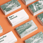
Their framing of photography through the die cut window of a mixed fibre/recycled, unbleached, uncoated, substrate sleeve is a lovely idea that has a care and crafted quality that really draws out and compliments the detail of the images which are printed on an internal board with a layout reminiscent of vintage and collectable cigarette cards.


A letter-pressed finish and sticker treatment, franked, numbered and hand-written elements introduce the themes of travel, individuality and exclusivity, layering the identity with a conceptual and representative depth. For me the business cards deliver a smart juxtaposition of material and image that should give Michael’s corporate work an earthy, humanistic and grounded sensibility and compliment the rest.