MYB Textiles by Graphical House
Opinion by Richard Baird Posted 15 January 2013

Last week Glasgow-based design agency Graphical House launched their new website which included some more shots of their branding work for MYB Textiles, a lace manufacturer located in Newmilns, Ayrshire that has a history dating back to the 1920’s. Based around a reinterpretation of the company’s monogram, new art direction and simple, tactile, material choices, Graphical House created a visual identity solution that draws on the heritage of the factory and gives it a contemporary polish and humanistic dimensionality.
“For over 100 years, a small town in North Ayrshire has been the world leader in lace production. To reinvigorate the MYB Textiles brand the monogram which has adorned the factory door since 1920 was re-imagined to create a contemporary marque and identity.”
“Stylish art direction documents the extensive range of fabrics, while an engaging short film produced by Mark Huskisson reveals the story of the company, its processes and its people.” – Graphical House
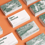
The new monogram retains the original’s unusual but authentic combination of slab and full bracketed serifs and its distinctive, extended B while making slight adjustments to the under and overlaps, now emphasised by cuts across the intersections that – whether intentional or not – appears to expertly ‘weave’ together the three letter-forms. The ampersand and LTD have been appropriately removed to make way for more internal space and a two-stroke line weight has been replaced by one, achieving a far more restrained interpretation without compromising its established character. A well spaced sans-serif logo-type underneath appears practical in a way that cloth and lace is an elemental component of more elaborate pieces, that along with the monogram have been executed across a collateral choice of uncoated, tactile substrates that reflect the craft and quality of the lace.
I do not know much about production but the video work – created by Mark Huskisson – for me has an atmosphere of resolve under modern industry pressures which is enhanced by a rhythmic soundtrack that follows the flexing of the looms. The images of employees and the reoccurring shots of work-worn hands introduce a very humanistic element to the identity which resonates well with personal qualities associated with monograms.