The Beaufort by The Company You Keep
Opinion by Richard Baird Posted 25 January 2013
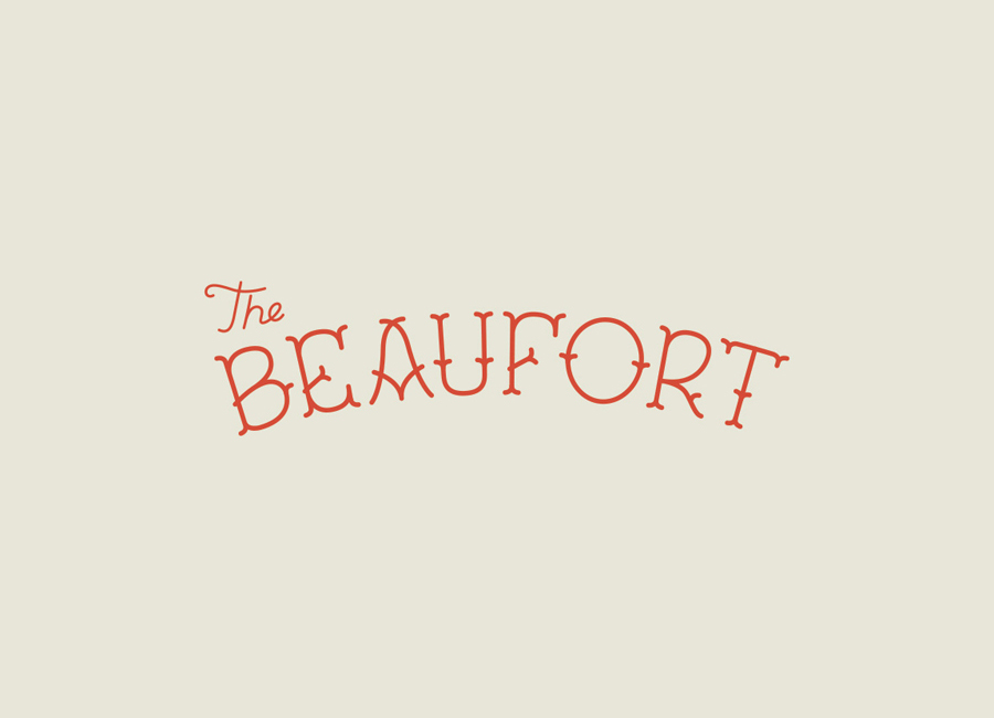
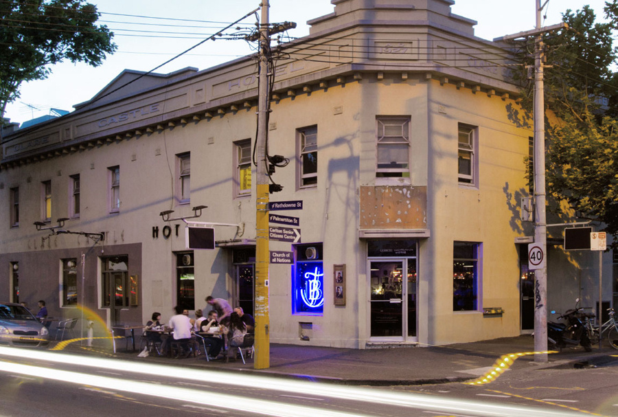
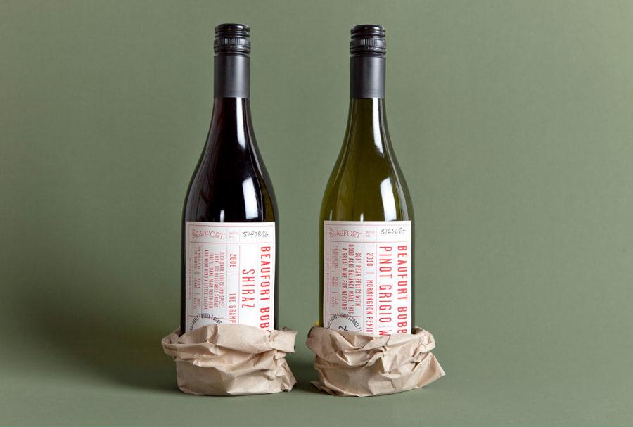
Design agency The Company You Keep (TCYK) have recently finished working with bartender Dave Kerr on the naming, branding, collateral design and signage for The Beaufort, a themed dive bar located on Melbourne’s Rathdowne St. The agency’s visual identity solution, a combination of a quirky, well rendered, bespoke logo-type – built from unusual but original uppercase characters inspired by iron dock cleats and American sporting insignia of the 50’s and 60’s – set along a classic curved baseline and executed with a more recent single consistent line weight and rounded terminals.
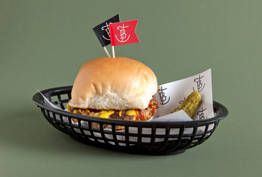
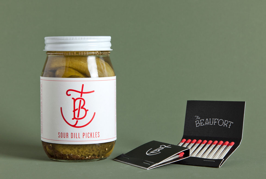
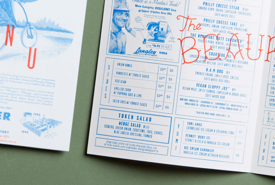
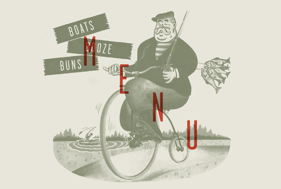
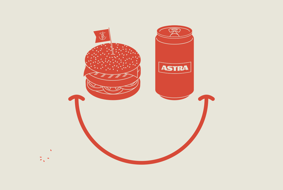
Alongside a neat anchor monogram, type heavy collateral layouts and retro imagery -with an on-trend watery blue tint and a red overprint treatment across a simple white substrate – delivers a distinctive and nautical personality with a sporting undertone and a contemporary simplicity.
